French singer/songwriter Petite Meller has been the focus of my attention for the past few months and it's been hard to keep her music and image off of my mind. The constant thought at the back of my head whilst designing this 'digipack' mock-up was heading for an authentic look, true to the era's creative direction. The most notable shared trait is the vibrant yellow tone [#fbd623] present strongly on the official album artwork, both on the border surrounding the cover as well as on the text. This was my centre-point and the framework I developed my project around.
For the front cover I went with a photograph shot presumably by Mongolian-born Khasar Sandag which came from the same set as the official cover photograph. I feel that this shot has a lot more soul in it, with the official making Meller look slightly windswept.


For the interior I used an image Meller tweeted shortly after the release of Lil Empire which shared her thanks to her team, which I thought was perfect for the insert (reverse of front cover), however the original photo had a blurred background and I wanted to use a screenshot from the visual for "The Flute" which was where the final album cover was photographed. With that in mind I cleaned up the image and isolated the text before transferring it into my insert canvas, making sure that it had the same yellow tone consistent throughout.
For the CD compartment I used a vintage map as the backing slip to symbolise the album's continental voyage and the spirit of adventure the album carries and again the trademark yellow tone for the CD case. Instead of adding text to the actual CD I left it blank to maintain the clean typographic pattern I've introduced.

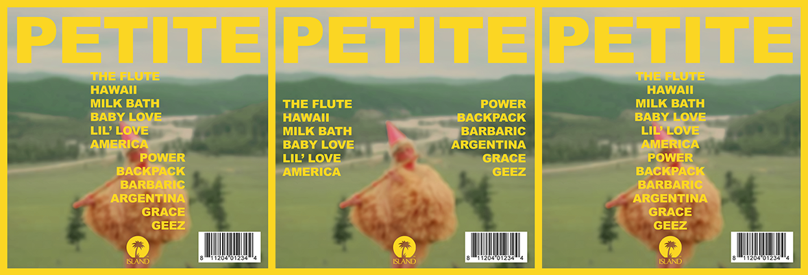
Similarly to my insert I wanted to use extend the continuity and use a screenshot for my background. For low quality screenshots applying a Gaussian blur is an easy and effective way of removing the problems associated with quality. The final product looks sleek and continues the theme effectively I feel, below are two of my previous experiments with typography. I ultimately chose to have them placed centrally flowing downwards to avoid insinuating that the album was divided in concept.