


Style Frames & Logo Refresh
Below are some different iterations of a logo refresh/reimagine I created before I began making the Motion Design piece. I wanted to create a contemporary logo that represented connectivity and accessibility. A logo that was modern and that could be dynamic when animated but was equally strong when static. I wanted the logo to suggest being "switched on" and a part of global communication. The font I chose was Harbara because it was a bold and modern sans serif font, a typeface that is highly legible and a little bit different but retains legibility across multi - platforms.

Performance Science Style Frames
Vector drawings created in Illustrator in silhouette form to create strong forms that can replicate fitness techniques or training. These animated forms when training help deliver the concept that exercising and training is quantifiable and learnable. Setanta college courses provide the tools to train and analyse training techniques and physiology.

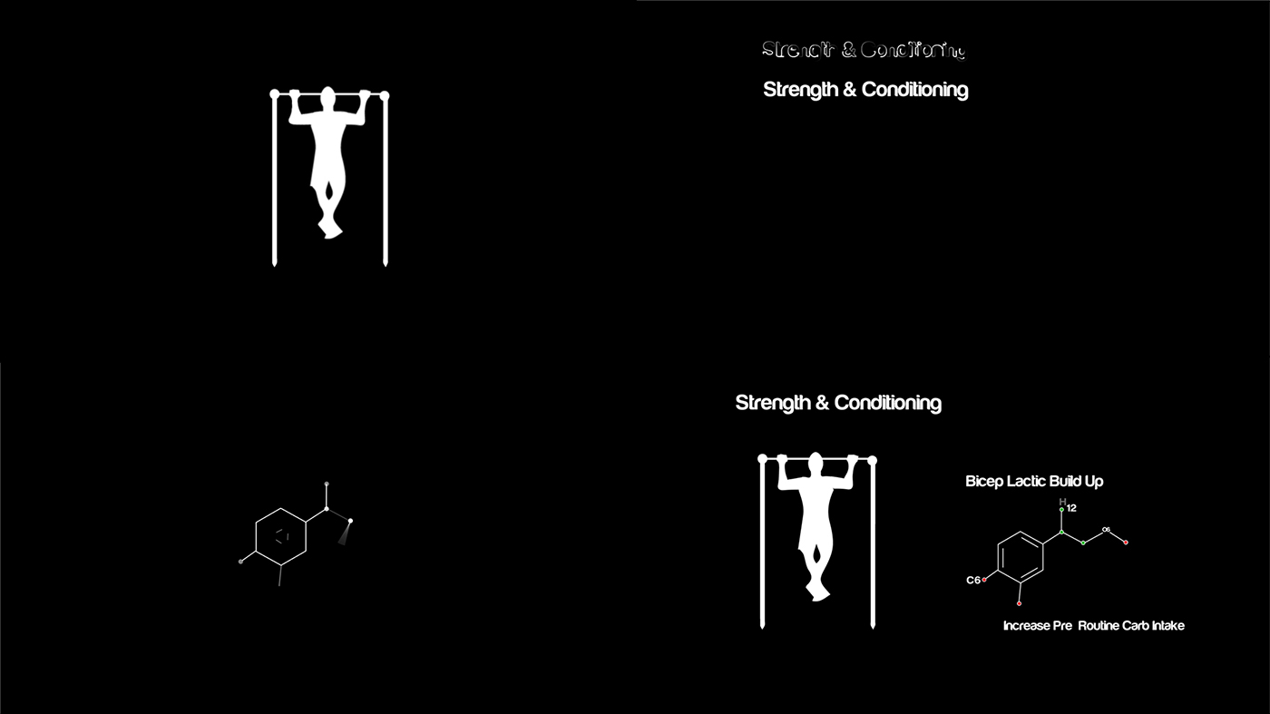
Strength & Conditioning Style Frames
Strength and conditioning sequence aimed to provide some visual information about how lactic build up can occur during reps and how this can be avoided. I also wanted to create a 'hard science' look through the use of Carbohydrate molecule illustrations to emphasise the scientific approach and knowledge base thats available through enrolling on the online courses.
Technique Style Frame
Technique sequence focussed on two main areas of visual representation. Firstly each exercise or fitness technique must be learned or taught correctly to reap the full benefits to gain enhanced rewards. Secondly the Bio- Mechanical function of each routine must be looked at and studied so that students have an understanding of what is happening from a musculoskeletal perspective.

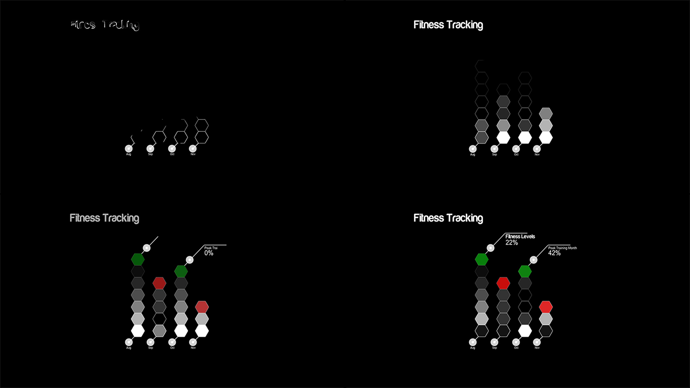
Fitness Tracking
Fitness Tracking section looked at how its possible to represent Fitness Tracking elements across a section of time and represent these in the form of graphs.
Colour & Tones
The concept behind the colour selection for Setanta Motion Design Promo was to keep it simple, stripped back and minimal. Using black, white and strong primary colours I wanted to represent each of the sequences and core concepts in a 'bare bones' approach and let the science,information and ideas behind the animations represent themselves. Black and white and use of silhouette would not detract from the core concepts. The use of green and red colours used sparingly throughout highlights key areas and connotes peaks & troughs (positive/negative values) achieved in sport/fitness.


