Udacity Branding
THE CHALLENGE
Udacity is disrupting the traditional idea of higher education. They specialize in providing industry-prepared courses and “nanodegrees” to help students learn the skills they need to get a job. They challenged us to create an experience that elevates Udacity from the sea of ed-tech startups into a league of their own, while communicating the accessibility and affordability of their new style of higher education.
OUR APPROACH
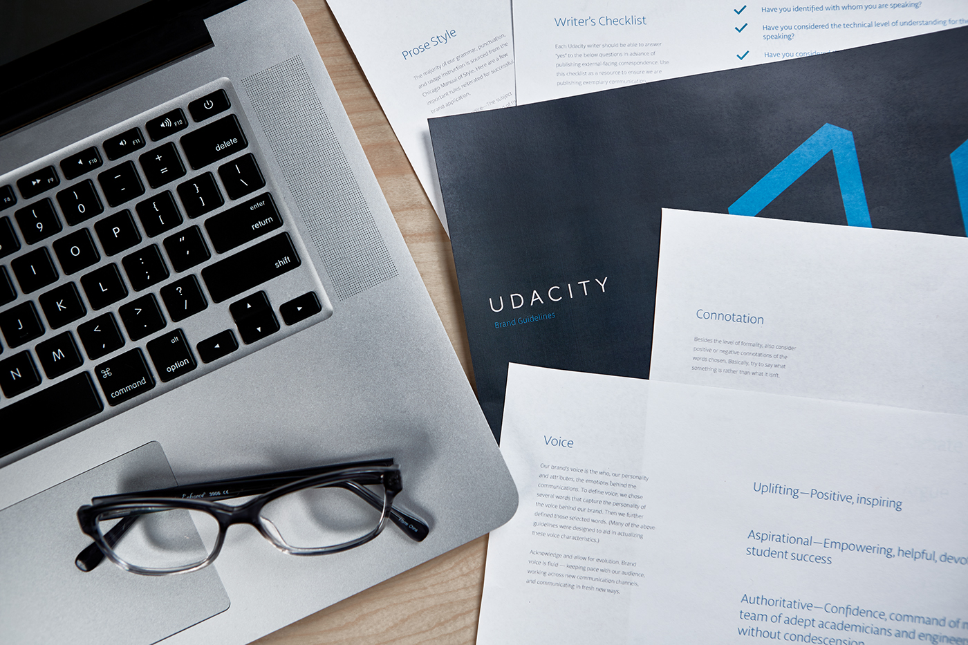
Care was given to create a visual identity that scales and co-brands well. The new visual storytelling is evocative, real, and clear, and the voice captures Udacity’s devotion to the success of its students, collaborative spirit, and integrity. Messaging centers around empowerment, accessibility, academic excellence, and digital literacy. The overall experience of the website mirrors Udacity’s modern and easy-to-understand approach to education. Implementing clear interactions with clean design elements, we’ve created a website that aligns with the caliber of courses provided by Udacity.


The new visual storytelling is evocative, real, and clear, and the voice captures Udacity’s devotion to the success of its students, collaborative spirit, and integrity.
BRANDING
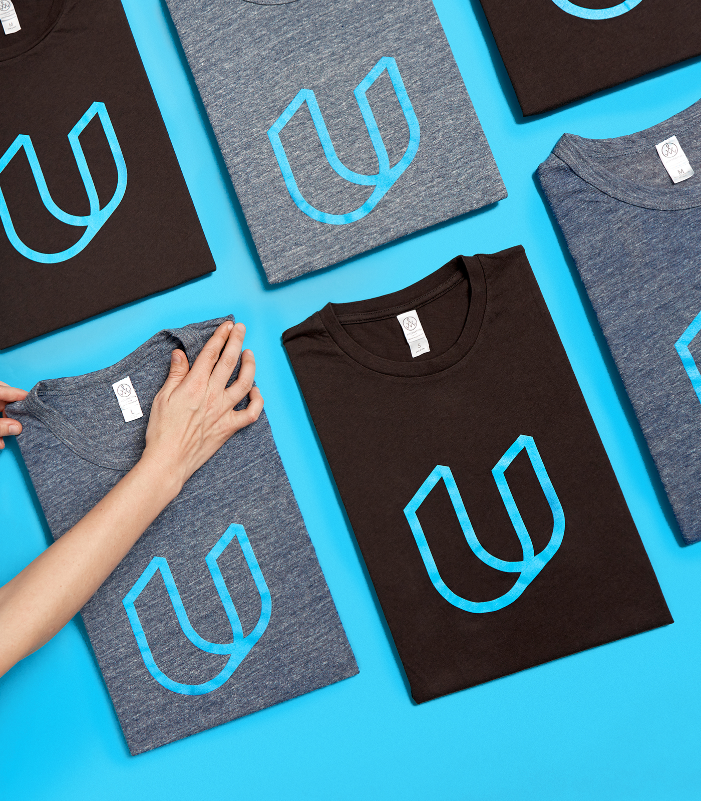
We created a comprehensive brand experience that is clean, simple, honest, and professional. The vantage point of the logo mark embodies Udacity’s non-traditional approach to education. Paired with the logomark, the logotype gives a subtle nod to the ownability of the brand.


"Focus Lab is one of the best design agencies I’ve worked with not only on a professional level, but personality wise as well." — TED BODA, DIRECTOR OF DESIGN @ UDACITY


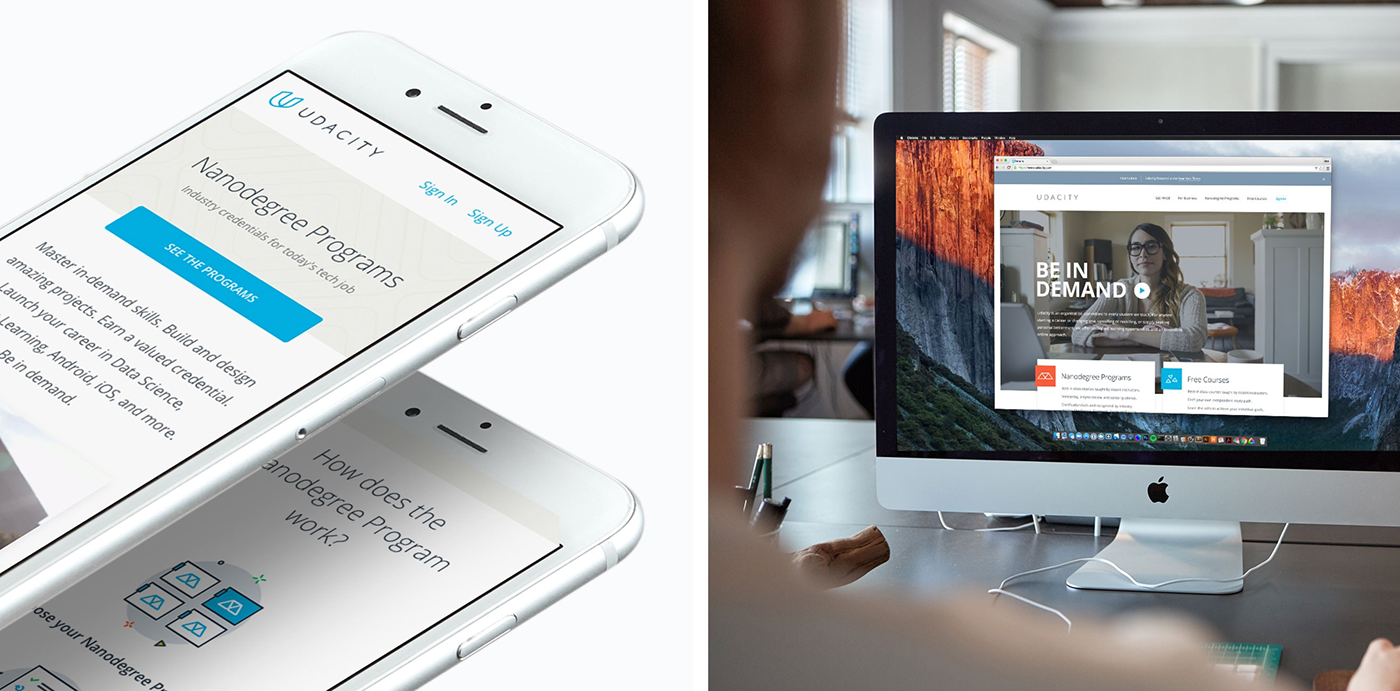
UX AND UI DESIGN
Udacity is a large website, with varying audiences, an ever-growing list of course and degree offerings, and a desperate need to rethink and restructure the presentation of information. Because of the large amount of content, we sought to contrast the bulkiness of the previous design by creating a more airy look and feel, relying heavily on whitespace, readability and information hierarchy. Devising repeatable modules allowed us to create consistency in the interface for the user, and streamline our design and development of other pages.
I’m running out of variations on “you rock.” How about “thou igneous!” — CHRISTOPHER WATKINS, SENIOR WRITER @ UDACITY


Congrats to Summer, Alex, Shabnam, Alicja, and Sam for their hard work on this project. #goteam


