
One of the main things that got me into design was my love for typography. It started as an early interest in graffiti and urban lettering, then later matured into an interest for hand painted signage. I found that I was pretty good at it once I tried it myself, so painting signs became an easy way for me to earn few bucks every now and again.

Once I got to college and started studying more formal typography and type design, these two interests merged together; the result was Clearance, a typeface inspired by a casual brush script I developed over the few years I painted signs commercially. I considered it to be the best opportunity to utilize my skill set to create something unique, which has become increasingly difficult in the current age of type design where millions of typefaces already exist.
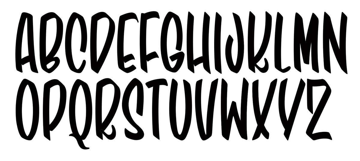

My primary objective for this project more or less consisted of finding a suitable balance between the precise, calculated structure of type design and the imperfect, humanist nature of hand lettering. Each of the letterforms were sketched originally by hand, after which they were scanned into the computer and converted into vector format, at which point each glyph was refined to establish a cohesive family of characters.
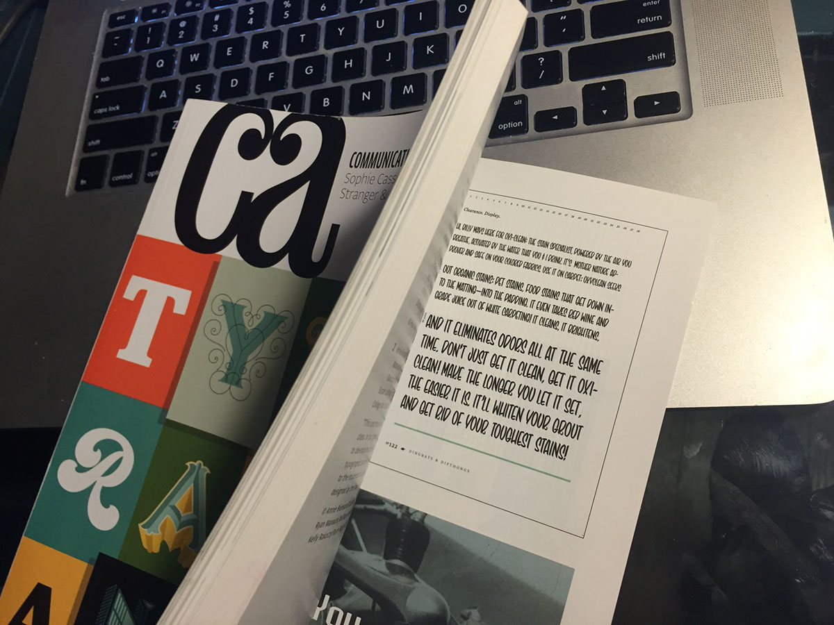
Each year, Communication Arts calls for submissions of typographic work, and chooses their favorites to be featured in their Typography Annual. My typeface was submitted by my typography professor, and ended up being chosen to be featured in the sixth edition of the publication.

