

I started the process by researching existing logos from small cafes and delis that exemplified the fresh, clean feeling that I was going for. I had a wide range of directions that I branched out in for my first round of ideation, but kept coming back to a logo that was a circular emblem.
Hand-lettering was the best type treatment for "Sandwich Club". The play between letters in "Sandwich" is friendly and welcoming. Pictured is one of the later hand lettered drafts, which I then scanned and finished editing digitally.
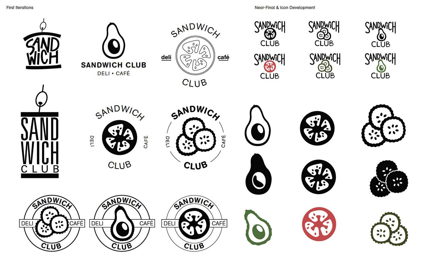
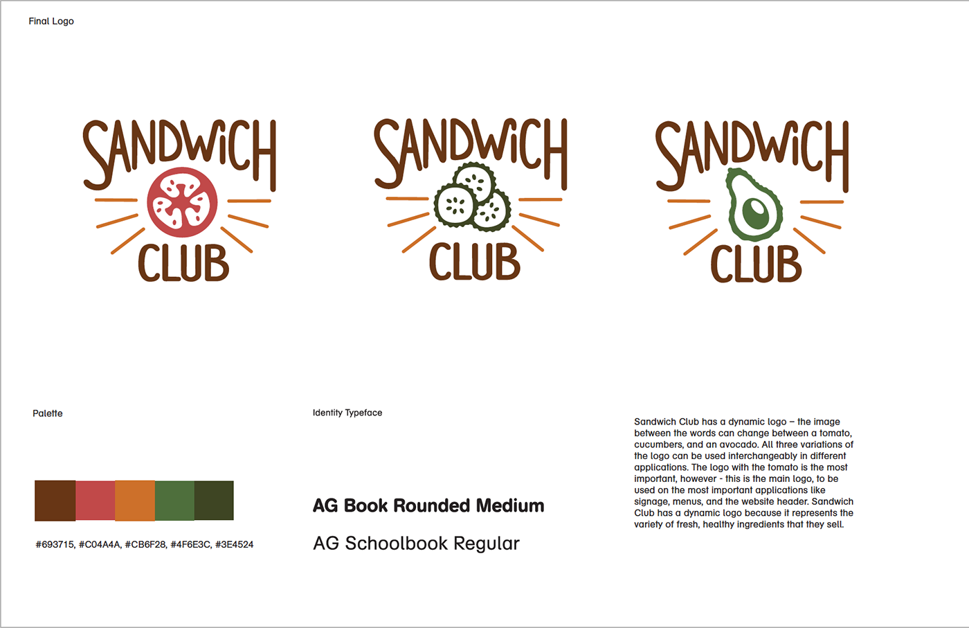
I began to create iterations of the strongest ideas digitally. The emblem type logo continued to be the strongest, but settling on only one type of ingredient to go in the center seemed incomplete. "Sandwich Club" is a cafe & deli that prides itself on offering a wide variety of toppings and sandwich customization, so a dynamic logo ended up fitting this mission perfectly. The logo can change (between an avocado, tomato, and pickles), which represents the large variety of fresh ingredients that Sandwich Club serves.

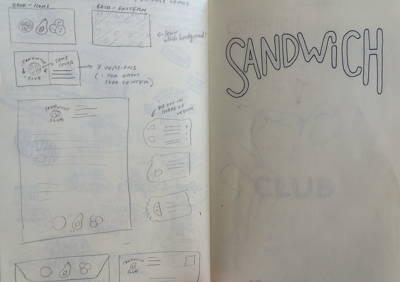
Letterhead, envelope, and specialty die-cut business cards. The variability of the business cards is meant to reflect the dynamic nature of the logo.


