samone
SAMONE is a Software Asset Management company based in Poland. The company’s core values are about trust, knowledge and supporting other businesses.
Helping Hand
Finding support for your own business is not always easy. Experience, training, equipment, software, network structure and many other factors can pose a serious challenge for a business. Sometimes we need to outsource to solve such problems. We need other people’s expertise.
Together
My client was looking for a name with a chunk 'SAM' in it. Because in Polish language "sam" sounds like "some" I proposed 'SAMone' which could mean someone who can help.
I decided to make a logotype with a sign at the end which symbolises a reference mark. I also added optional notes beneath the logo which describe what kind of company/person the customers need e.g. someone to help, to trust, to make it, to solve the problem.
Make it clear
I used four colors which symbolize trust, knowledge, technology and fresh look. The best person for cooperation should have all of these features so I decided to use gradient. I also designed pattern by using reference mark from logotype and made a big organizational structure.


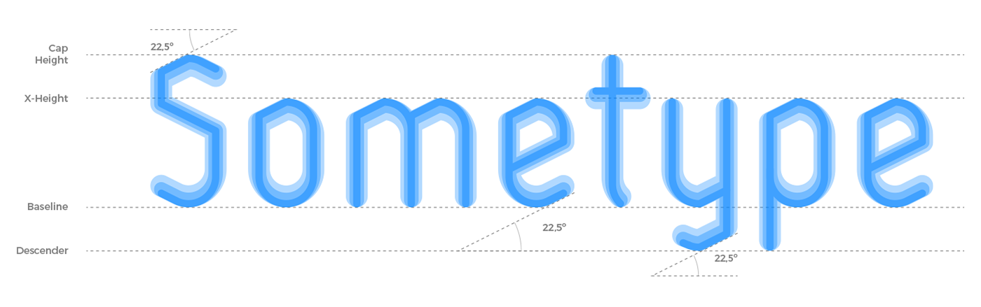
Typography
I designed brand new font for the notes below logotype. You can check typeface here sometype™. I also chose two fonts to keep SAMone clear and readable. First one for headlines and slogans, another one for texts. Both are available for free for my client on google fonts.