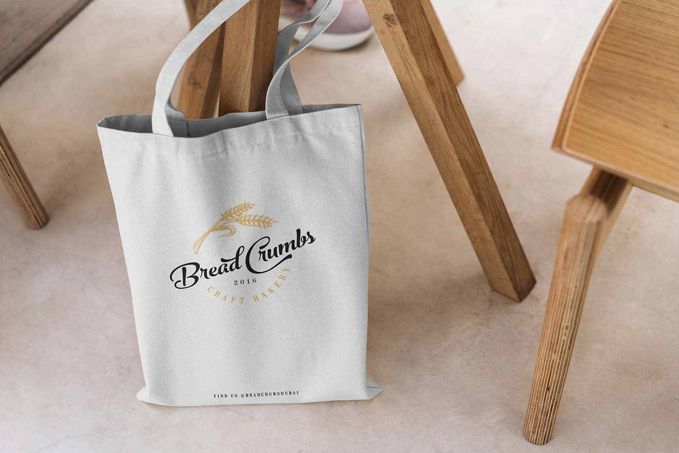

Hand-drawn wheat design wrapped around the text for the logo is a great representation of the wholesome and natural elements that are associated with bakeries. The wheat adds a rustic and charming feel, while the text is bold and easy to read, making it a great logo for a bakery that serves traditional and fresh shourdough bread and quality pastires.
The harmonious interplay between the delicate wheat and the bold, easily discernible text strikes a perfect balance that resonates with the viewer. The chosen fonts not only enhance the logo's visual impact but also convey a clear message: the bakery is both welcoming and professional. The graceful curves and flowing lines of the lettering imbue it with a warmth that speaks to the handcrafted nature of the delectable offerings.
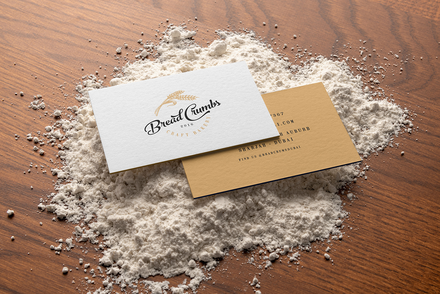
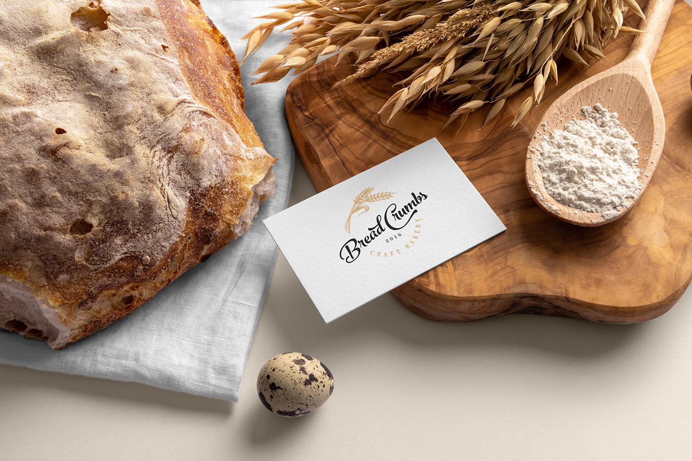
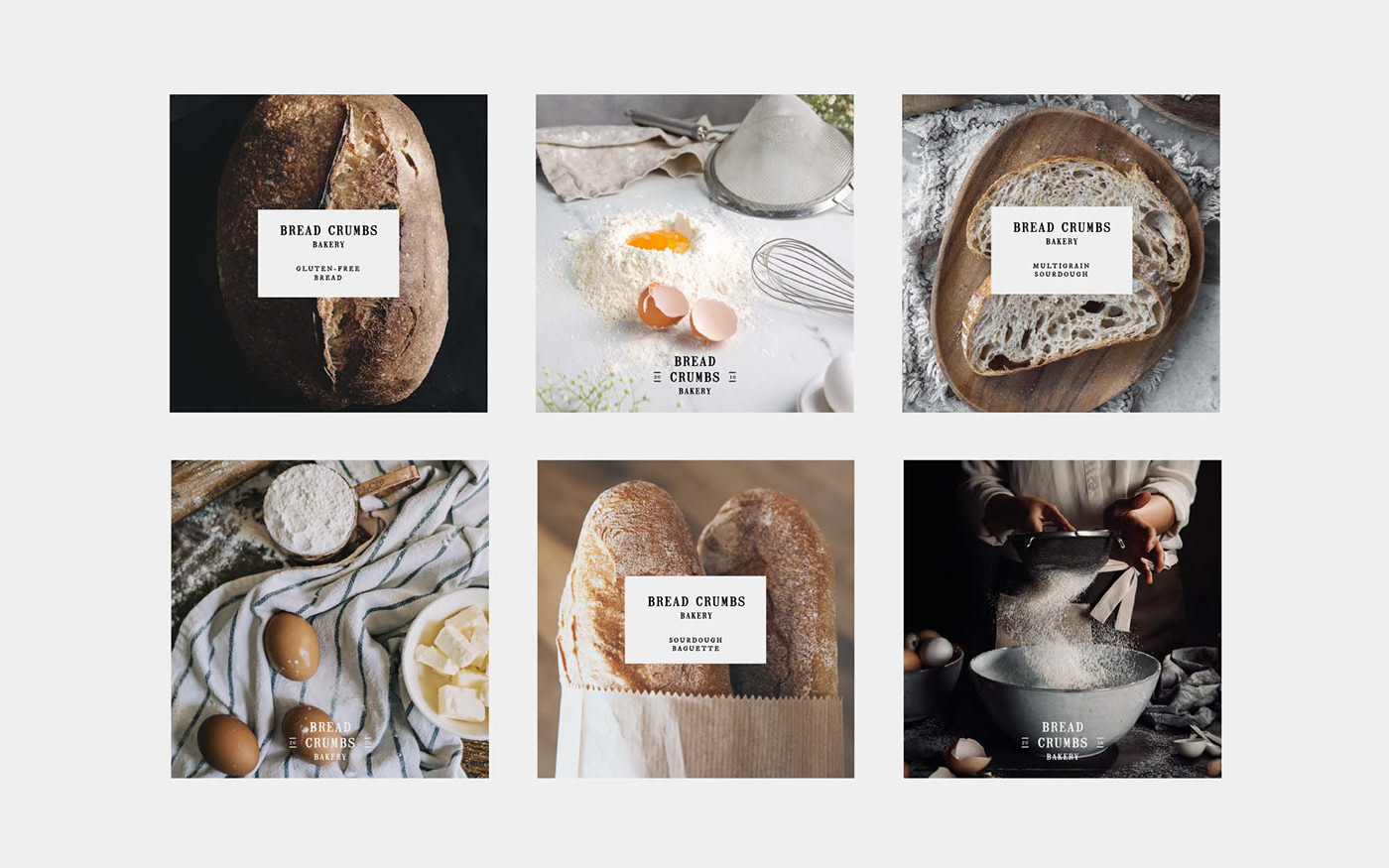
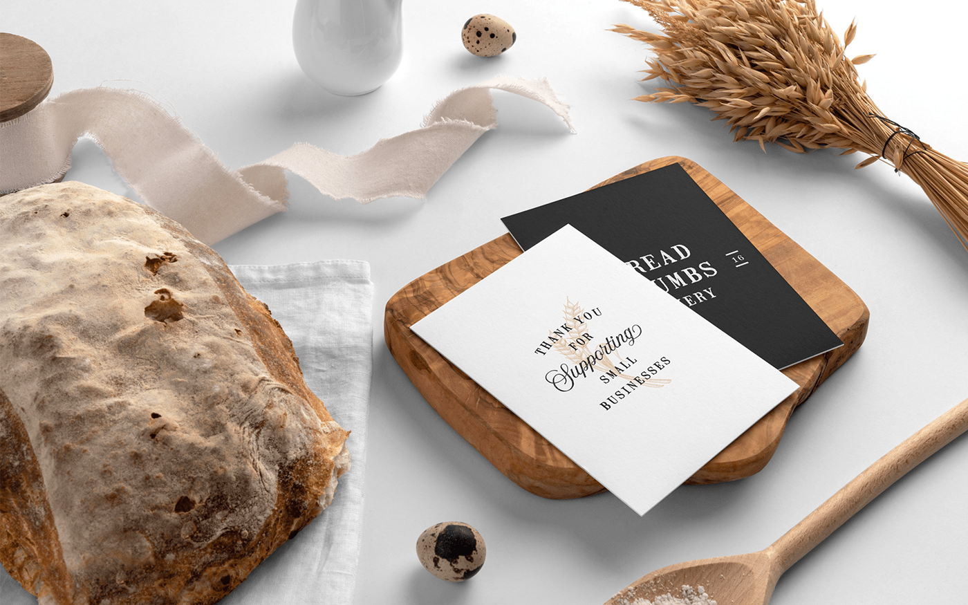
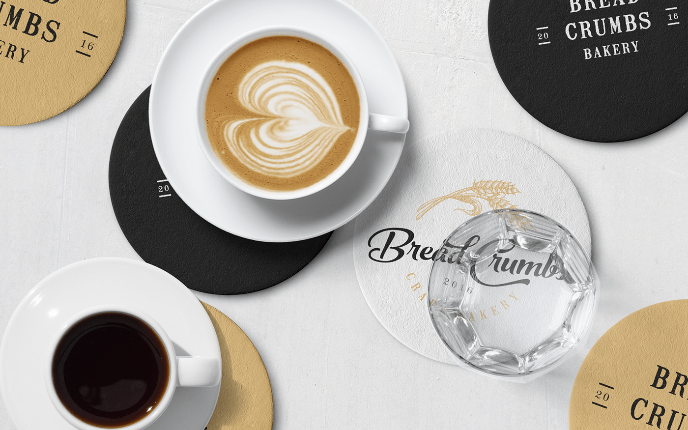
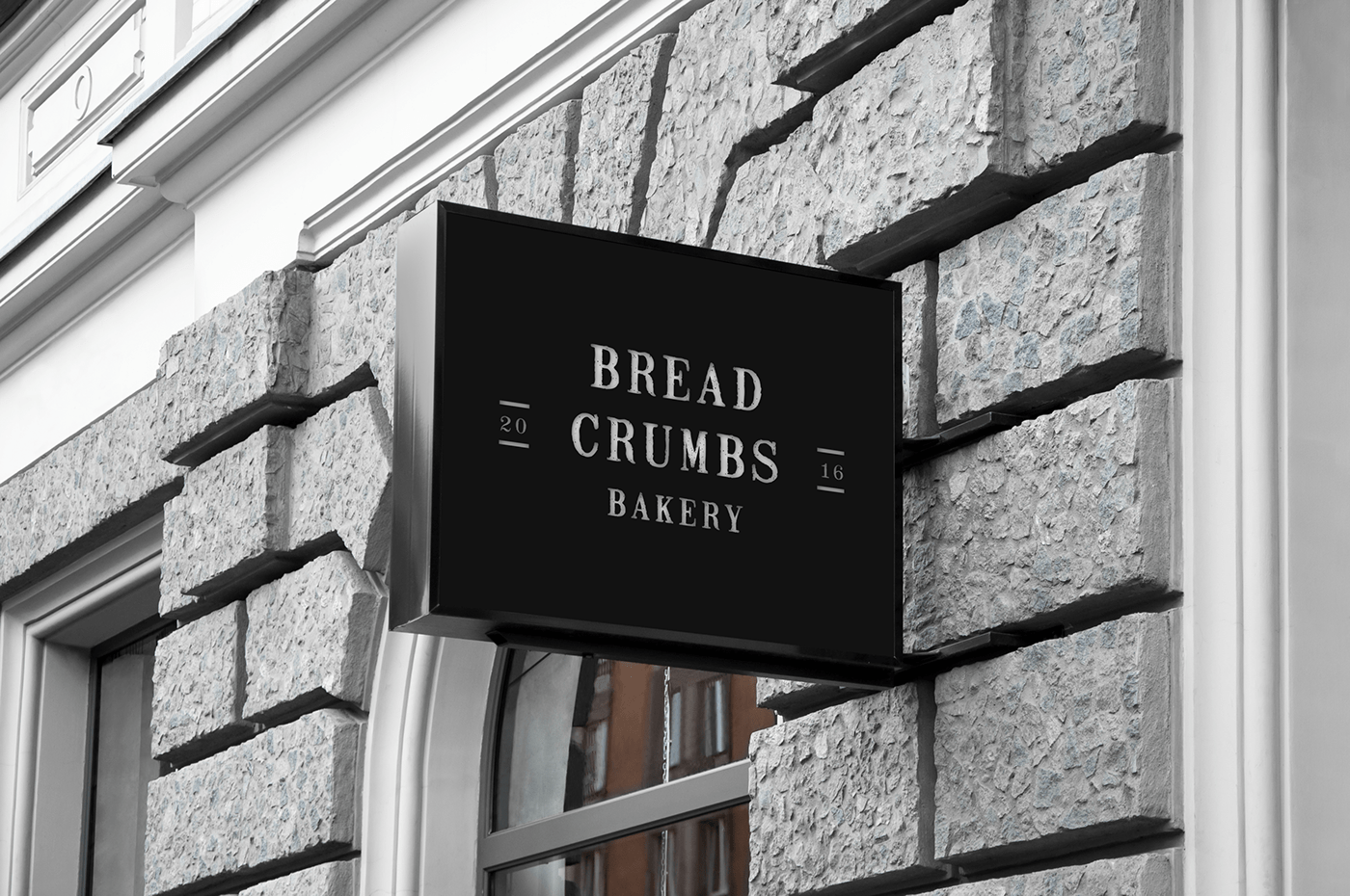
The logo design is complemented by a full identity system, including business cards, menu design and packaging. The clean but organic aesthetic was created to reflect the restaurant’s farm-to-table philosophy. Color choices were simple but fitting to the industry and made the designs look mroe approachable.
Overall, the design is simple yet eye-catching, and it effectively conveys the message that your bakery offers fresh and natural baked goods. The hand-drawn wheat design, gracefully encircling the text in the logo, eloquently captures the multifaceted essence of the bakery—where nature's bounty intertwines with culinary craftsmanship to create an unparalleled haven of fresh and natural baked goods.
Overall, the design is simple yet eye-catching, and it effectively conveys the message that your bakery offers fresh and natural baked goods. The hand-drawn wheat design, gracefully encircling the text in the logo, eloquently captures the multifaceted essence of the bakery—where nature's bounty intertwines with culinary craftsmanship to create an unparalleled haven of fresh and natural baked goods.