
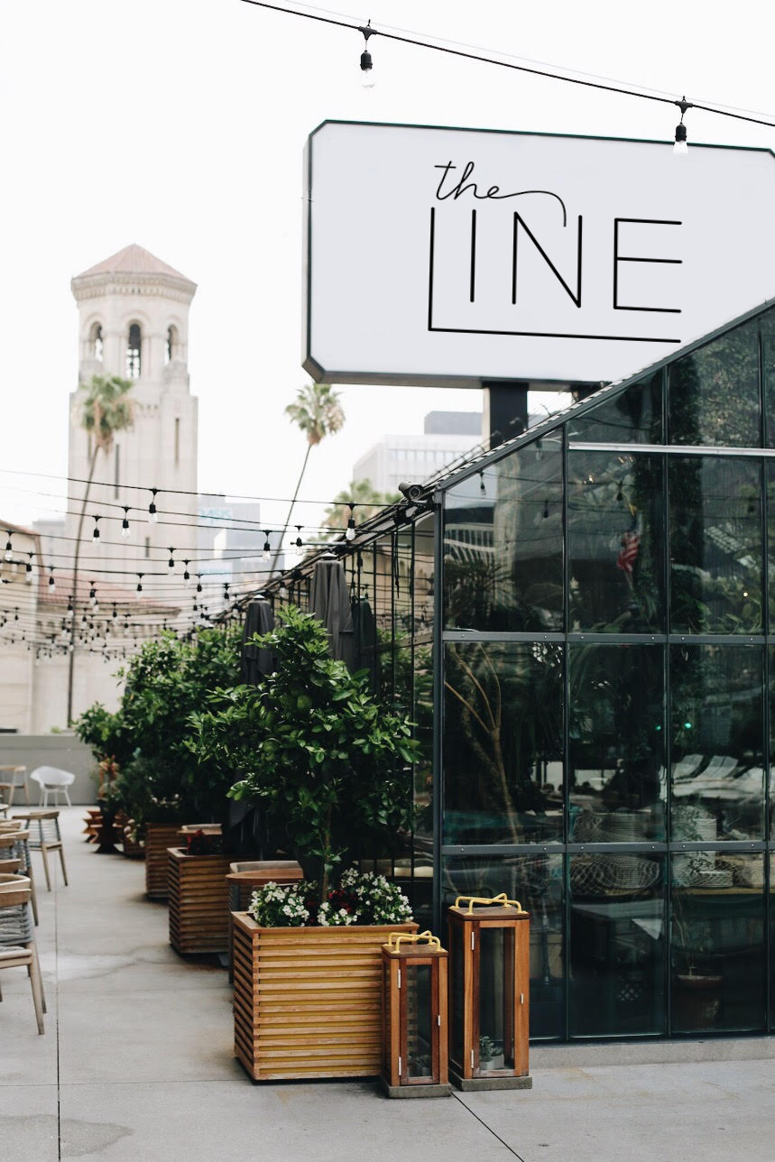


The Line is a hotel by the Sydell group with a downstairs lounge, boutique, greenhouse restaurant, and more. The decor is urban with a twist of desert-inspired elements including muted tones and grunge textures. It is in Southern California’s highest concentration of restaurants, bars and businesses in Koreatown. It prides itself in being not only a hotel, but also a provider of some of the best food and creative services that LA has to offer.
Gotham Extra Light is the base font, and reflects the urban and structured elements of the hotel. The leg of the L is continued as the line element in the logo to play off of the name of the hotel itself. By creating a play on the word line, the logo becomes more memorable. The addition of the hand lettered “the” adds a more whimsical element and caters towards the artistic, creative side of the hotel. By combining a thin san-serif with the hand lettering, the logo comes across as both refined and fun. “LINE” is slightly thicker than the “the” to ensure that it stands out and is easy to read.
Photo of The Line by Caitlin Flemming, used with permission.


