
Everything contained on this page is personal work I have taken on independently.
OBJECTIVE
What is It?
Nike's Answer: A premium membership pass to all things Nike including exclusive access to Nike products, training events, expert guidance, and behind the scenes content from your favorite athletes
User's Answer: Nike's shopping app
Objective
Realign the app’s focus to better serve the needs and expectations of it’s core users
Solution
A modern e-commerce experience focused around what matters most to its users — product browsing, personalized recommendations, and product reservations
DEVELOPING CONCEPTS
1. Home
The Challenge: Designing the landing page to better reflect the focus on product to align with expectations of a shopping app
Prototype Demo Video

Research & Insights Gathered
Summarizing the App's Purpose
1. Users often infer the scope of an app or website by the landing page
2. The homepage should clearly reflect the app's purpose as a shopping app to distinguish it from the several other apps in the Nike+ family
3. Users should be given more control over the variability in the type of Feed content they see (available product, upcoming releases, athlete journals, collections, etc.,) to ensure the landing page aligns with their motives/interests and can serve as a hook for more frequent visits
Home Solution Mock-Ups
Alternate tab views and filtering options to give users more control over the variability in content and to clarify the scope

Feed - Highest content volume, serving as your central hub for all Nike updates ranging from new product, upcoming releases, athlete collections, and more
Trending - Hottest Nike products discoverable by you and available for purchase (linked to PDPs)
For You - Personalized offerings based on your in-app behavior and Profile presented in a curated, category-based format
Challenges Encountered
1. Determining an appropriate layout to summarize the broad scope of an “all-in-one destination” app while maintaining the essence of a personalized experience
2. Picking tabs that will be scalable over time as the app updates with new content and features
3. Creating tab names that are clear enough to avoid conceptual overlap while ensuring each tab covers enough ground to capture the wide variety content
Home Tab Toggling & Search Interactions

Tap or swipe between tab views
Tab Tap Event: Tab Content (Paged Scroll X) – EaseIn Sine 0.285 sec
Search Tap Event: (1.) Search Icon (X) – EaseIn Quad 0.25 sec + delay 0.25 sec; (2.)
Cancel & Search text (Opacity) – EaseInOut Quad 0.2 sec + delay 0.5 sec
Home Filtering

Toggle on the Auto Filter Favorites switch to keep the 'Feed' and 'Trending' tabs tailored to the "Interests" categories you follow whenever you open the app
Provides visual reassurance that content is relevant to the user's interests
– Filter Modal Entry Tap Event: Modal & Background scale (scale: 77% & Y: -677) – EaseInOut Quad 0.32 sec
2. My Store
The Challenge: Minimize interaction cost associated with product browsing by clarifying the relationship between product refinement controls to keep filtering efforts intact

The Nike+ 1.) 'My Store' product/grid wall pages offer 2.) filtering controls and 3.) Facet tabs of top-level product categories as refinement options.
High Interaction Cost: These two refinement options currently conflict due to each facet tab having it's own unique set of filtering options, causing filtering efforts to be lost when users switch facet tab views.
Research & Insights Gathered
Filtering & Guided Refinement
1. A batch filtering approach has shown to be most effective with users that tend to have clear search criteria in mind
2. Facets are typically associated with interactive filtering, allowing an immediate response due to their mutual exclusivity
3. Tabs should be parallel in nature, particularly when scrollable due to lack of screen space, to ensure users can easily predict what they’ll find
My Store Product Refinement Solution
Dynamic filters and facet tabs that work in tandem to keep user refinement efforts intact
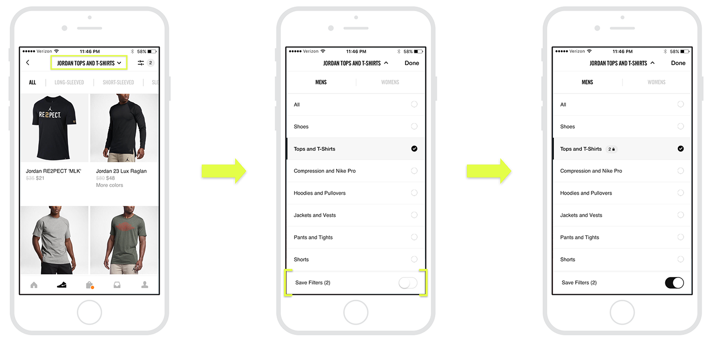
1. Replaced top-level product category tabs with more closely related subcategory/facet tabs
2. More flexibility for exploratory users through access to alternate top-level product categories
3. Keep filters intact within a particular category while exploring using "Save filters" toggle switch
Challenges Encountered
1. Digging through the information architecture to understand how the different product category levels could correspond better with the visual hierarchy of refinement options
2. Eliminating instances of non-gender specific product walls to maintain integrity of filters while keeping guided tabs/facets as an option for further refinement
3. Shopping Bag
The Challenge: Guiding the user toward making a purchasing decision with comparable options and without disrupting the shopping experience

Research & Insights Gathered
Modality
1. Full screen modal views are primarily for shifting the user’s focus to complete some task or save important data
2. Users generally prefer to interact with apps in nonlinear ways
3. A shopping bag modal can provide convenient access to items of interest for comparison or refinement, without navigating away or completely abandoning the current context of the shopping experience
Shopping Bag Solution
A modal supporting nonlinear interaction to allow more flexibility in transitioning between browsing and comparing items of interest


Convenient links to products you've recently considered, providing access to all items relevant to your purchasing decision, or particular shopping session, all in one place
Challenges Encountered
1. Repositioning the shopping bag from the navigation bar to avoid conflict and inconsistency with new home tabs
2. Designing a modal view that supports nonlinear interaction while still providing a sense of security and reassurance that any changes to items will remain intact
3. Creating appropriate modal entry and exit transitions that feel intuitive upon tapping a tab bar navigation item
Bag Entry & Exit Transitions

Edit Bag Interactions

4. Profile
The Challenge: Motivating users to build stronger profiles and to invest in Nike+ as their preferred destination for all Nike product

Research & Insights Gathered
User Investment
1. Users need clear value in exchange for building a strong profile
2. Highlighting personalized offerings throughout an experience can entice users to return and further invest when the content is inserted with enough variability and clearly connected to the actions/efforts of the user (profile info provided, past purchases, etc.)
3. Providing opportunities to opt-in for notifications about products/content of interest can load external triggers for users that aid the progression of a habit-forming product
Wish List Solution
A wishlist feature that incentivizes participation through restock notifications and more personalized offerings

Release Notifications

PROTOTPYE DEMOS
Home Prototype Demo
My Store & Product Walls Prototype Demo
Shopping Bag & Wish List Prototype Demo


