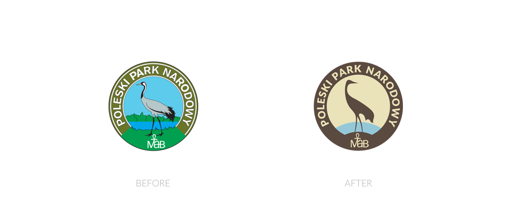
Poleski National Park logo rebranding
We believe that such a respectable institution as the Poleski National Park should have their logo redesigned with respect for tradition, but at the same time we believe that the very process of rebranding should improve corporate identity and adapt it to modern standards. The basis for the new Poleski National Park logo was the old emblem. We kept most important features of the original design and subtracted some unnecessary details that were reducing its clarity. As a result, we created a strong, modern and elegantly colored logo.
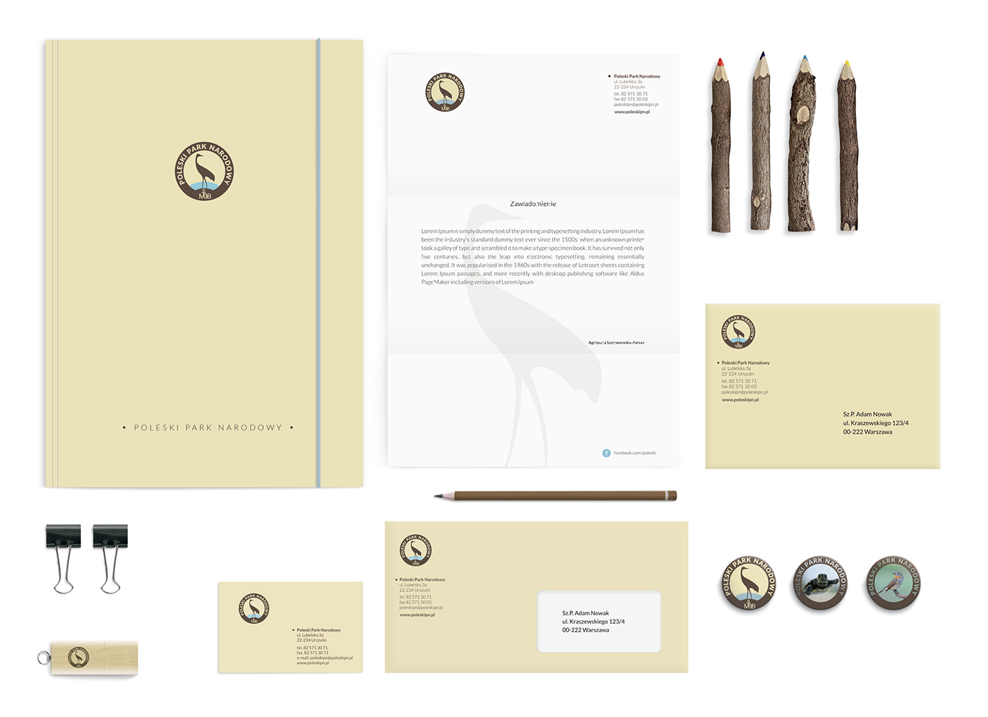
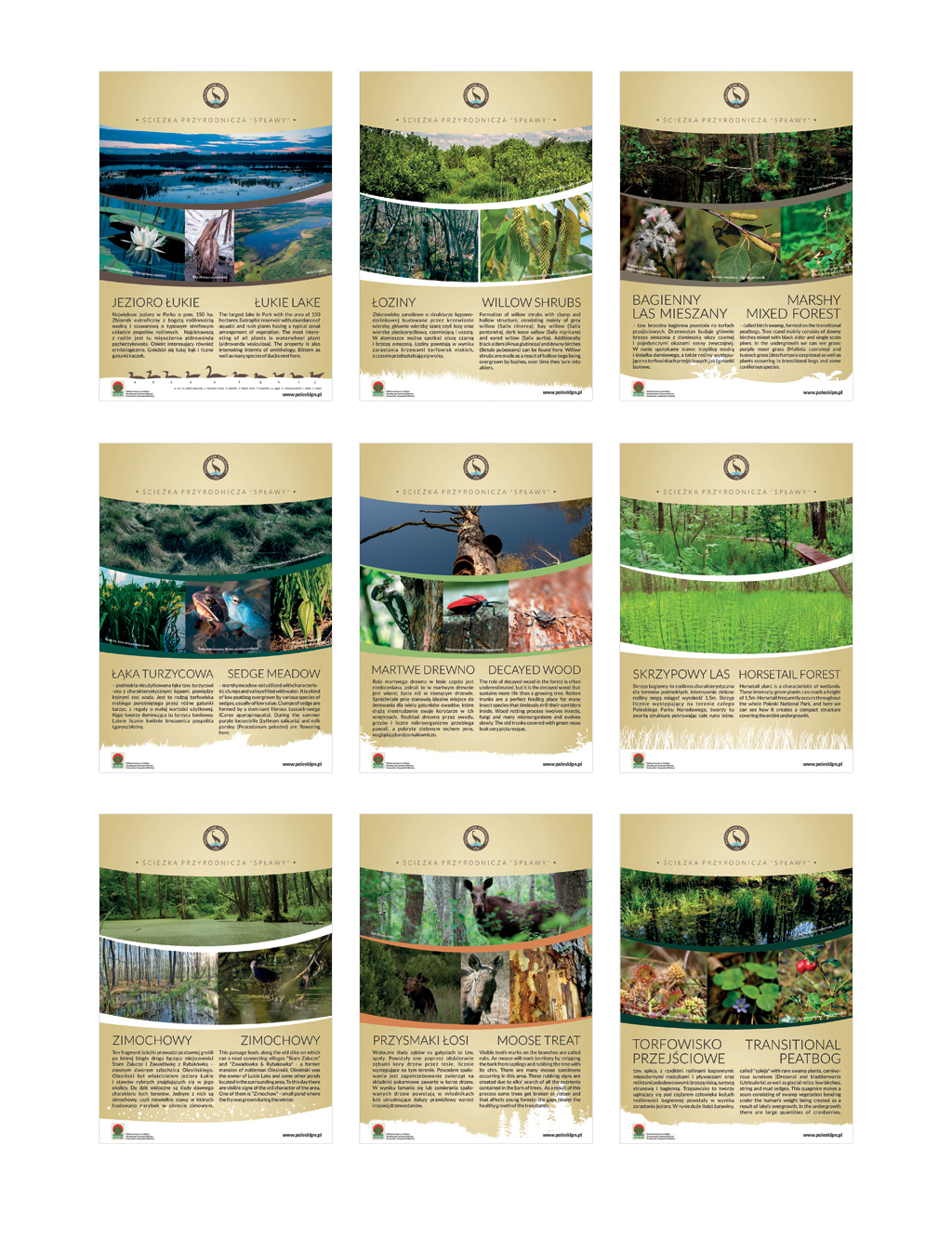
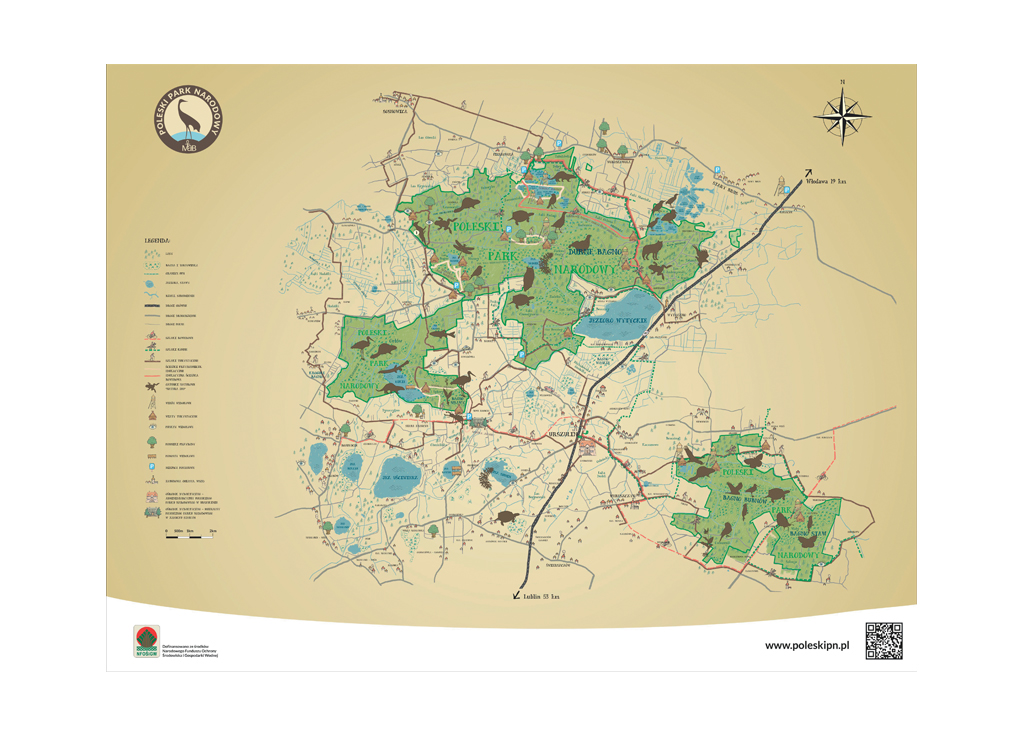
In addition to the logo we designed the office identity - envelopes, business cards, letterheads, banners, gadgets, roll-ups, brochures, billboards, exhibition materials.