Refreshing a Brand for Higher Education
Hyperquake develops new brand identity and strategy for a market-leading educational services provider.


TOTAL IMMERSION.
Hyperquake became a true partner and advocate for the mission of the Hobsons EMS team. With a merger on the horizon, we immersed ourselves in their brand and business documents, participated in collaborative work sessions, and quickly gained knowledge and insights into their world. The merging companies were positioned to be a unique services provider in higher education as the combination of services allowed institutions to gain complete visibility of their adult and non-traditional students from recruitment through graduation.
With this powerful market position in mind, the team realized it was necessary to build a new identity. This identity would need to carry the weight of our brand story and strengthen their position in the higher education market.

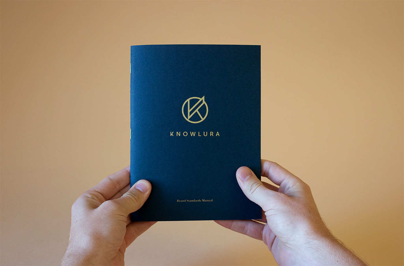

KNOWLURA. MOVE WITH PURPOSE.
Over the course of a several brainstorming sessions among both parties, the name Knowlura rose to the top of the pack. Leveraging our brand core, story and strategy work as a whole, we were able to craft a story around the powerful hybrid mashup of the words "knowledge" and "ura" (the latter meaning “collection of”).
Due to the dynamic environment of online education, even the best institutions need a partner that can guide them toward a path to progress. Knowlura is that partner. Activating their identity, Knowlura fuses a passion for education and progress to help institutions identify and develop new opportunities for growth.
Knowlura provided the design team a perfect jumping-off point to begin developing identity concepts. Armed with an arsenal of strategic ammo, we strove to build a mark that would carry a premium feel, yet capture the heart of the people who make Knowlura tick.


A SHARP NEW IDENTITY WITH A BIG HEART.
The mark itself carries two shape languages. One, stemming from the K, is full of diagonals and sharp angles. This part of the mark most accurately represents the sharp minds behind Knowlura. That visual is countered by the encapsulating circle which surrounds the stylized K. This wholesome shape has come to be known as the big heart. It’s the collection of emotional knowledge that stands behind and instinctively guides the brand as it moves with purpose.


A SOPHISTICATED PALETTE.
Knowlura works with some of the finest institutions in the world, each with their own unique rich histories, storied backgrounds and traditions. Knowlura is no stranger to the education scene, with more than 50 years of combined experience, Knowlura is an intelligent guiding force within the education industry.
A palette built of rich tones was curated to represent the brand, developed around the execution of gold foils and heavy cream papers. We wanted to represent a brand that partners with higher education institutions, by creating a palette that speaks to that level of sophistication.


ROLLING OUT FOR EDUCATION.
Needless to say, the Knowlura team was incredibly excited to announce the launch of their new brand identity. Rollout came in a few phases, starting with Hyperquake helping overhaul their website, collateral and all sales materials. To learn more about Knowlura you can check out their newly launched website, knowlura.com.


