
The Challenge
Printoo needed to be a standout app in the world of photo editing applications. Facing a saturated market, our team took cues from the old days of printing polaroids, and created a stand-out, powerful photo printing application.
I was a challenge to communicate the concept in a fun and vibrant way, while offering a simple UI/UX that made photo selection, cropping, and editing a quick, responsive, error-free experience to order prints.
Printoo brought back the nostalgia of printing and holding your printed photos.

Branding
We made sure to create a brand that was modern and youthful. With a playful and fresh color palette, the end result is a product that is inviting for all user types, enticing them to have fun while bringing their photos to life. Our design purposely communicates the app's purpose, and turnaround time for printing your photos.
Our solution
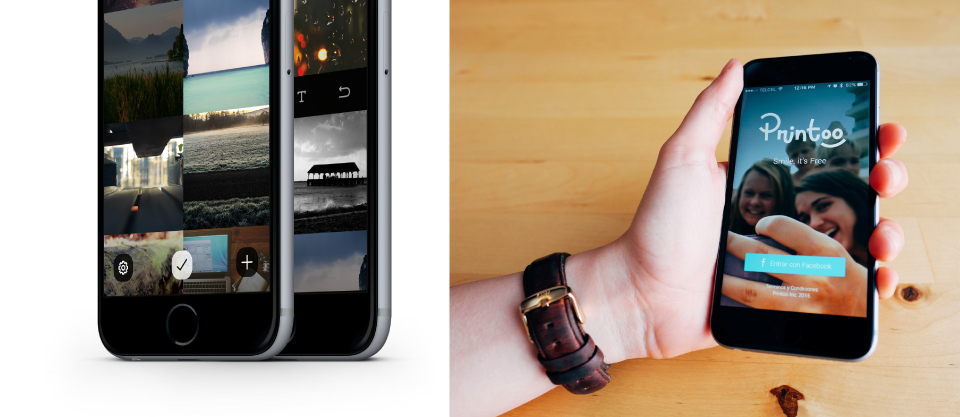
With Printoo, users are able to select favorite photos from their libraries, have the option to add filters, cropp selections, and to send them off for printing!
With a good deal of research and drawing from our expertise with photo management and editing interfaces, we focused on simplicity in order to maintain focus on the photos. We allowed ample space for the photos in the UI so they could be easily and quickly selected with just a few taps. Utilizing an oversized grid system, we took advantage of the entire device screen from edge to edge, organizing the photo library so photos were easily viewed.


