
Client: Seminole Hospital District
Background
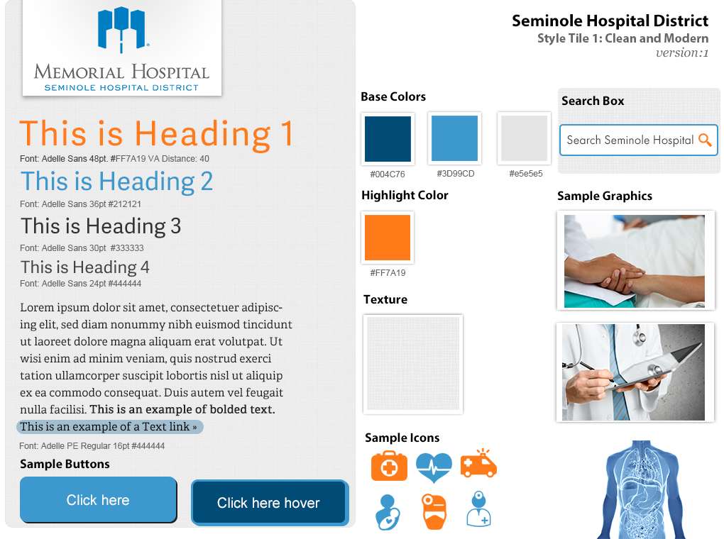
Seminole Hospital District was going through a major renovation and expanding to compete with the larger surrounding towns in the West Texas area. Seminole wanted a clean and modern feel to their site, which was the design approach I kept in mind for the look and feel of the site and when designing the style guide.
User Research
My team and I at Standard Beagle began by doing user research. We had two members of the team travel to West Texas to get a feel for the community and meet with the clients. They held interviews with staff and administration to figure out their pain points, especially when it came to their current website. UX Design should be human centered, so we wanted to figure out the best way to make the site user friendly with different functionality than the current site offered.
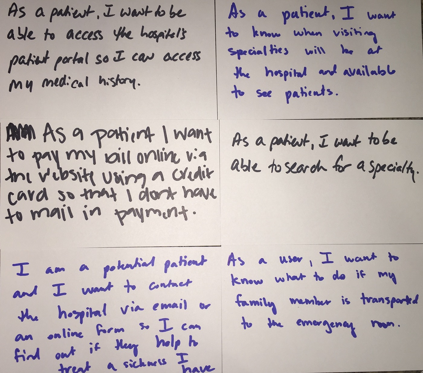
User Stories
After performing user research we began to create user stories based upon our research of the market, the pain points of the hospital staff. We created index cards of the user stories in order to organize them based on priorities of low, medium, high, and backlog items. Once we had these organized according to priorities, our project manager was able to create the tasks for the project.
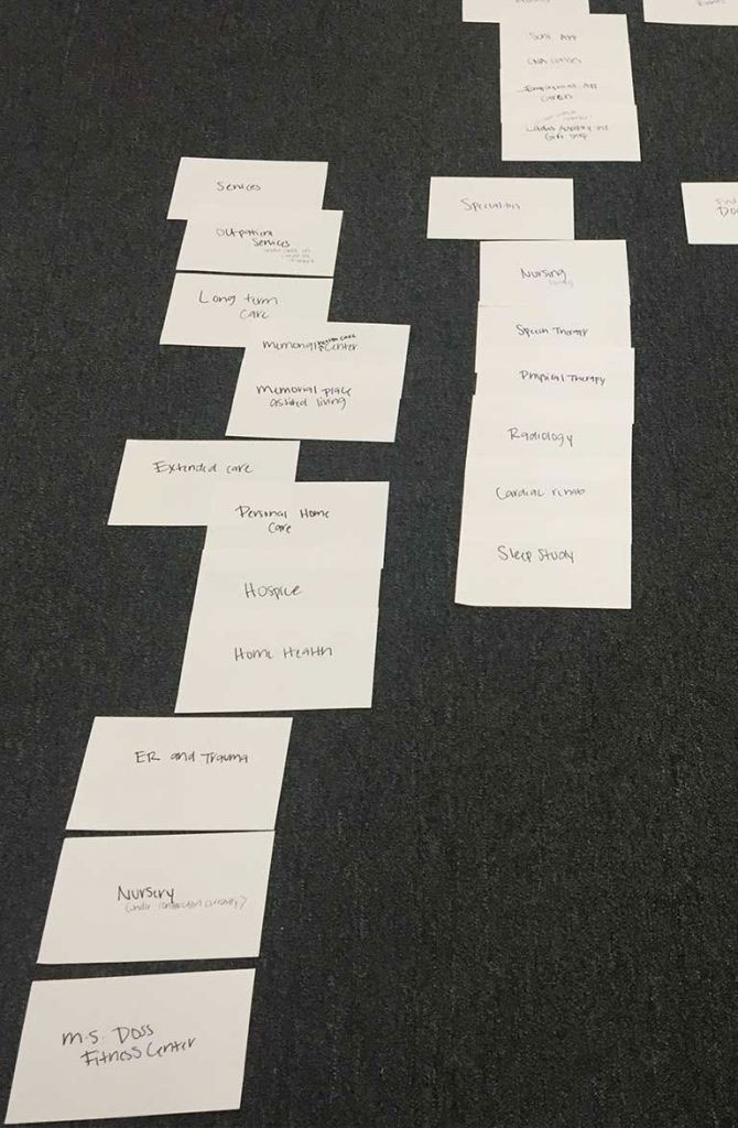
Content Inventory and Information Architecture Design
Next I went through the content of the entire site and made a content inventory for the client to review and make changes accordingly. From there, I designed the information architecture of the new site and the sitemap by doing a card sort. Once I finished I brought in a few of my team members to review the cards and iterated through multiple rounds of sorting.
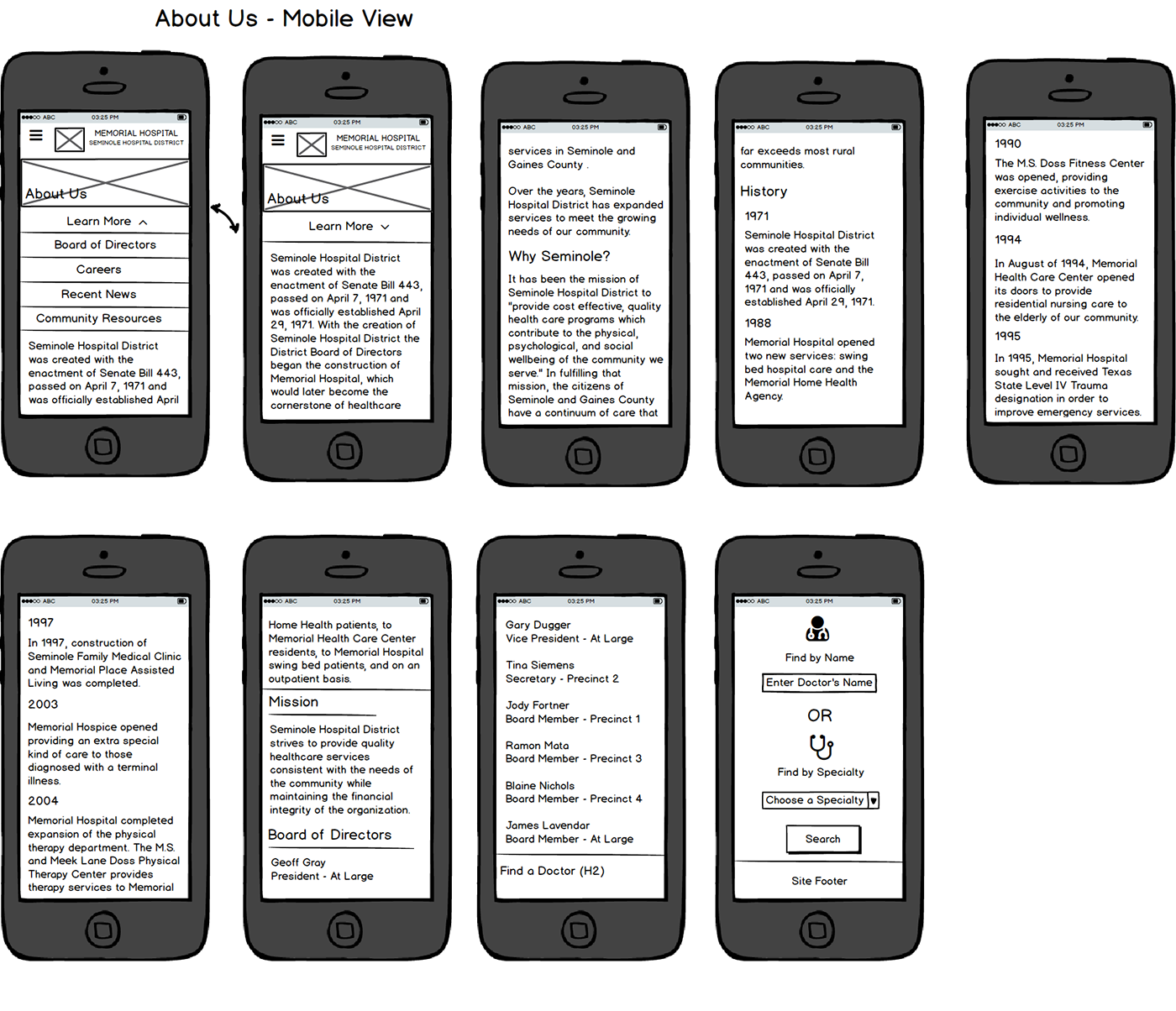
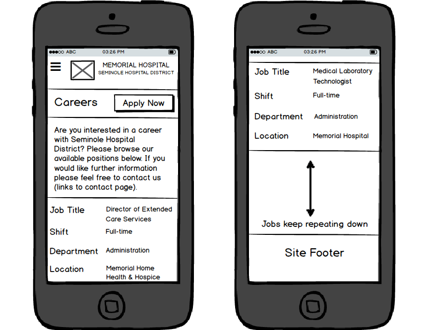
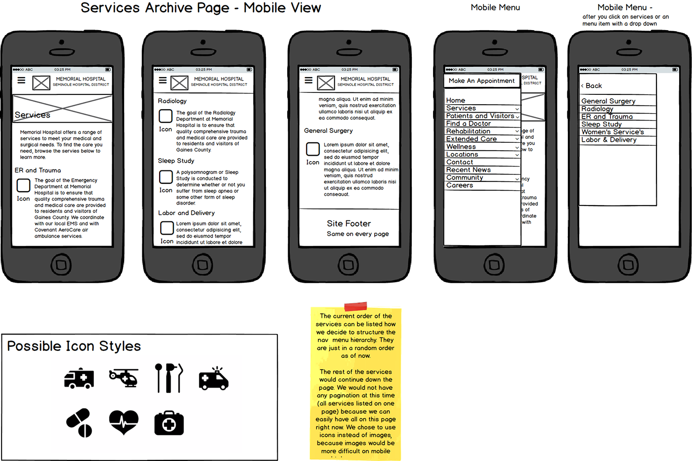
Sketches – Design Part 1
Once the information architecture was reviewed and approved by the client I was able to start sketching out multiple page designs for the site for desktop and mobile. Sketching out for more than one screen size is so important because often times mobile is the first place that someone looks at a website.
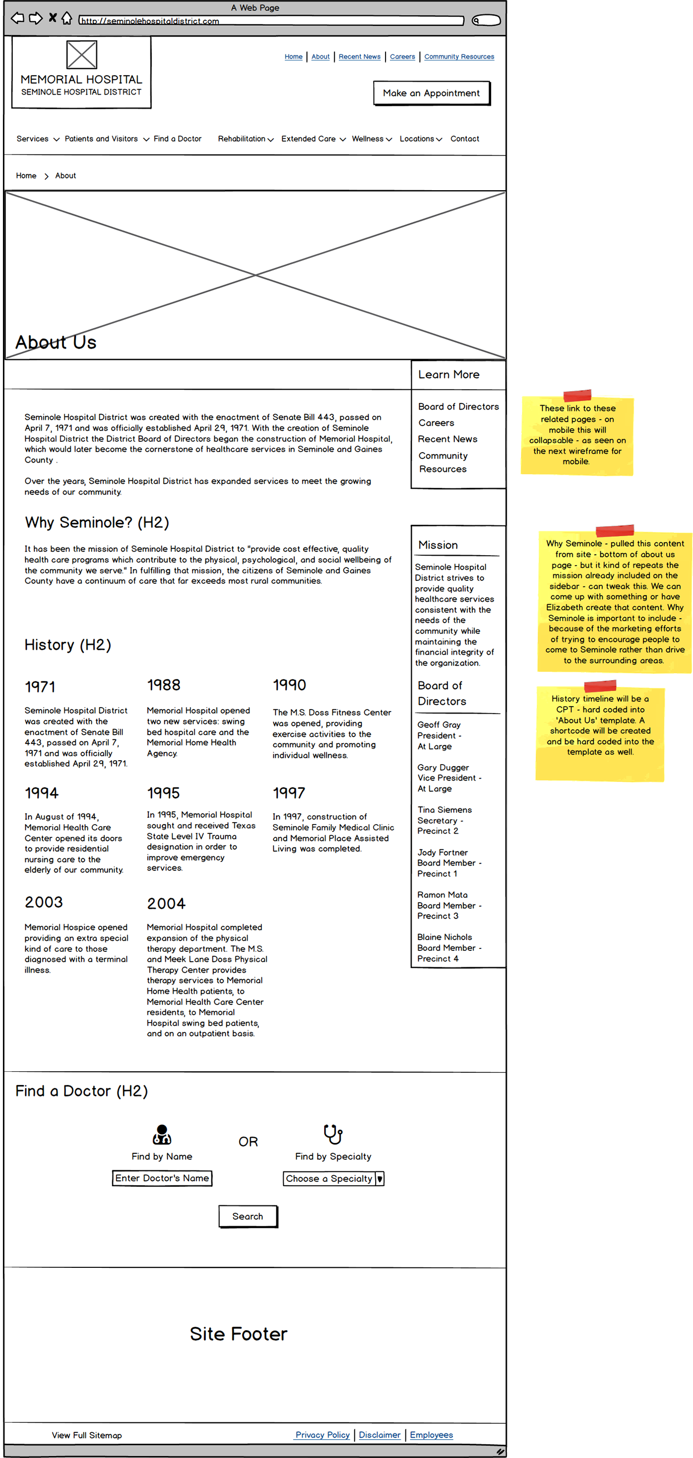
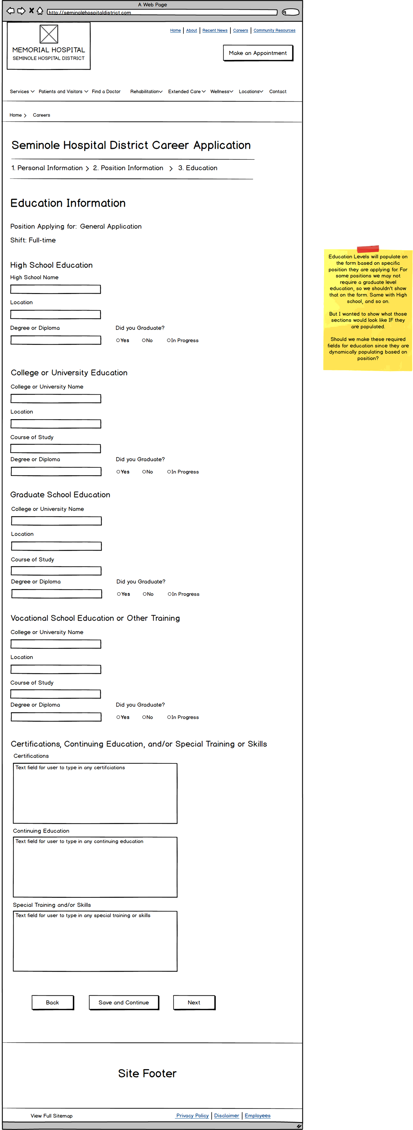
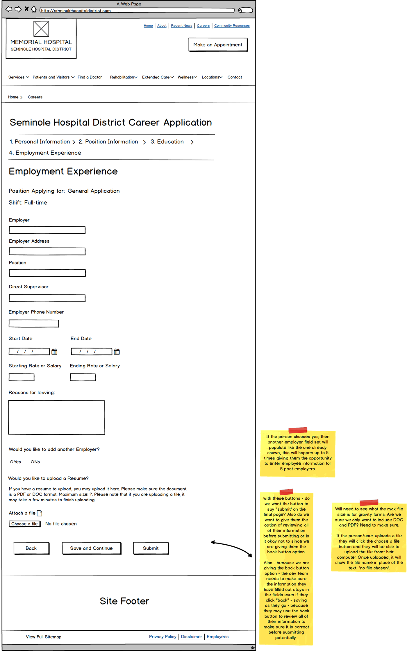
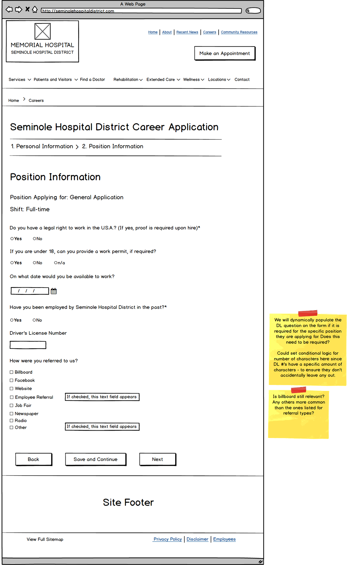
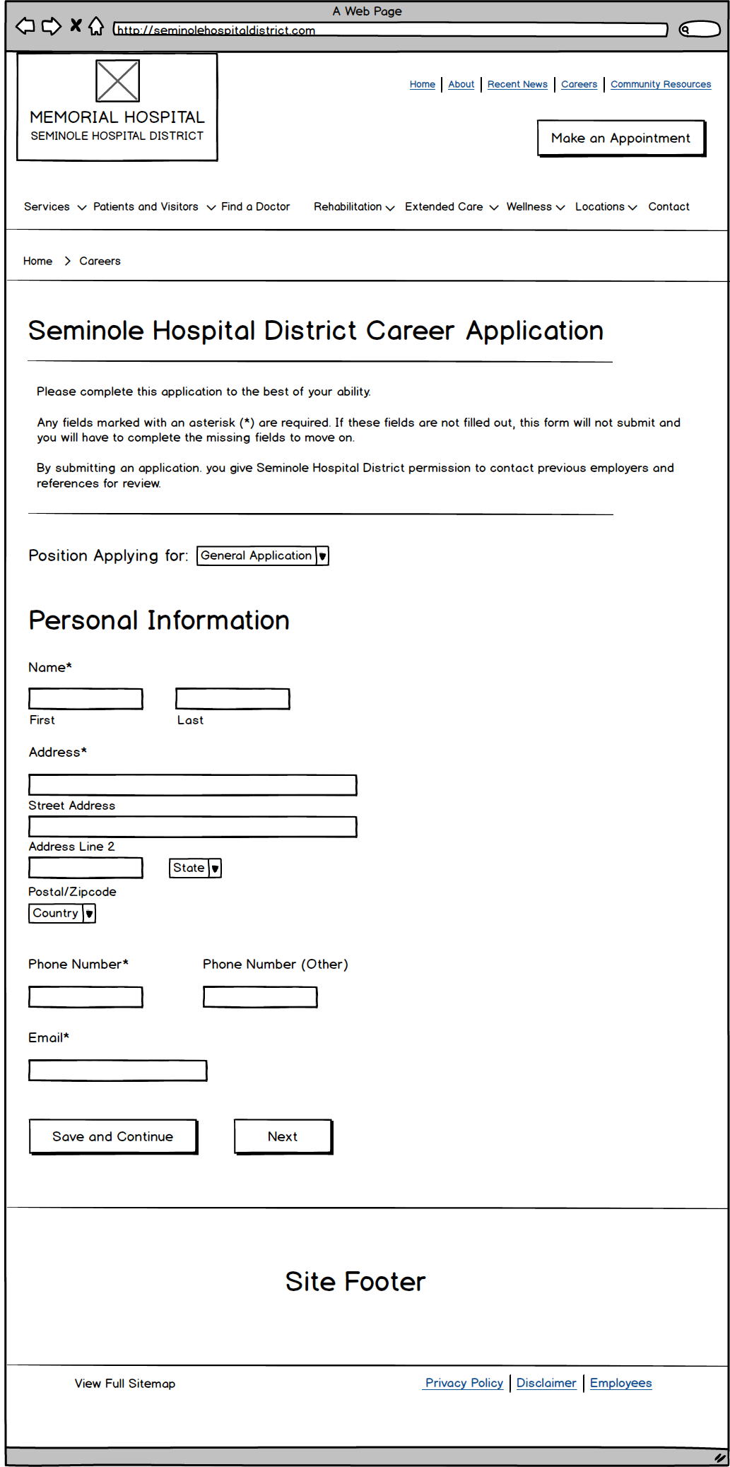
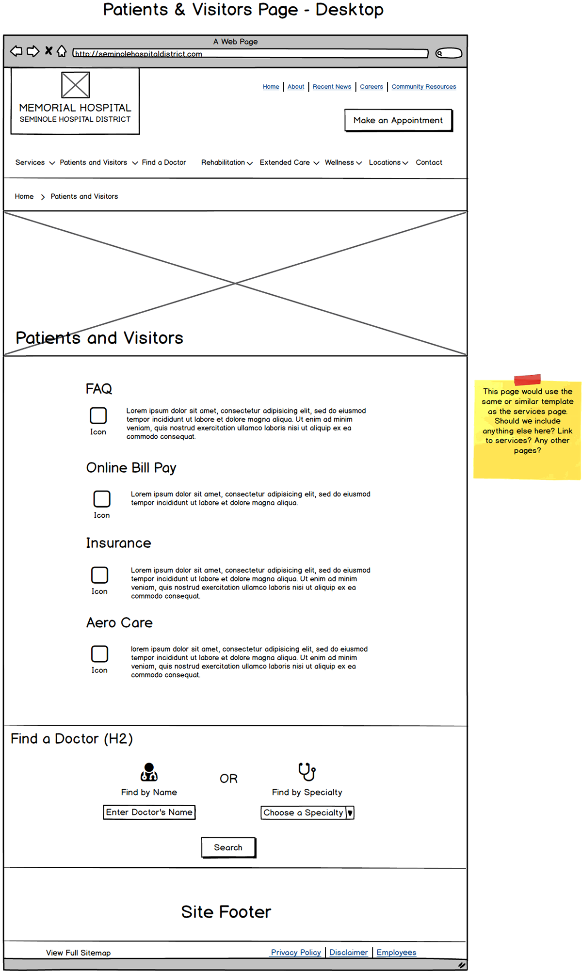
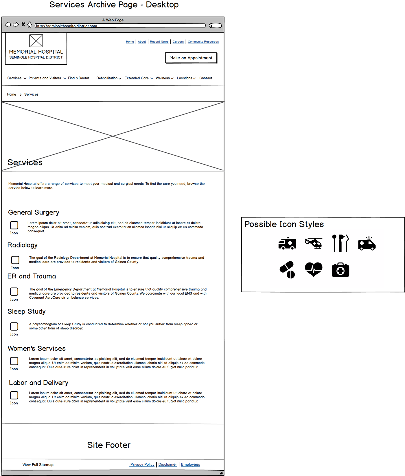
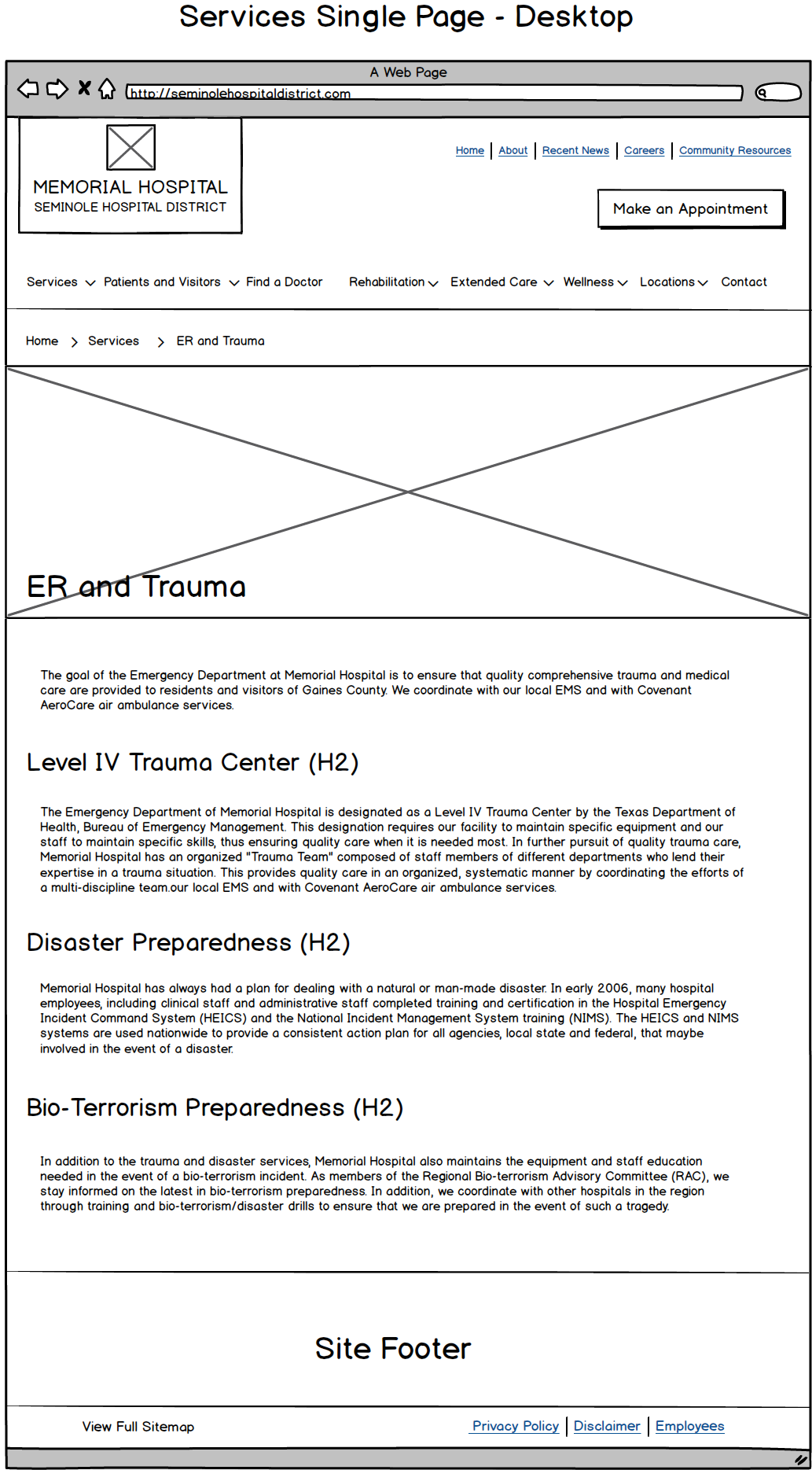
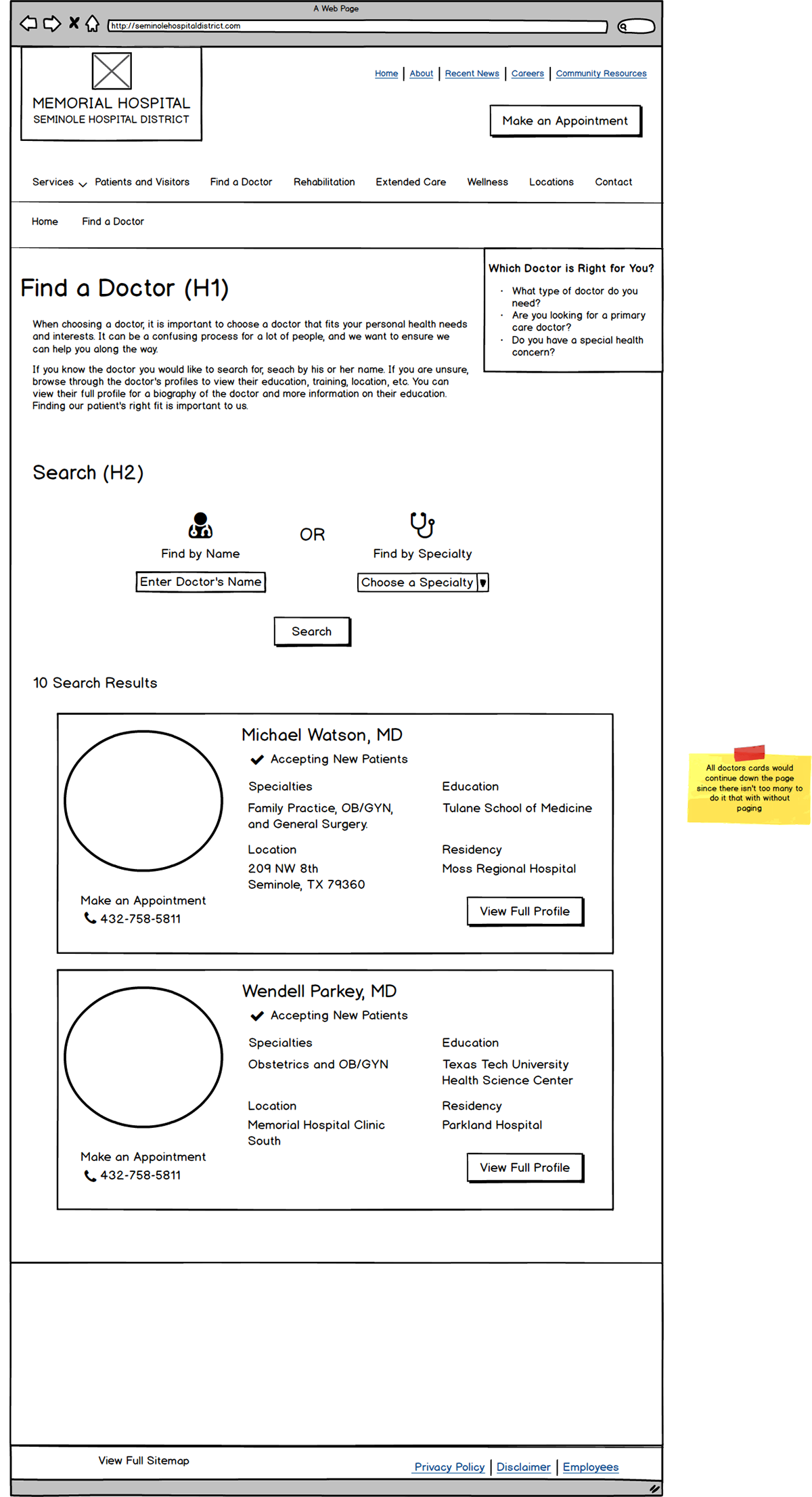
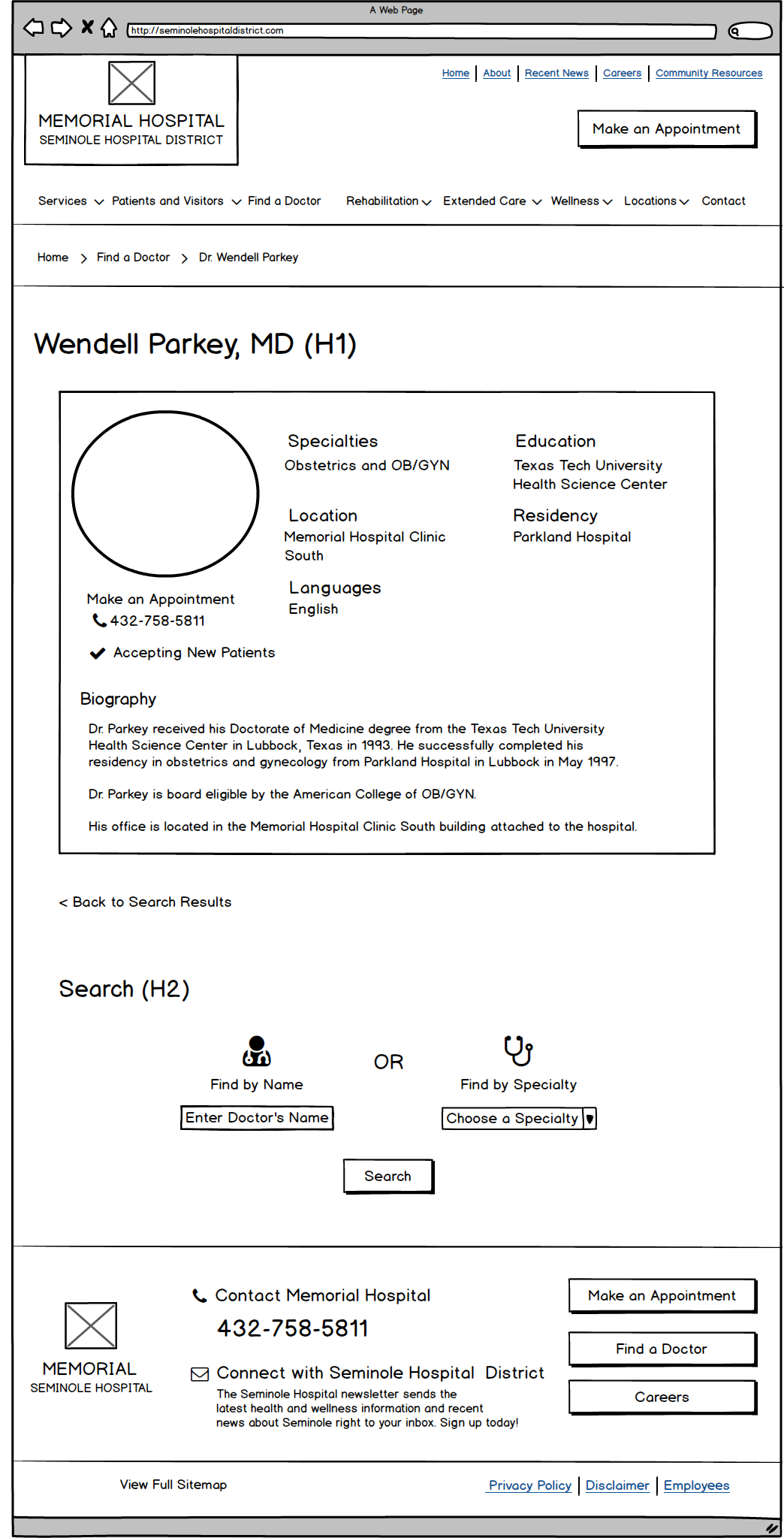
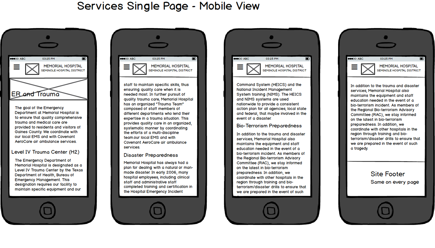
Wireframes – Design Part 2
The sketches were reviewed with my team for feedback and from there I was able to create wireframes on Balsamiq mockups to give a better visual guide. The wireframes show the skeletal structure of the site in a low fidelity mockup. Throughout the entire process I got feedback from my team as well as the client to ensure I was on the right path.
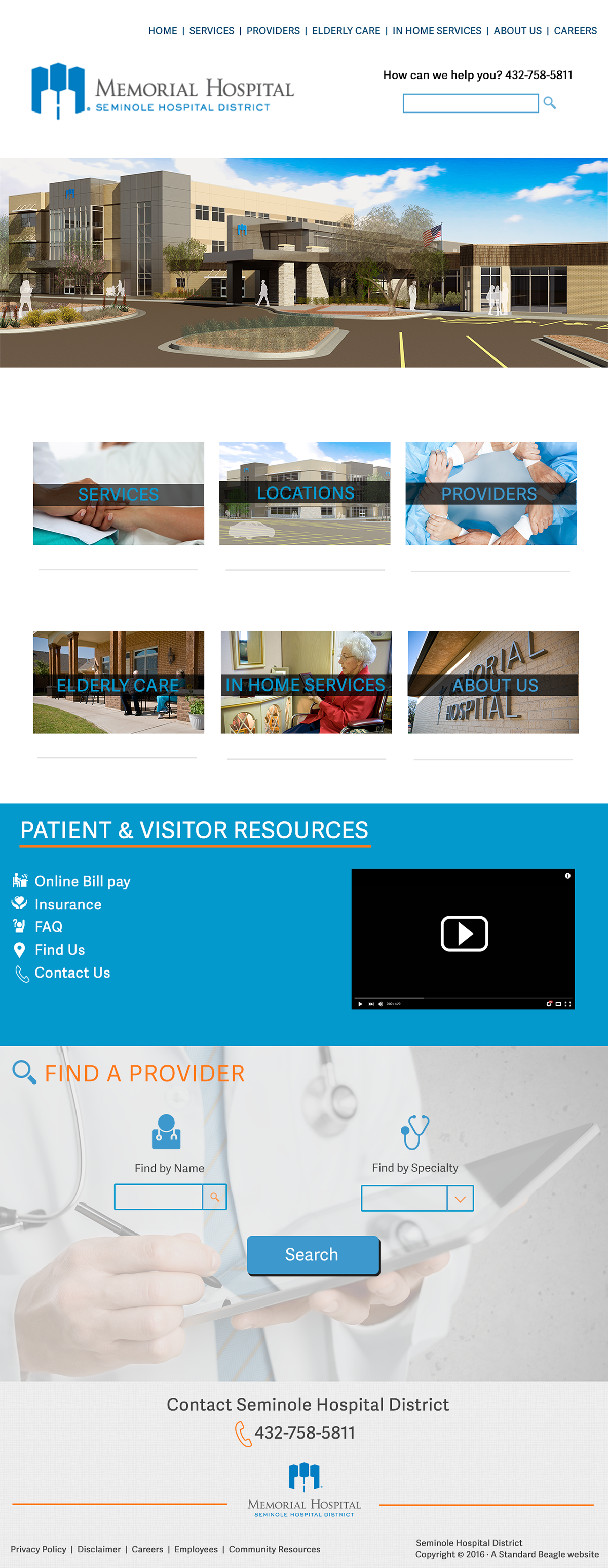
Hi-fidelity Mockups – Design Part 3
Once the wireframes were approved it was time for the high fidelity mockups to more closely match the visual and user interaction design of the final product. This gave the client a better idea of what the final product of the website would look like. As I designed and got the designs approved I was able to have the developers work on the site, which helped with having a great design and development collaboration for the project.
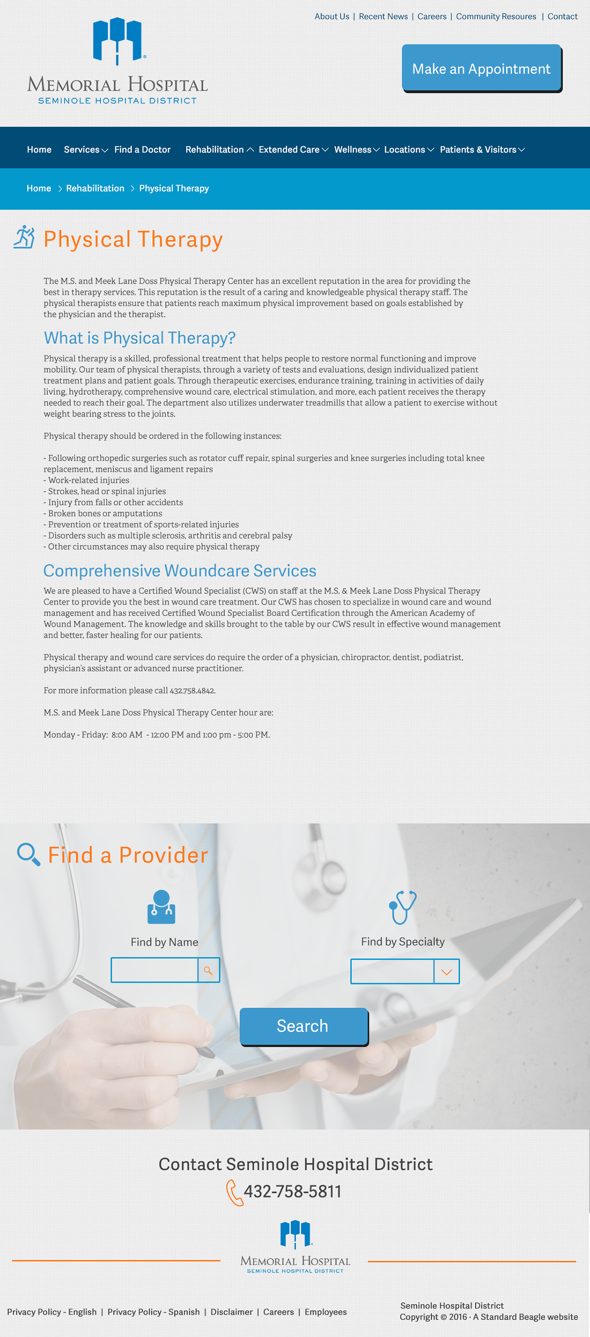
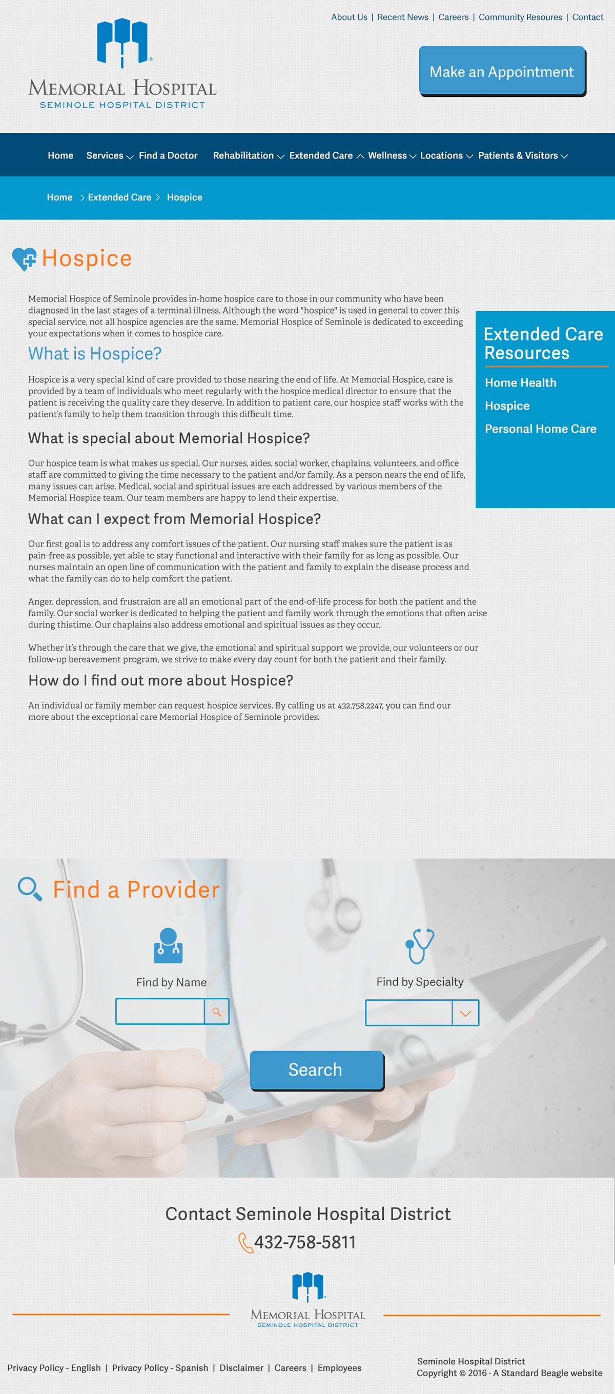

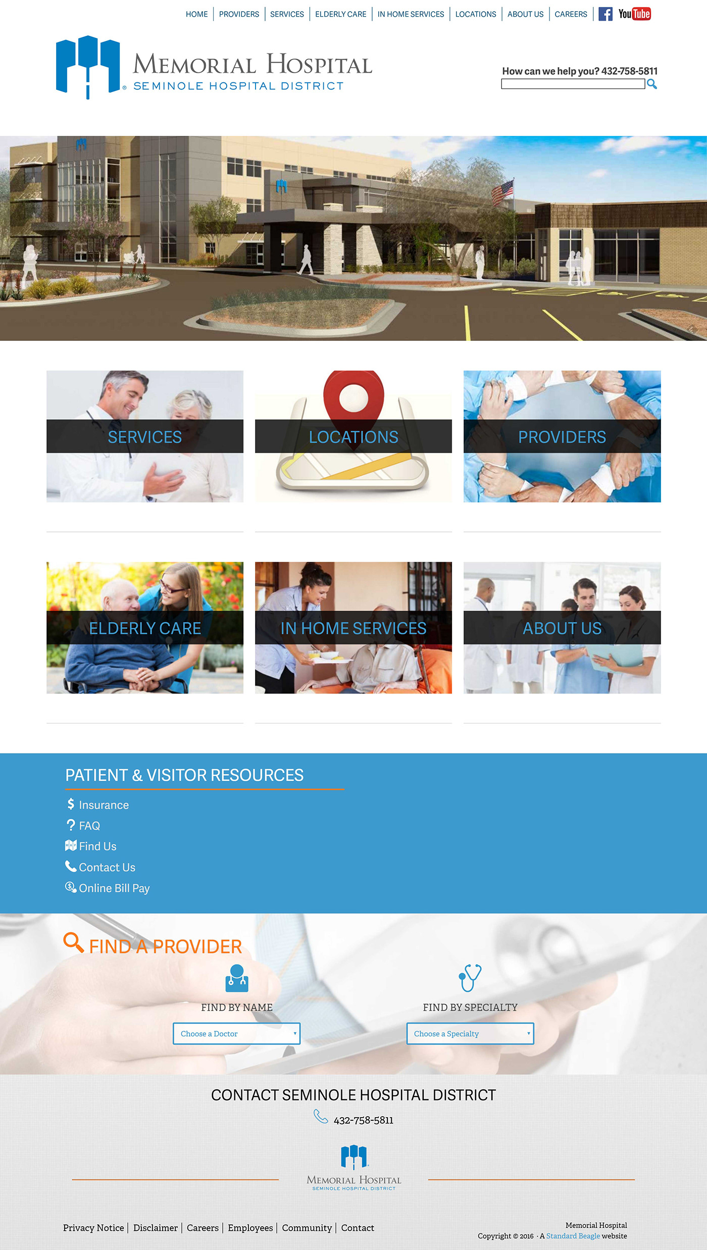
Final product
We ended up iterating some of the design after it was developed, but were able to easily do so, since the changes were minor. The developers I worked with built the site custom on WordPress, and were able to do a final documentation and training with the client on how to use the site. I find it very helpful to do this with clients so they don’t have to come back to you with minor things like content changes.
I delivered a clean and modern design to the client with the help of my team and in turn had very happy clients with an increase in traffic to their website after the site was launched.


