Excerpt from the brief:
"We buy UK property, renovate and rent it out to individuals or local councils.
[...]
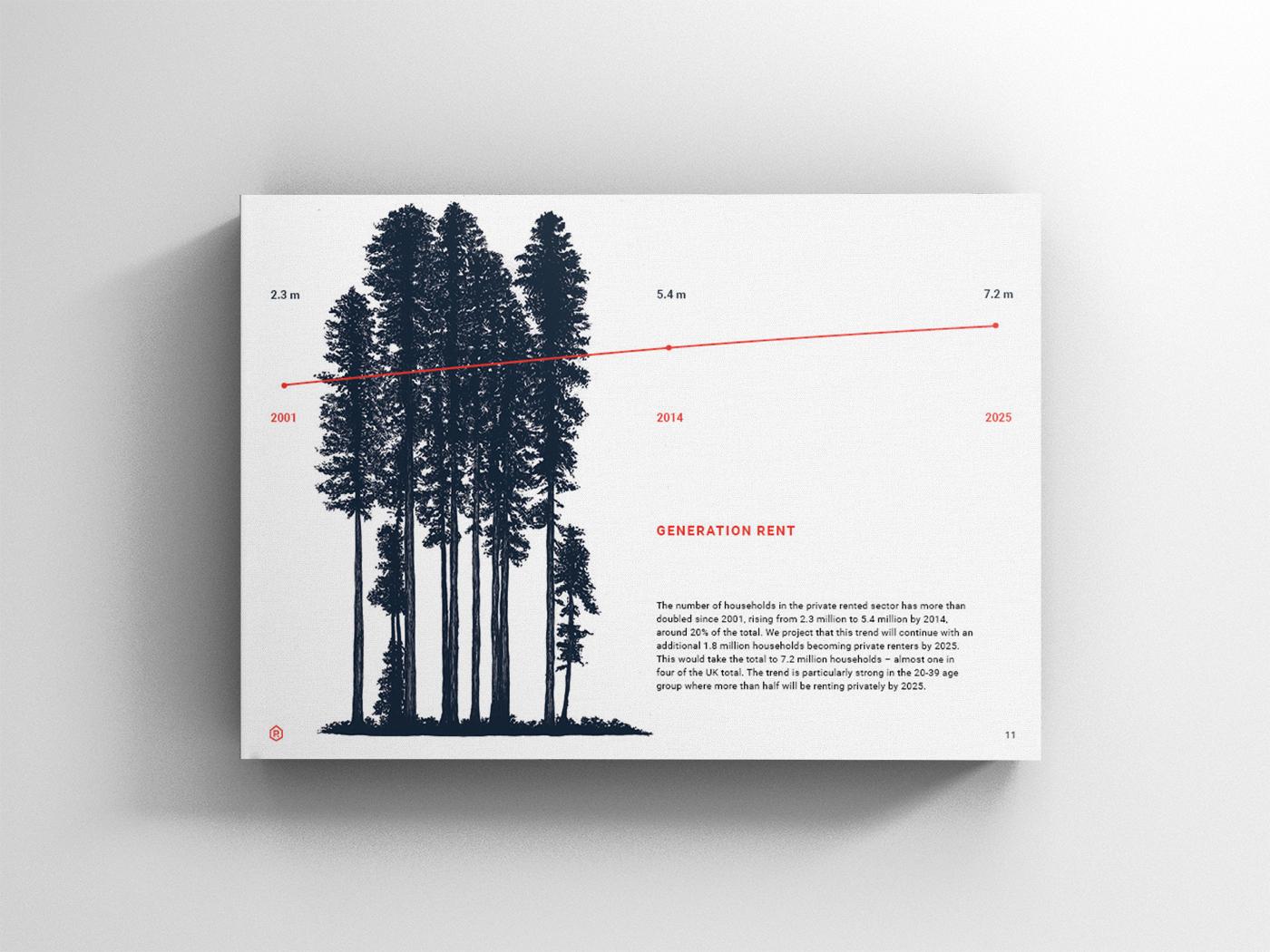
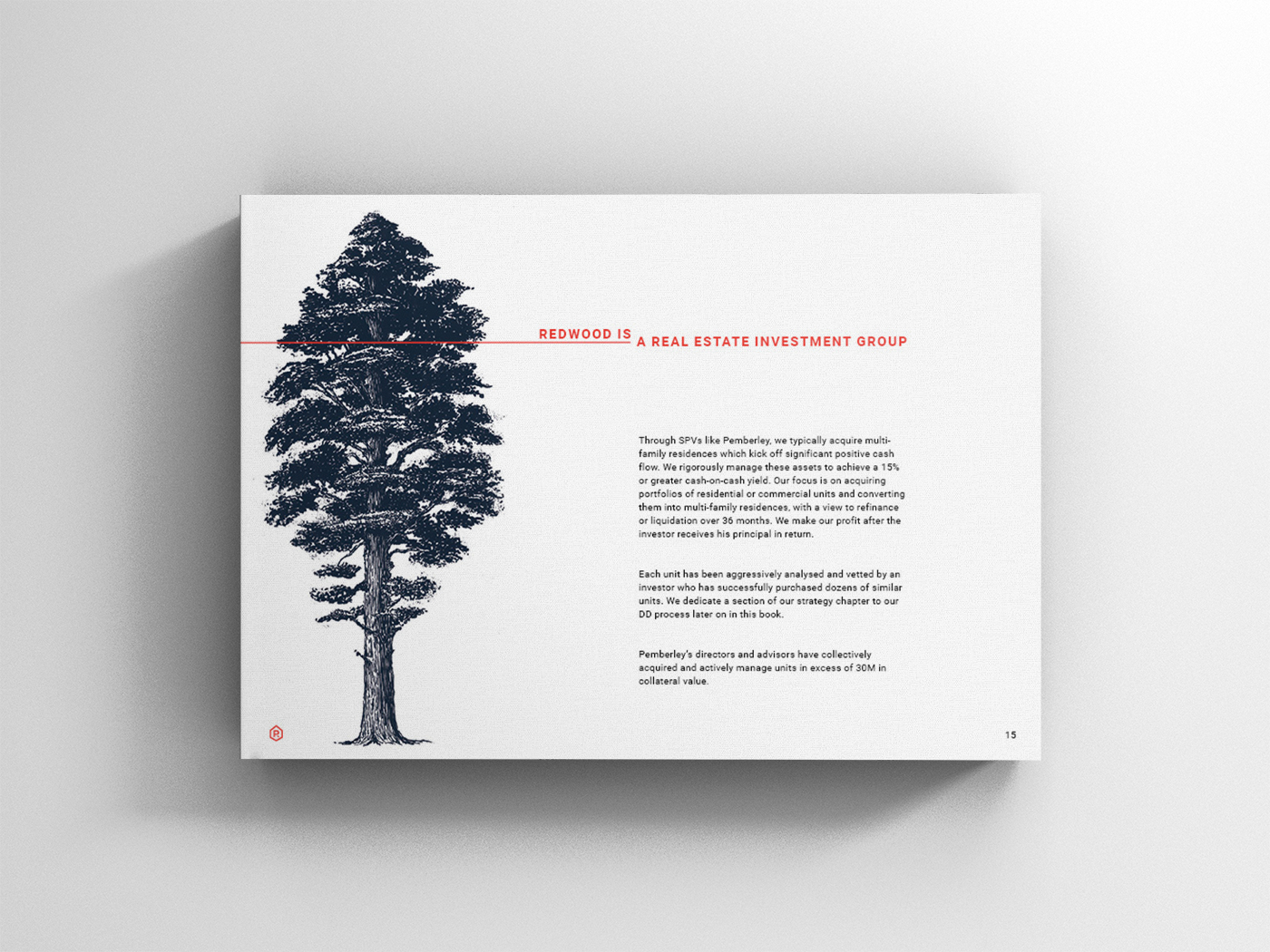
We meet a significant market demand with people having tighter budgets, higher standards of living, getting married later (if at all) but at the same time still wanting interaction with others (common living). We are extremely interested in being example landlords who work closely with local administrations to build thriving communities.
[...]
Audience:
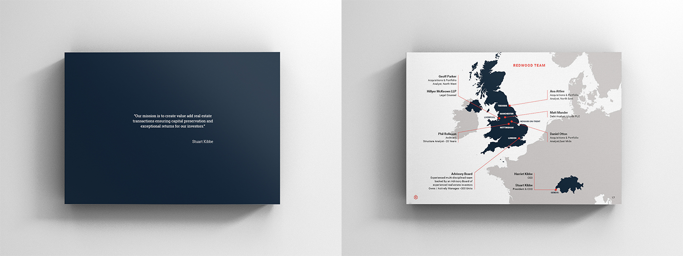
Investors who will fund us. Renters who want to rent from us.
Investors who will fund us. Renters who want to rent from us.
[...]
What impression do we want the brand to make on our audience?
Professional, Credible, Excellence, Fun, Dynamic, Young, Trustworthy"
Professional, Credible, Excellence, Fun, Dynamic, Young, Trustworthy"
Approved concept:

Logo and colours:

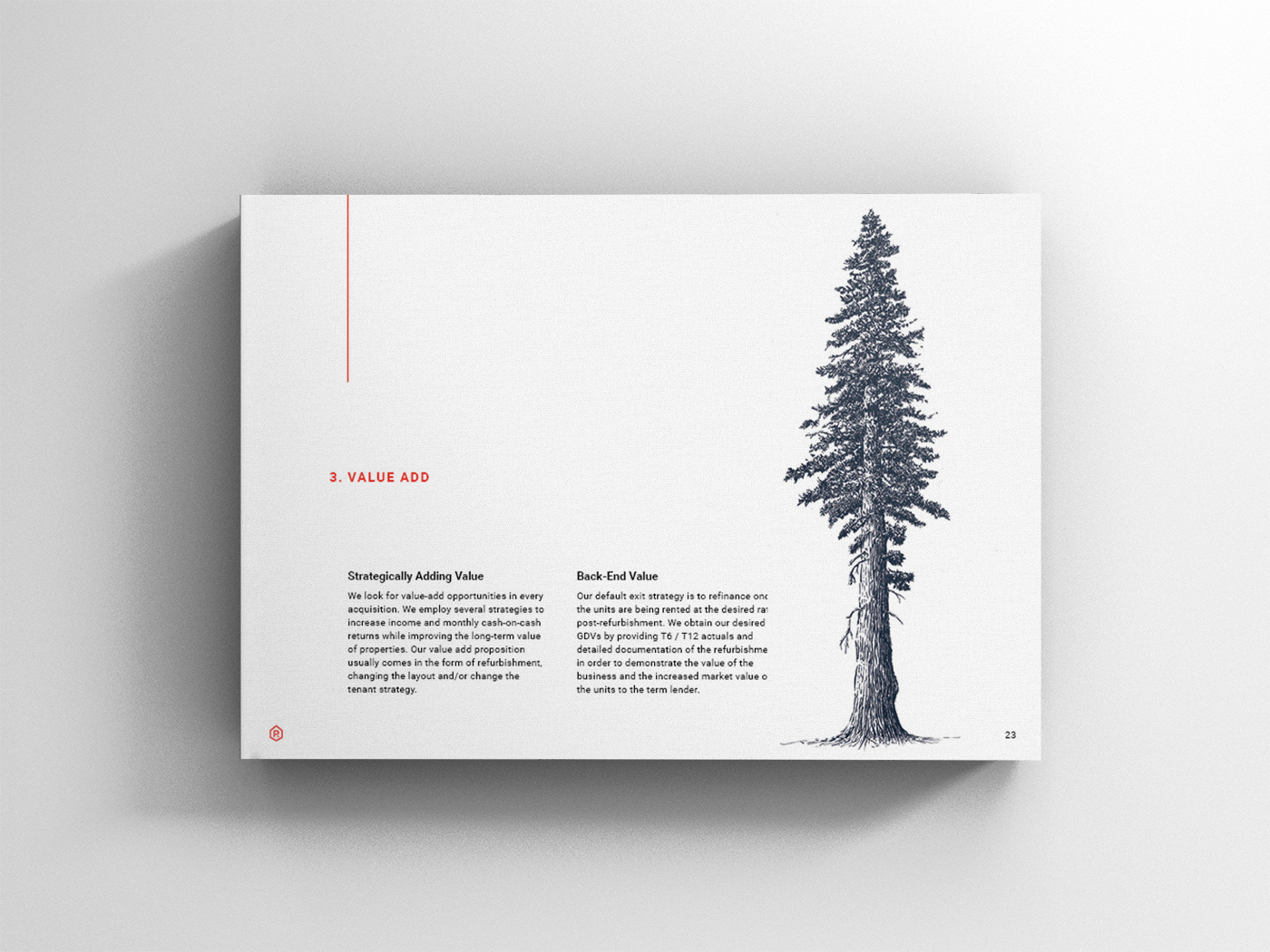
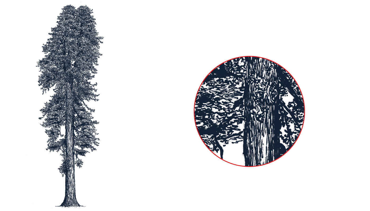
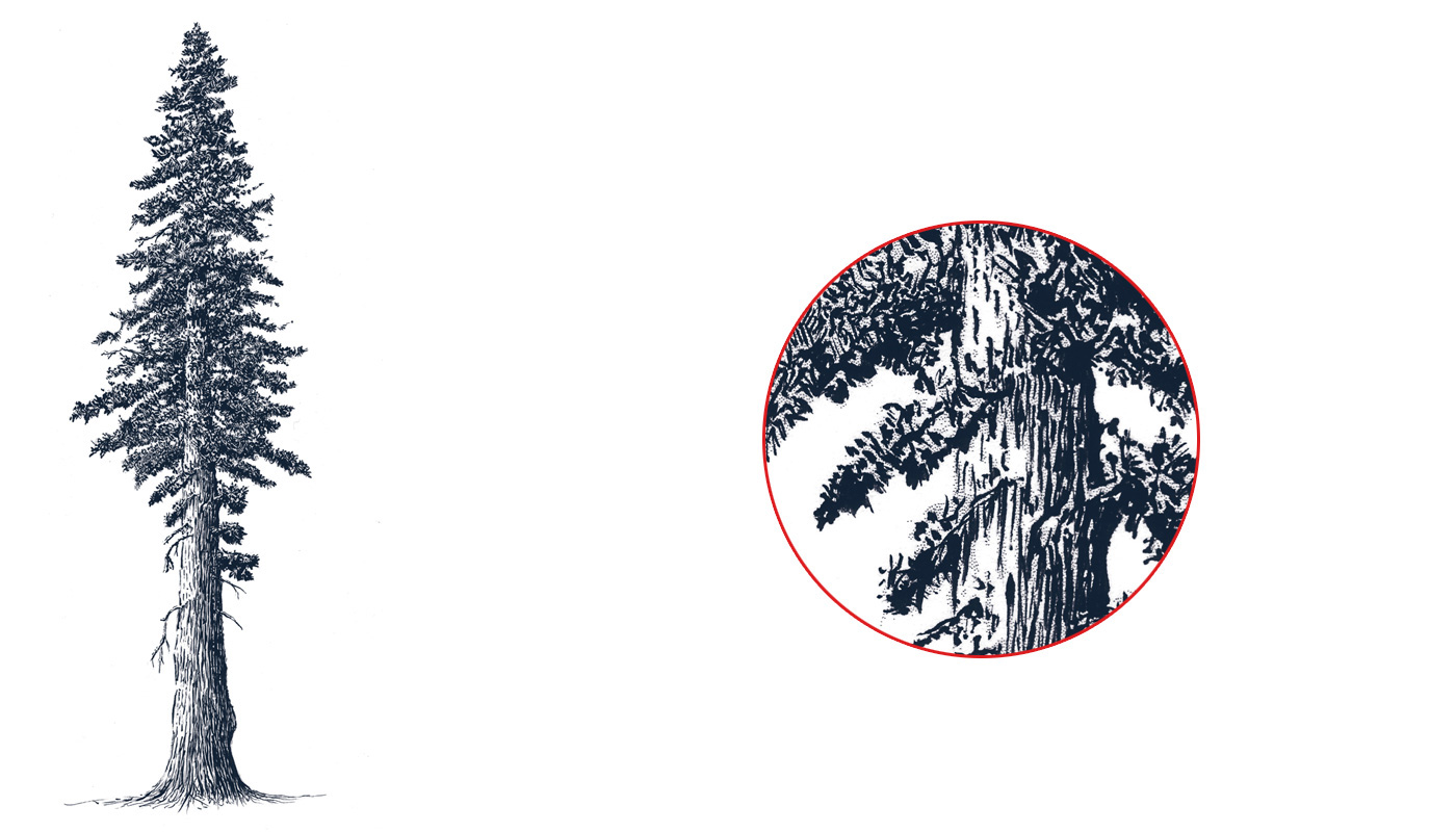
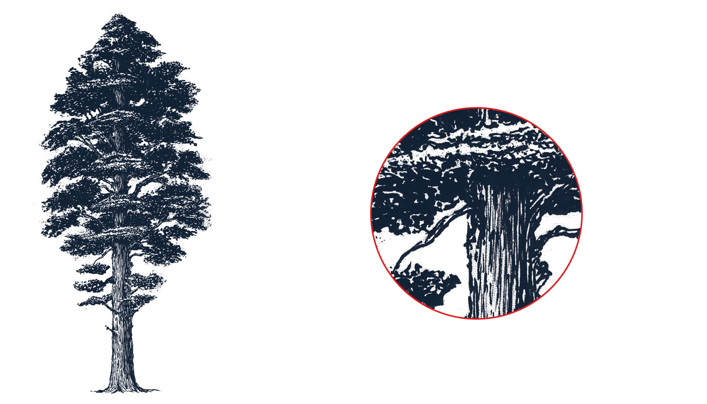
Redwood trees illustrations to be used with the brand materials.
(brush and ink on paper - drawings from the web used as reference)

Presentation design
to be used on print, digital or slides