Kindle Reader: UI redesign
Wireframes for the Home page and Book-Open page
Wireframes for the Home page and Book-Open page
I am a heavy reader, but am not very happy with the Kindle interface, mainly because too many taps are needed for simple things such as scanning libraries, jumping within books, locating bookmarks, and managing collections. This is a PoC for an alternate UI.
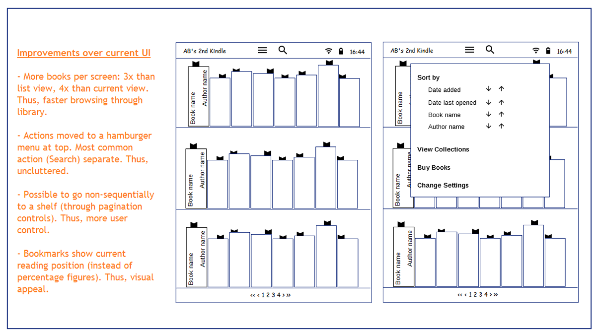
Here is the redesigned Home page (the first page that I see if I'm not currently reading a book).
This is the redesigned page UI, when I am already reading a book.

All this while, I was redesigning the existing features. Presented immediately below are two UI options for a new feature, something that I'd like any Kindle book to have: the ability to peek at a random page before going to that page.

Back to existing features.
Back to the book-open page. Tapping anywhere at the top or bottom of a page shows me the menu.

Open questions:
(1) Top vs. Bottom: People with smaller hands (me) prefer Bottom but needs further research.
(2) What about non-books? Like magazines?
(1) Top vs. Bottom: People with smaller hands (me) prefer Bottom but needs further research.
(2) What about non-books? Like magazines?
Not done yet:
(1) Redesign the 'Go To' menu.
(2) Redesign the 'Search' menu.

