


STARRY
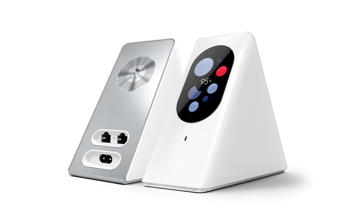
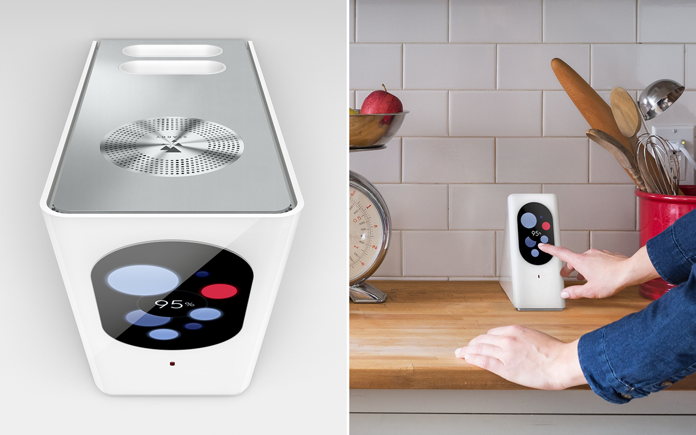
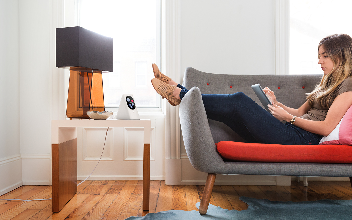
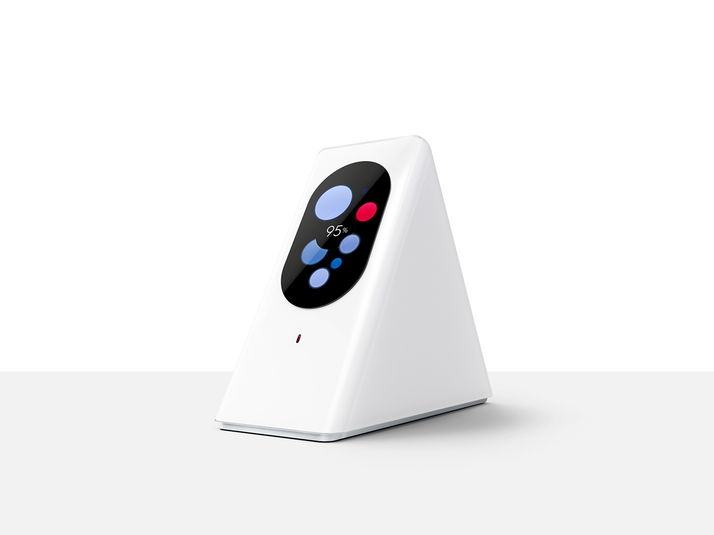
The Starry team came to us with a bold challenge: “We want you to visualize the internet.” We told them that might be NSFW, but we’ll see what we can do. They had a great mission, Starry wanted their users to control and understand their Wi-Fi like never before. They were doing this by building a powerful router with a touchscreen display–one that would be beautiful enough to put on your desk and simple enough for our mom to use. No more blinking lights to decode, just a better way to stay connected to the things users love.
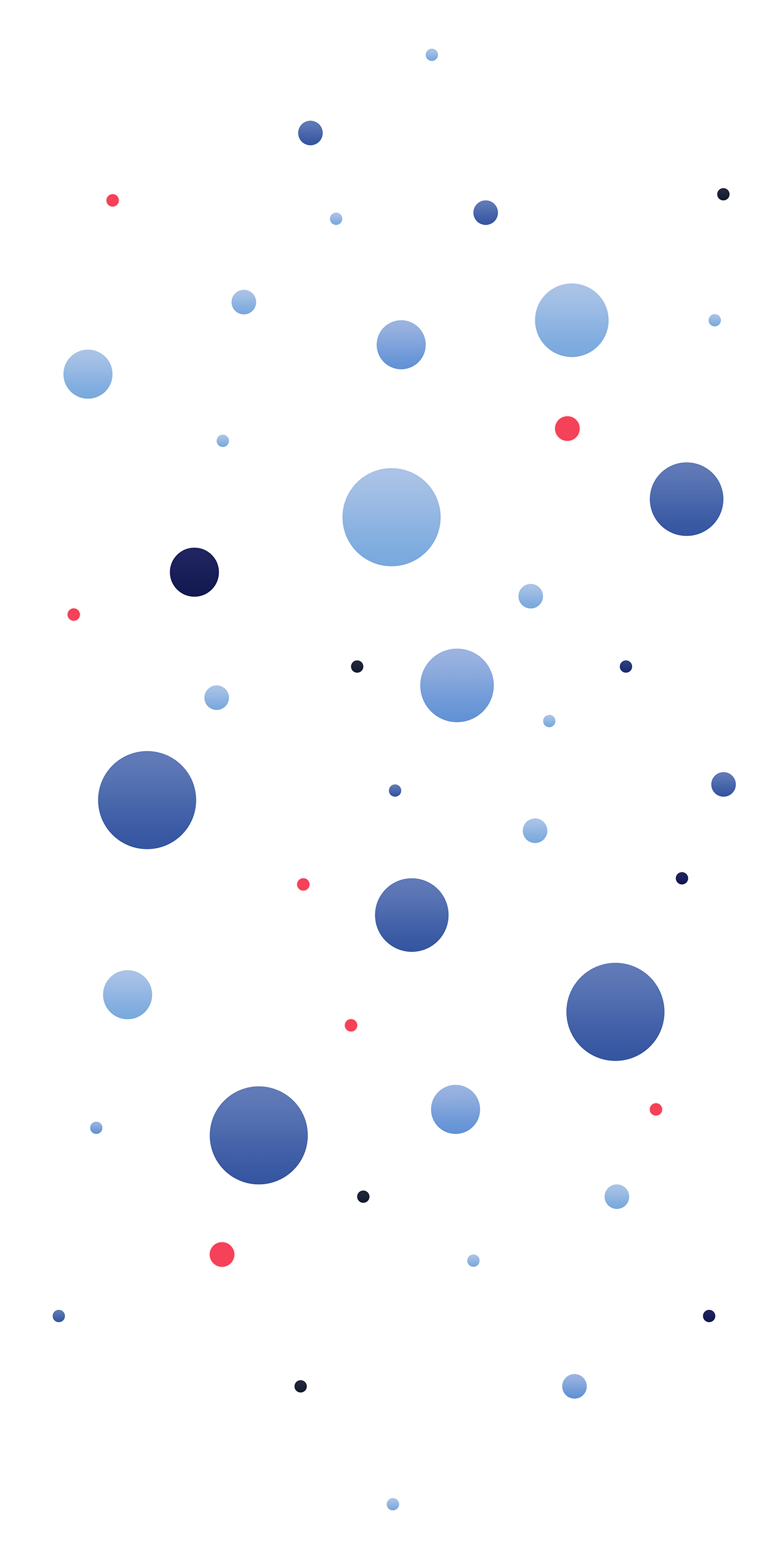
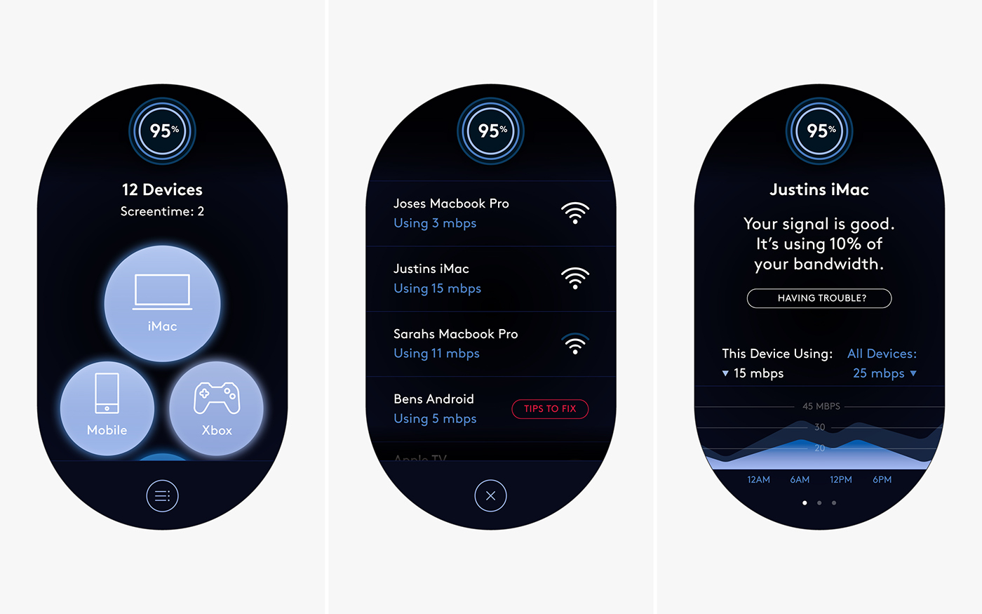
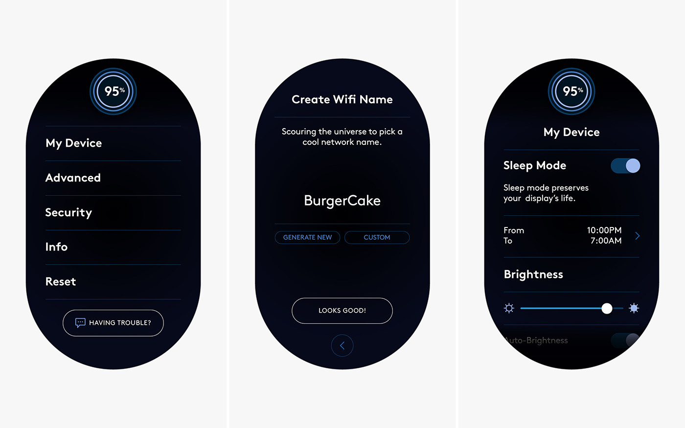
The first step for us was to prototype many different UI visualizations–ranging from complex generative mesh patterns to bar graphs. After testing and iterating, the visualization of floating orbs (representing connecting devices) had a very immediate and beautiful quality. Devices that are connected to the network would be represented by colored spheres, floating and drifting in space. The color palette was another characteristic that was incredibly important. We established that “healthy devices” represented their signal strength in shades of blue, and “problem devices” displayed a bright red, which created a color system that was easy to understand at a glance. This same logic would be carried across all data visualization: shades of blue meant everything was cool and red indicated there was a network problem.
In the end, the UI eloquently and simplistically answered a very tough challenge–to visualize the internet. Starry works so well that we use it every day, here at the studio. Oh, and it’s simple enough that our moms can use it.
CREDITS:
Creative Direction:
Jane Huschka
Jane Huschka
Art Direction & Design:
The Collected Works
The Collected Works
UX Design & Product Design:
Jane Huschka & Starry Team
Jane Huschka & Starry Team
Design:
Nick Hum
Photography:
Starry
Starry


