Precision Goalkeeping
Logo Concept
The Inspiration:
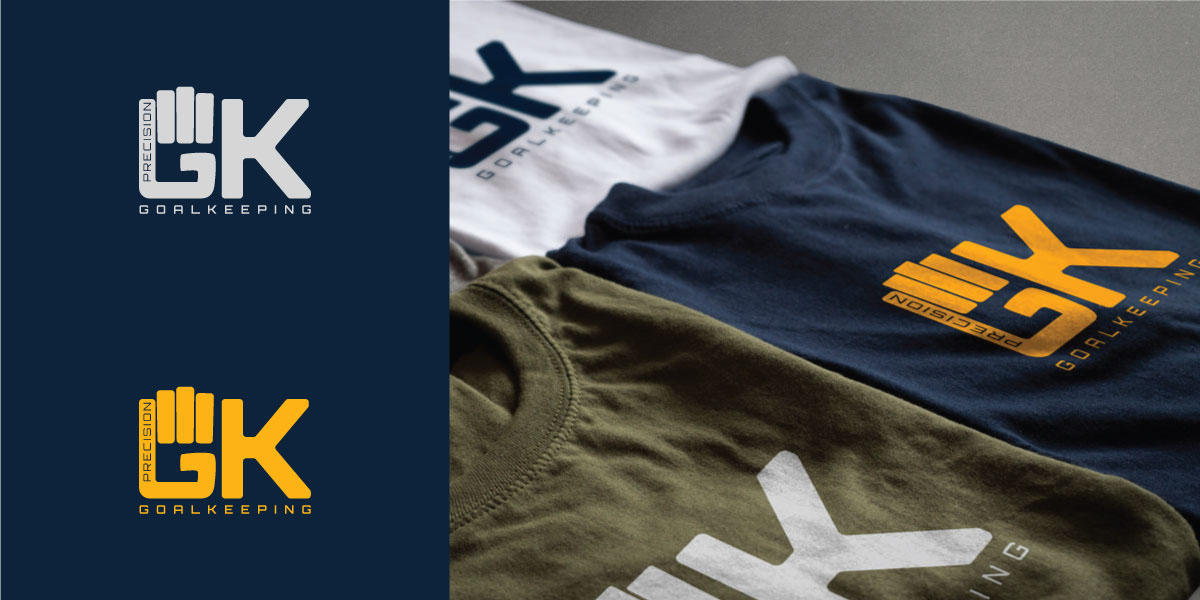
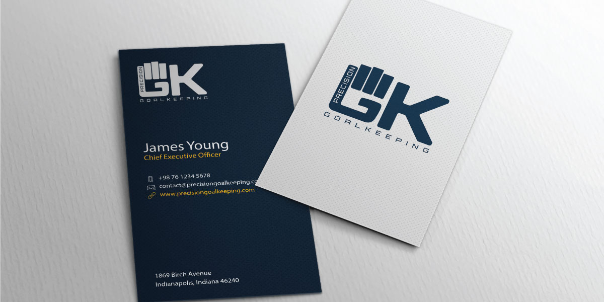
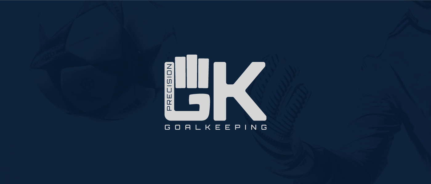
Precision Goalkeeping logo spawned from my love for the game of soccer. It is meant to personify strength and physical presence which are essential characteristics of all successful goalkeepers.
The Typeface:
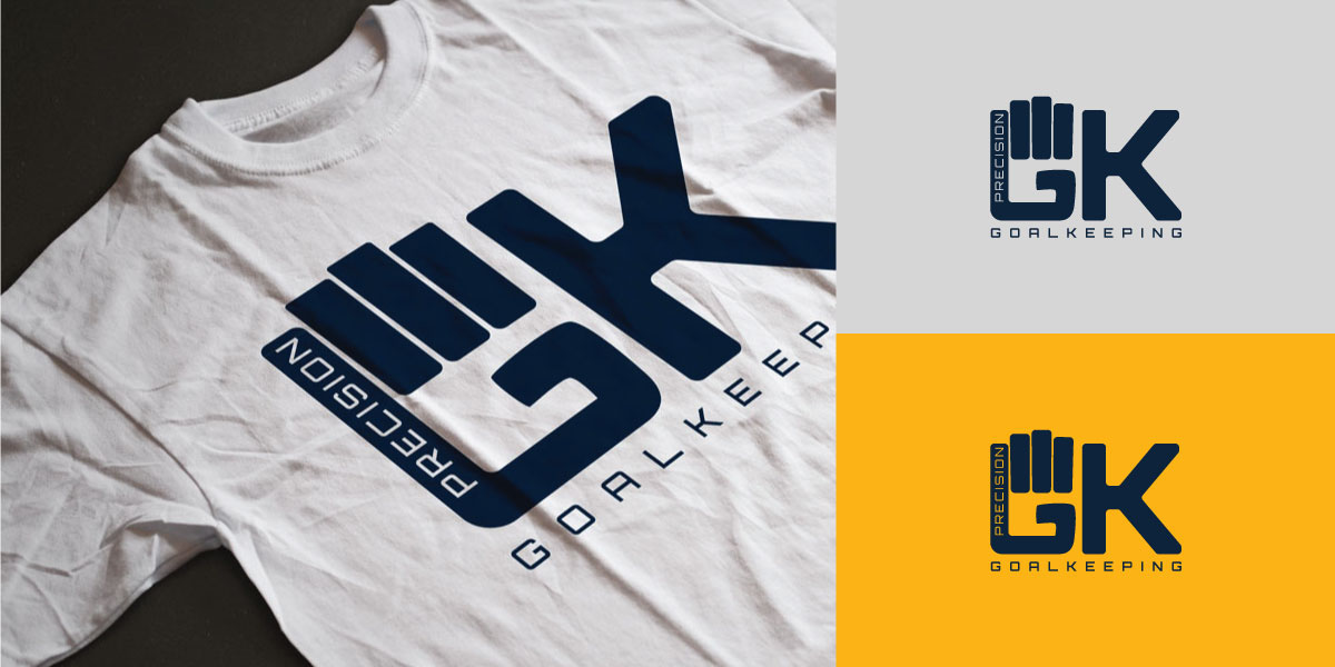
• Both letters utilize an uppercase form to increase their size and drive home the idea of strength & physical presence.
• The letter “G” utilizes varying curvatures in its Bowl & Arm, which assist in creating the resemblance of a goalkeeper’s glove.
• The letter “K” has a widened Crossbar as well as a lengthened Arm & Leg, which matches its Ascender Line, to add to the letter’s inherit size.
Fun Side-note:
If the logo is rotated 90deg clockwise, it has the appearance of a stick figure who’s hair is blowing backwards.
If the logo is rotated 90deg clockwise, it has the appearance of a stick figure who’s hair is blowing backwards.

Logo Grid
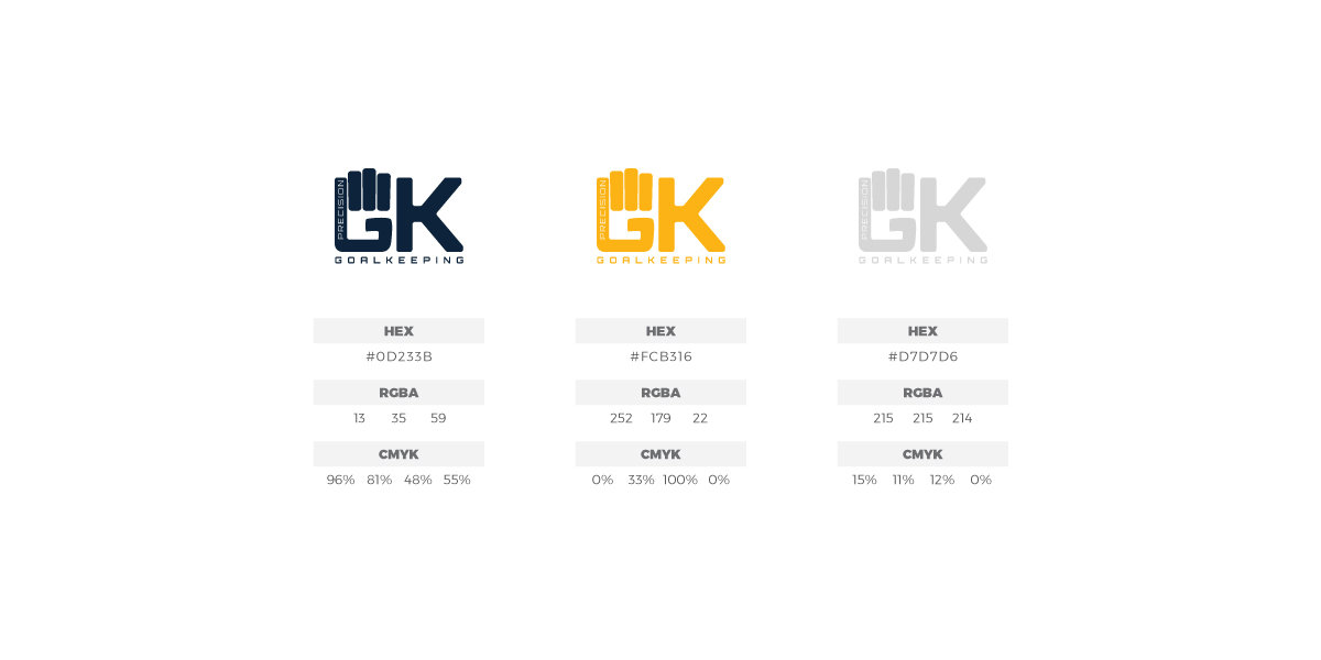
Color Palette
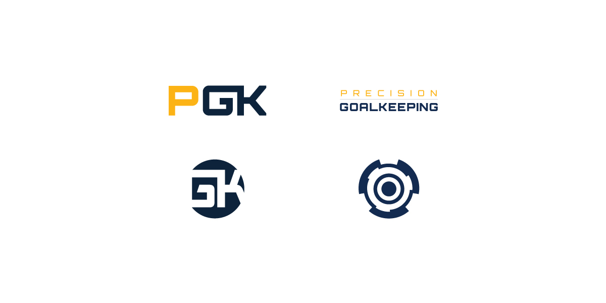
Logo Exploration