CLIENT WORKSHOP
As part of the task, the existing website needed a redesign. A workshop with the client was ran in order to evaluate the current content. We printed out each chapter, the size of the “roll” helped the client realize where there was a need for optimization. During this exercise I helped lead the client through the chapters and extract the most important sections.

Aside from the existing content, the client’s team was providing new material. Due to our timeline, the challenge for me was to design an experience without having the actual content. The design needed to be flexible and adaptable. Because of this, I categorized all the content types that we could have in order to design modules. This would allow to accommodate as many combinations possible of content types.
SKETCHES
Having the content structure in place, I started the sketching phase. Lead a collaboration effort with visual design to tackle different navigation patterns, how to make the chapters more infographic, and the design of the homepage.
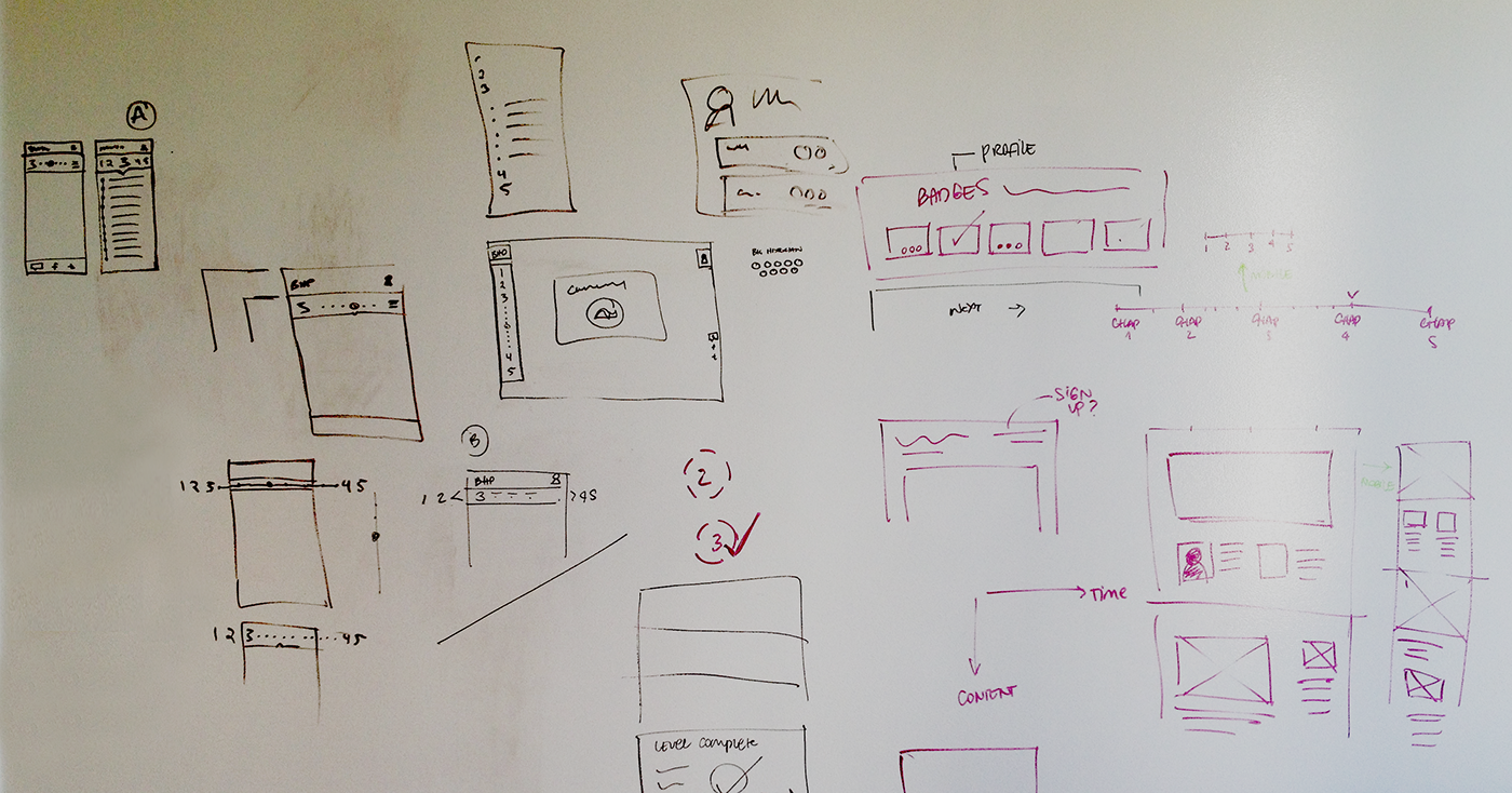
The navigation for the website had multiple purposes. Illustrate the timeline through history, let the user know where there are activities to complete, and also act as a bookmark. Simplifying it visually and making it responsive was the biggest task. I designed a nav that would have a collapsed state, that would guide the user where they are in time and how long it will take them to complete. The expanded state would show more detail on the thresholds and the activities. For smaller screens, in order to maximize the layout, the navigation changes to a horizontal view.

These sketches illustrate a brainstorming session for the homepage. Some requirements for this page were: the objective of the project, explain the chapters and the badge system, offer an entry point to the private and public content, and give users the option to sign up/sign in.
WIREFRAMES
I designed a 3 column layout that would allow the modules to scale. Started designing for mobile and scaled to tablet and finally desktop. The wireframes initially illustrated the different combinations we could have with the modules of content identified. Worked on Axure in order to facilitate sharing work with the client and other team members.


To make the process more efficient, we used a lot of lean processes while collaborating with visual design. Wireframes were used as a reference to understand how the modular system worked, but had a very low fidelity. Majority of the visual details were resolved on the whiteboard or directly in the designer’s monitor.
FINAL PRODUCT
After 3 weeks of design (UX and visual), the comps started to come alive with the first thresholds we received. The project is now live and you can find it in www.bighistoryproject.com


