

In 2016 the ICON project celebrates its 4th anniversary: after its previous editions with Moschino (2013), Versace (2014), Cavalli (2015) the project continues introducing a new limited edition bottle, designed in partnership with the famous Italian fashion house Etro.


The inspiration comes from the textile culture: the new Disaronno Limited Edition bottle takes on the look and color of paisley, exploring traditional values tied to the art of design done by hand, like that of tattoos.
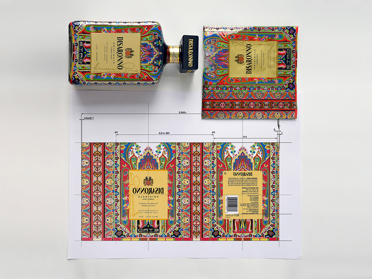
Starting from the file given by Etro, I create the artwork with all the optical corrections needed to fit the bottle. Then I declined it into all the different ML formats and 20 Countries languages. Always manteining the design centered and the correct correct proportions.
Starting from the file given by Etro, I create the artwork with all the optical corrections needed to fit the bottle. Then I declined it into all the different ML formats and 20 Countries languages. Always manteining the design centered and the correct correct proportions.


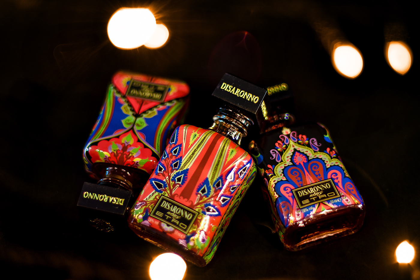
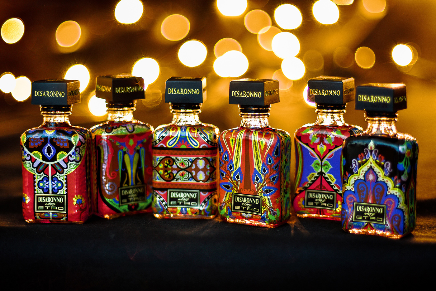
One of the formats that I had to create was the small 50ML mini bottle. Its design was all on me, so to create it I decide to cut-out 6 detail of the Etro sleeve and use it to wrap the six bottles. The result are six very cute bottles, coherent whit the big one: all different and collectables.

This year challenge was to make all the yellow parts of the Etro design in gold. To make this I used the same silver layer of the label, an created a drawing under all the paisley, so once the CMYK yellow was printed aboveit the result was gold.
In addition to the bottles I had to create all the others packagings and materials supporting the sale of the sleeve, like: VAP, glasses and folders.

See more of my works at my website: pels.it


