This app works two ways: as a national microchip registration service for dogs and cats in Spain, and through allowing pet owners to buy smart id tags, which allow lost pets to have their tags scanned via the app for immediate links to their owner. The UX is designed to be calming and positive for pet owners who are missing a pet.
Considerations I had in mind:
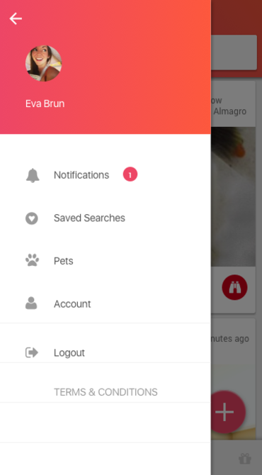
- People in Spanish and Latin American cultures have two surnames, making this fit in a small space such as mobile layout with other information such as location and time of going missing.
- Reducing reluctance to report a found pet because of the owners appearance in their icon or name (e.g. an immigrant or ethnic minority name, or "looking irresponsible" are some real world examples).
Prejudice is a human reaction that everyone has sometimes. Our job as product designers to help people connect in meaningful ways.
- The above needs to be balanced against fostering trust and community, such as in listing distance and district name, and not just distance alone. It's strange how people preferred knowing the district too, even though two districts may be the same distance from a user at any given point.
- Emotional sensitivity to the owner's state of mind:
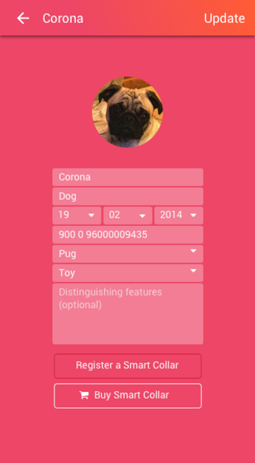
a. Pets are "missing" (a temporary status), not "lost".
b. A missing pet is still considered part of your "squad" and listed as a pet.
c. Keeping positive wording and imagery throughout the user journey is important for good moral. Rescue work can be hard. The orange to coral-pink gradient is to keep users feeling positive, upbeat, calm and energised. Sunrise colors.
- Different user journeys: e.g a person working in rescue might use this app without having pets of their own. They need to be able to skip the pet registration section. Meanwhile, pet owners will find having a pet registration at the outset faster than having to log in and create a profile for each pet.
- for later phases the concept of "karma" and rewards for finding more pets with the possibility of getting discounts from sponsoring partners, fostering a sense of community and reward.
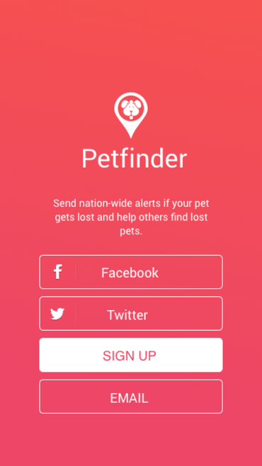
Login showing custom icon / logo design.
I chose the coral-pink color as being optimistic, active, and calming - the very idea of potentially losing a pet one day is distressing.
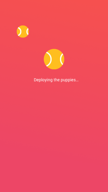
Load screen leading to...
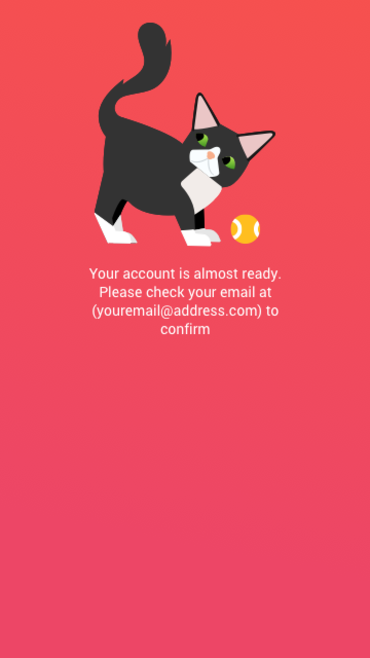
Confirmation Screen A (Babushka the cat)- surprise and delight
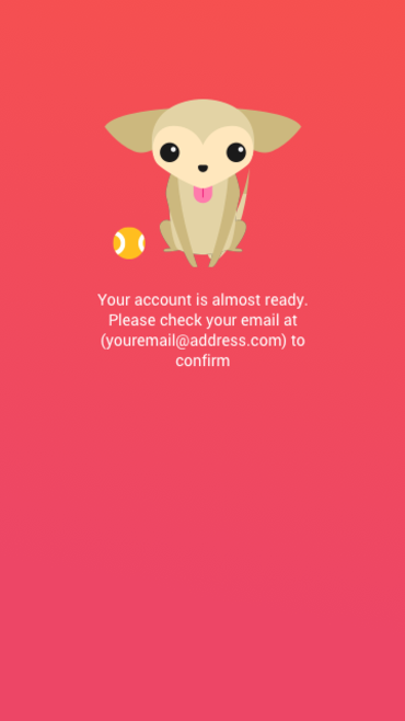
Confirmation screen B, Luxie the chihuahua. The are to be shown randomly with potential to add more pet personalities in the future.
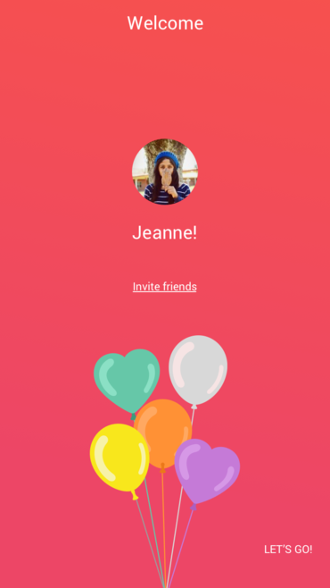
Signup confirmation screen. Celebrate your users! keep and nice and positive mood.
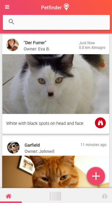
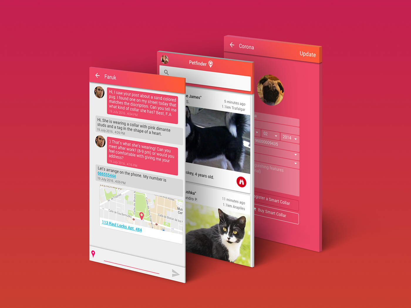
In the above screen you see the default feed and quickly access the collar scanner and store in which the smart tags can be bought. The action button is for adding details of a lost of found pet. Different icons for lost and found pets are used in the postings for quickly scanning a feed. Today I would not use that action button, but it was a popular design pattern for mobile at the time.
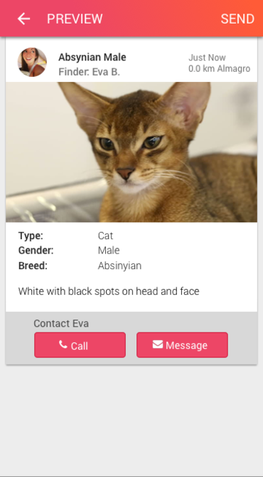
Preview screen of a lost pet announcement so you can edit before publishing.
Let's Talk About Mistakes I Made
There's a bit of misalignment between the icon in the image above and the text that happened when font awesome icons are imported to InVision as fonts and not SVGs. This would also happen with some fonts too. While I did correct this in the prototype manually and painfully, this earlier screengrab was done while I was (not so wisely) using InVision's Mac extension folder as place I saved my original sketch files because InVision managed version control so well and abstract and plant didn't exist yet.
What I didn't understand was that if I archived a project to save space on my subscription, I would also lose the source sketch files. And that's what happened. So I had to use my earlier exported images here. Which are fuzzy looking on retina screens. And make me want to die a little bit.
We learn and grow ¯\_(ツ)_/¯.
We learn and grow ¯\_(ツ)_/¯.
Today I use Abstract for design version control and save my sketch files in icloud.
There's a bigger mistake I made that isn't shown in screenshots: I didn't ask my client about the business model or viability of this product- treating them like a boss rather than a client who might need guidance. This product never got released in the end due to not finding a "product market fit". Today, I consider discussing the viability and market research behind the idea to be "step 0". I may ask a lot of questions up front, but I want to be sure that the product is going to succeed.
Today, I host product design and UX meetups teaching the things I've learned about finding a reliable idea and building a product that can reliably expect sales.
Today, I host product design and UX meetups teaching the things I've learned about finding a reliable idea and building a product that can reliably expect sales.
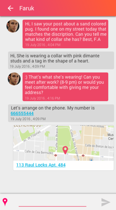
A screen showing the chat function with a hypothetical conversation about a missing pet.