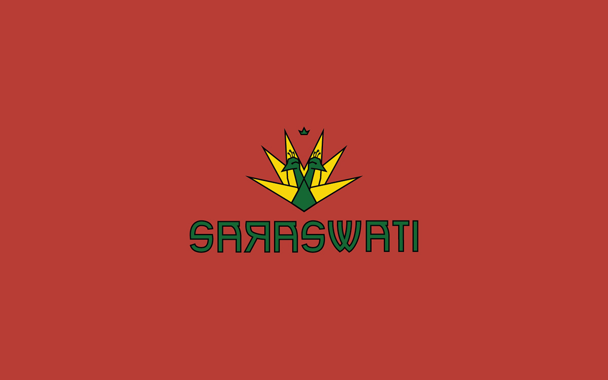
Saraswati is a band from Buenos Aires, Argentina. Their genre is reggae but they identify their sound as a hybrid of reggae, roots, hip hop, cumbia and dub. They made the peacock their identifier, symbolizing African God, Oshun; and their name, Saraswati comes from the Hindu Goddess of knowledge, music and arts. Their logo and name reflect the mix of genres and their connection to nature and their craft.
Saraswati appointed me with the creation of their logo, that had to represent the duality of their music, which is bright and dark at the same time. Bright in tones and dark in words, and vice versa. It was definitely a challenge trying to merge all these symbolisms that seem to work in such harmony in their music. We finally came up with the idea of a two headed peacock.
The fanning feathers help the logo image to be able to adapt to various types of mediums, and also be striking enough to work without the logo type, if needed.

I created a simpler version of the logo to be used in smaller mediums, such as picks or as a digital profile picture for Facebook, Twitter and Instragram. It is simple enough that when it is small, the lines don't blend, and the logo is intact and recognizable.

