
I took inspiration from Barbara Kruger's style that was adapted by Supreme and applied it to Puma's Trinomic shoe because the target customer aligned.


I took 16 teams that were playing in the 2016 UEFA European Championship and experimented with their identities, accentuating and minimising certain shapes and colours.

The Rio Olympics were also on during SS16. I altered the placement, opacity & shape of the country experiments to coincide with the
Olympic rings format.


In 2014 (When I arrived) Puma had redefined their brand with the "Forever Faster" campaign. I used Puma's nature of taking control and being first to "Lead The Pack" rather than succumbing to pack mentality to connect with young athletes and their winning mentality.


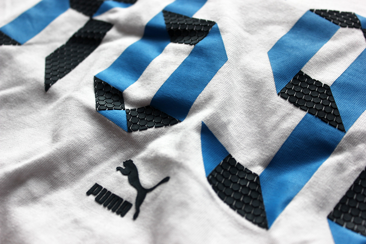
The process of how the design looked when finished. The R698 is a Trinomic shoe. The "honeycomb" texture looks like Puma's Trinomic technology.


Creating an illusion that reveals Puma.


