

Twitch became a great actor of streaming platform but I had this feeling they could improve the interface and the navigation system. For example, you can't search a game or a channel without leaving the one you're watching.
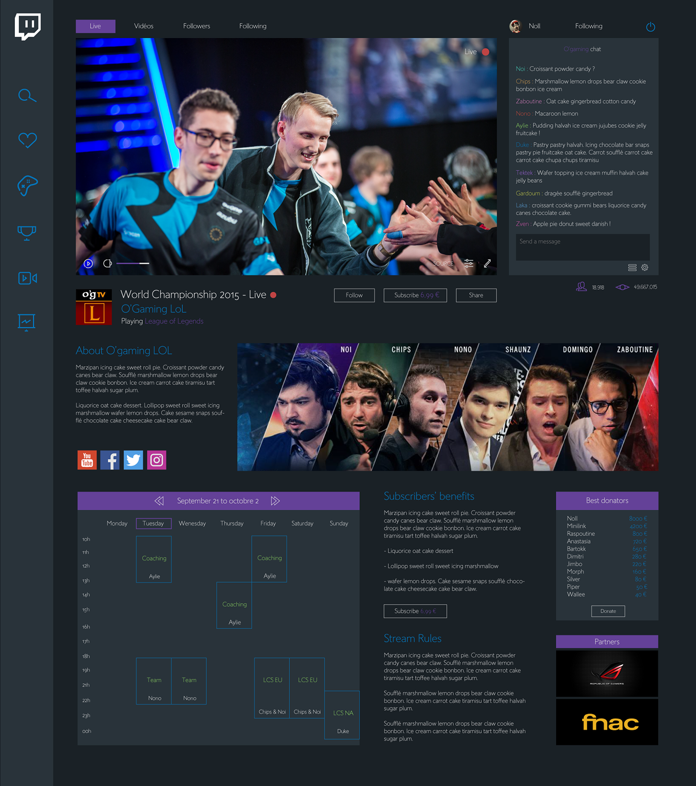
The design I propose give more spaces to the user. The informations and the divisions appear easily. The background is dark because I think it gives a more confortable interface to watch stream. I also rethink the menu in order to make it more effective.

Confort
The actual twitch design provide too much information on pages. As a result the interface is lacking of empty spaces. The space help to highlight the divisions and the content.
The white color doesn't suit to a webpage you still watching for hours. it hurts the eyes.
I chose a dark interface in order to showcase the streaming video. The confort is much better for eyes and for viewing experience.
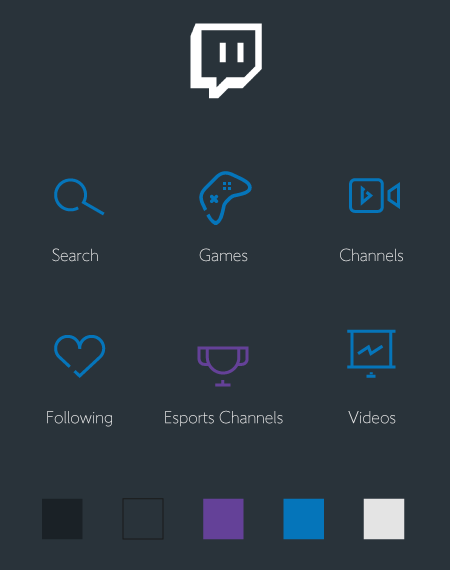
Icons
Thin line icons suit well with the minimalist design. I added an additional color. The purple is part of twitch identity but in a dark environment I needed an other tonic color. The blue and the green suit well with purple.
The navigation
The navigation is the biggest problem of the actual Twitch. You can't search for games or channels without leaving the streaming page you're watching.
I propose an extendable navigation where you're able to search anything without leaving the page.

Discover new channels
Finally, I redesigned the twitch discovering channel functionality in the index page. first you can select a game, then discover new channels about this game or simply discover the selection of streams about any game.


