Branding for a dental clinic.
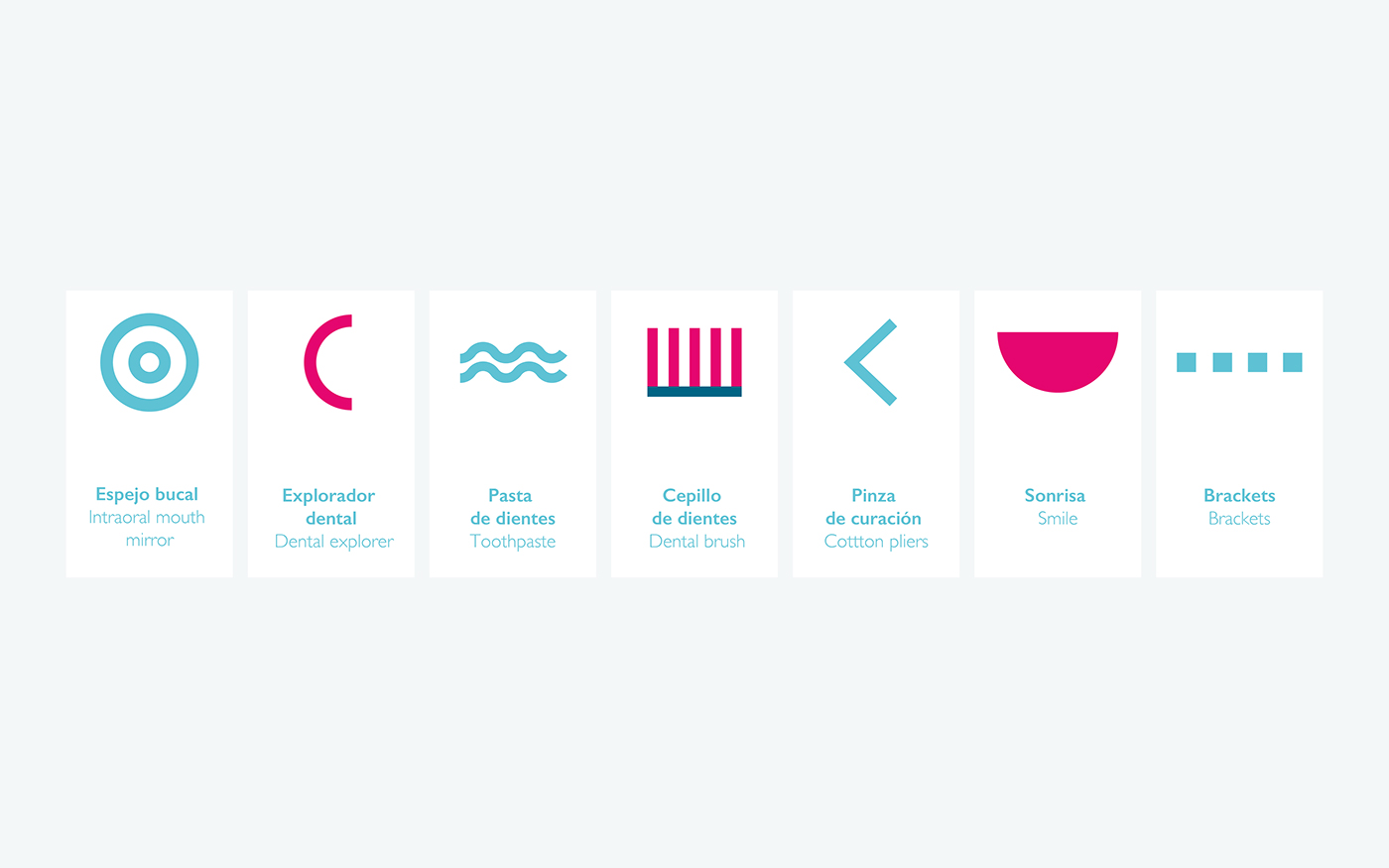
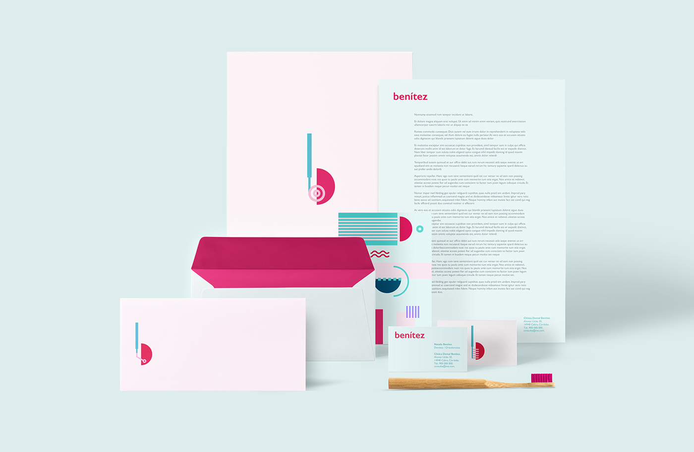
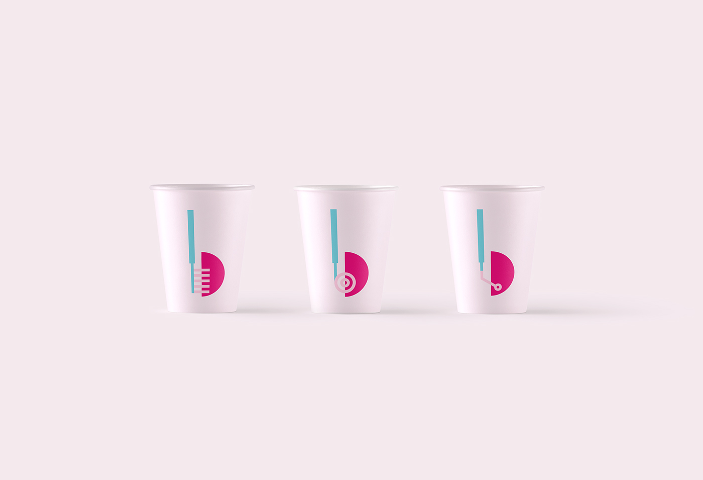
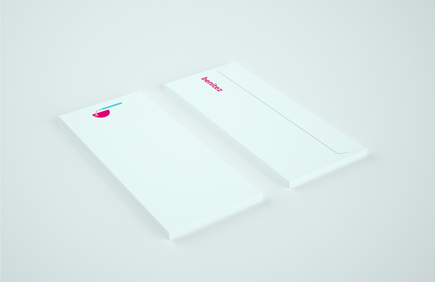
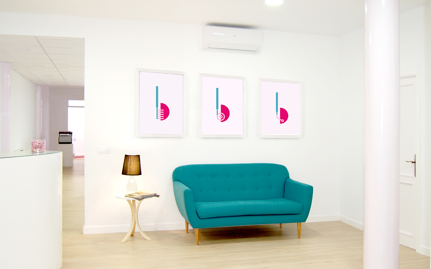
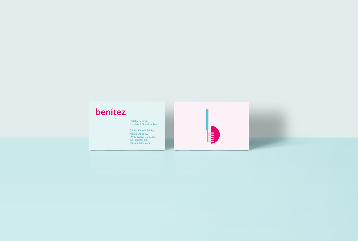
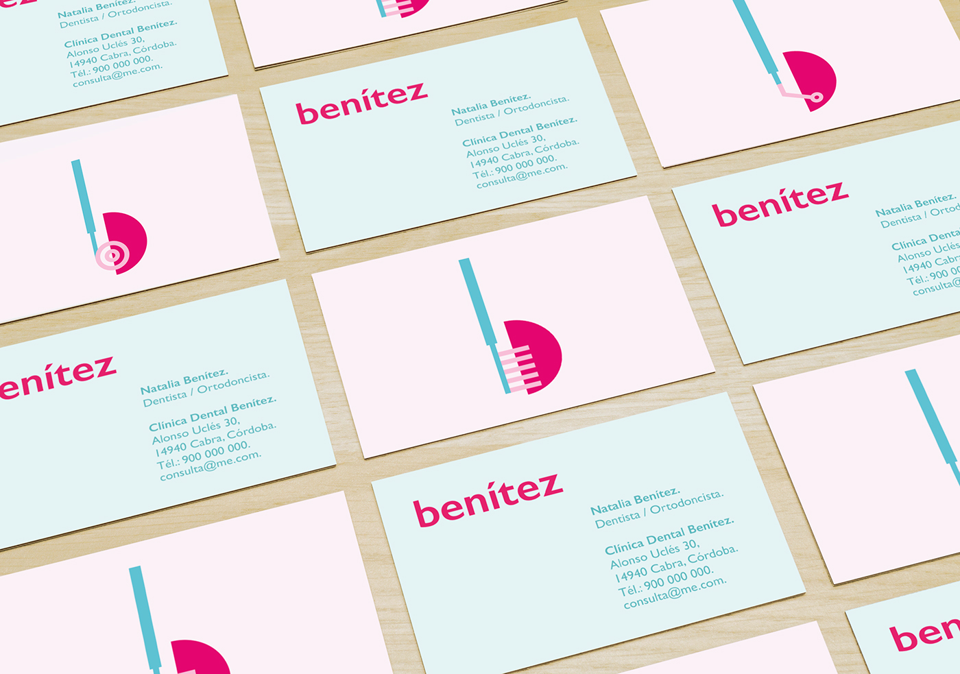
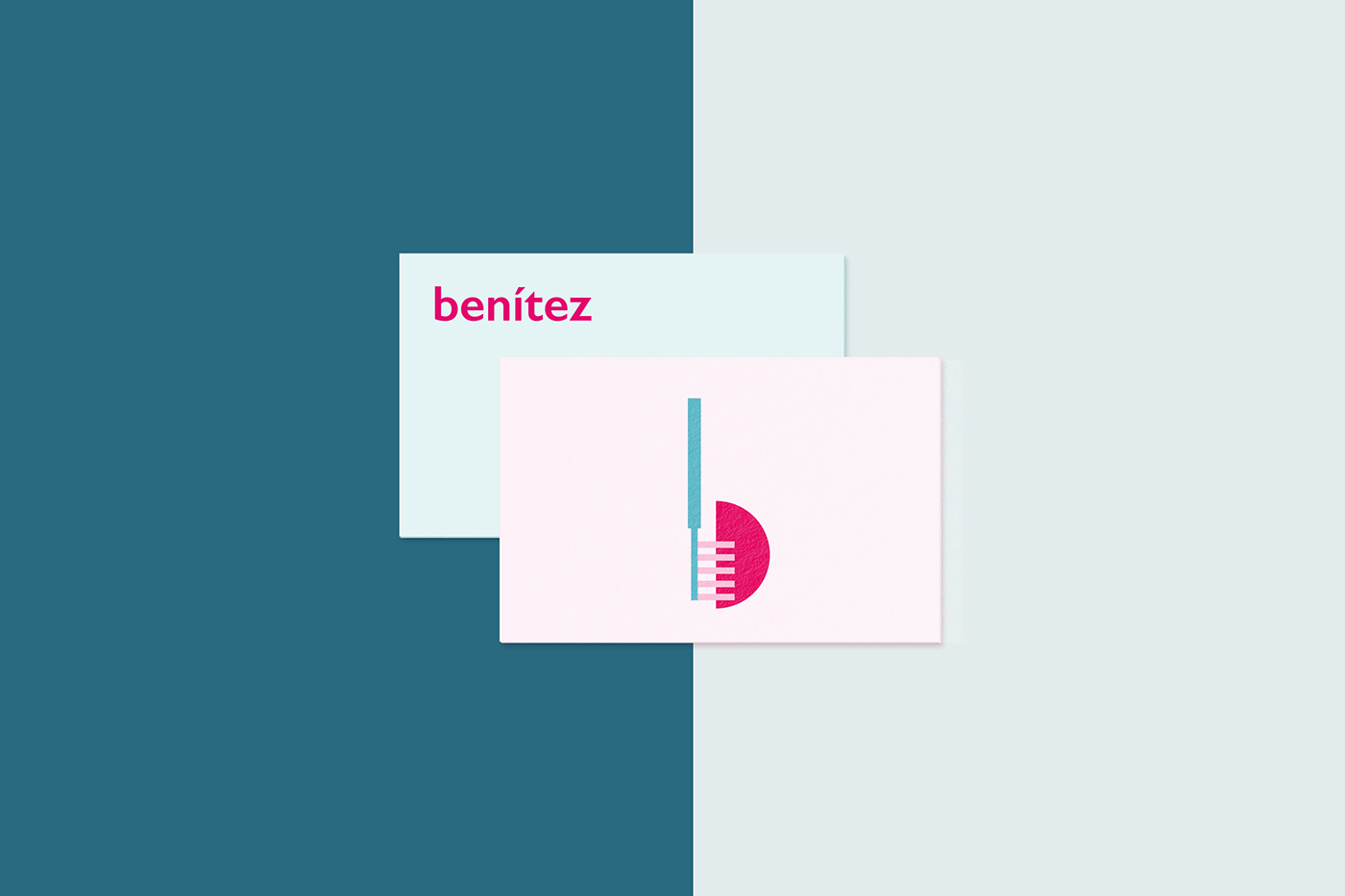
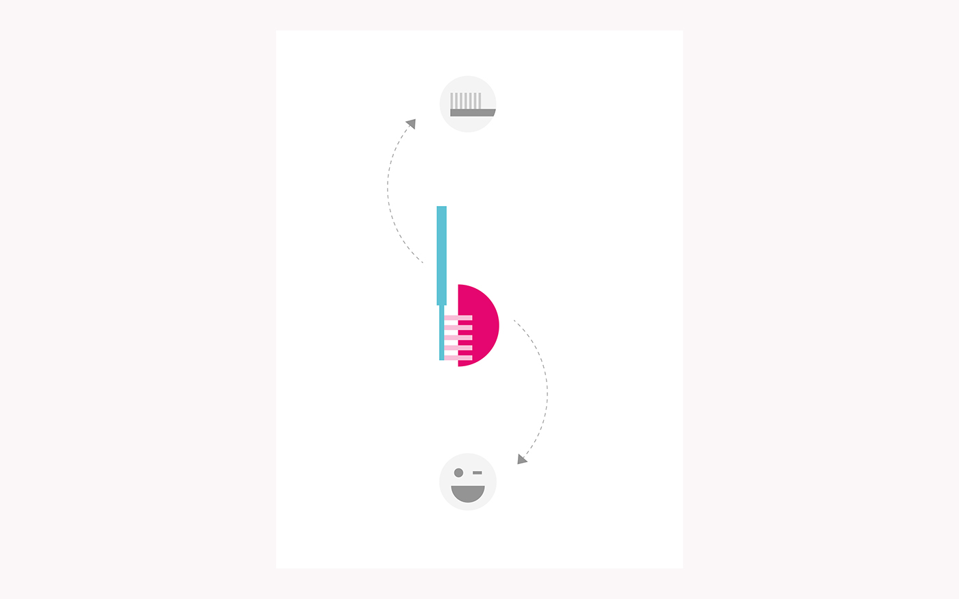
The "b" of "benítez" is formed by a semicircle and a changing ascender stem. These elements represent the smile of the patient and the dental instruments (dental brush, Intraoral mouth mirror or dental excavator).
Therefore, the brand identity has three symbols. The three variants of the logo represent the diverse and complete services offered by the clinic. The different elements of the symbol work as corporate graphics. These graphics represents the modernity and youngness of the brand.
The brand has a warm typography that expresses force and firmness at the same time with a functional and modern aesthetic.