
So, Auzom was an esports startup. Why "was" and not "is" is not important, what is important is that "Auzom" stood for "Aurum" and "Awesome". Actually, on a second thought, that's not important either. We just wanted a cool minimalist logo, with at least a little bit of history behind it. "Au" seemed deep enough, so we just went with that.

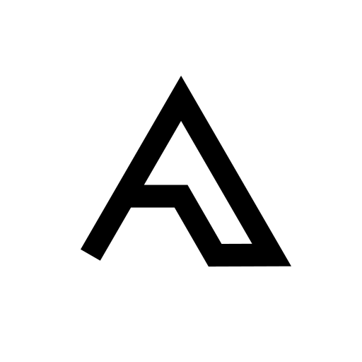
Above is the end result. And I like it. If that would make any sense, I'd use it for all my projects. Unfortunately, it doesn't, so it's forever Auzom. Below is everything between "let's do this" and what became final.

This was too obvious to pass up...


Cool and minimal, but looked too much like a camping tent, which is kind of meh for a gaming business


I can see a bank having a logo like this

A lil' bit of Half-Life

驚くばかり

Looks like a service logo out of AWS or something


A little bit of Ancient Egypt


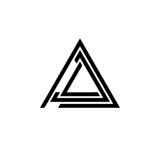
This was it, the father/mother of the final logo


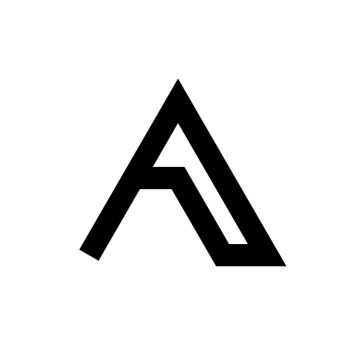
And BAM! Here it is

Did I mention that I like straight lines and triangles?


