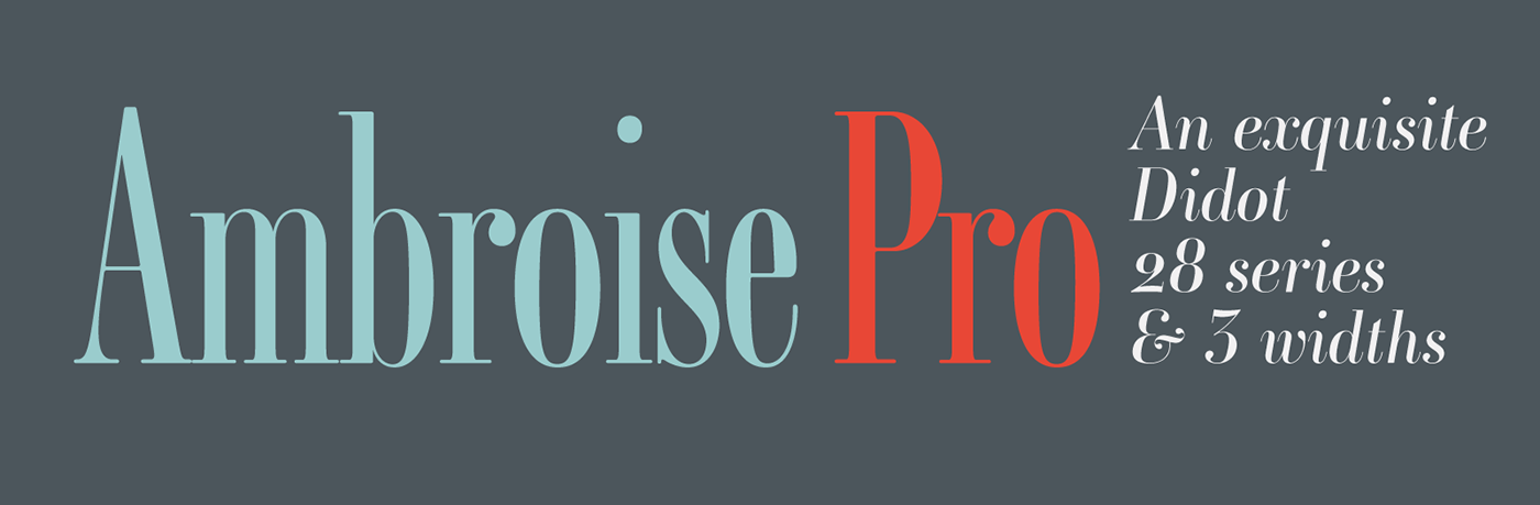
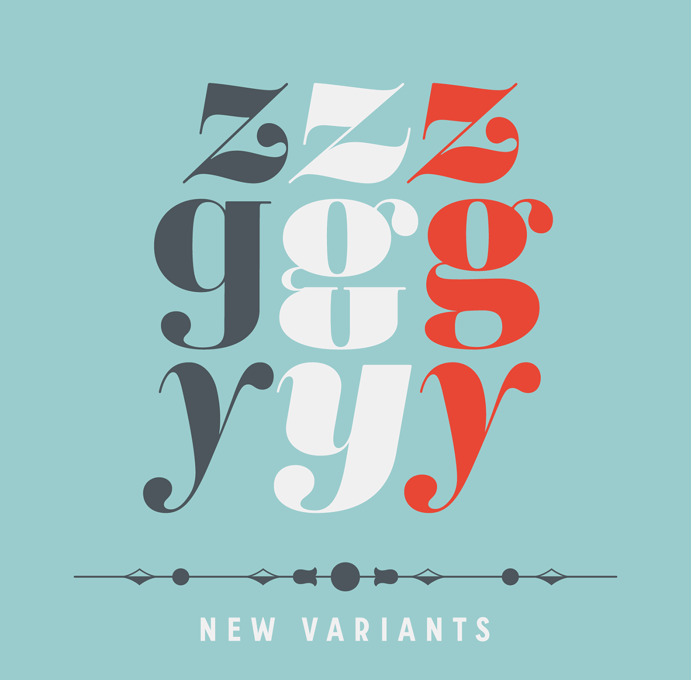
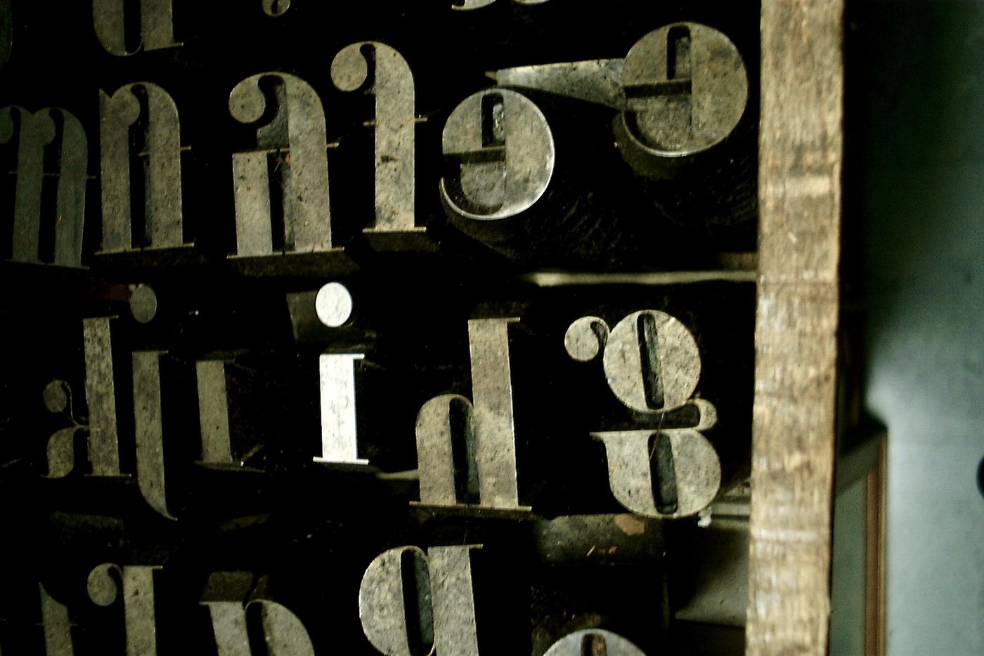
This brand new revision of Ambroise, — including new italics — has taken 15 years! Ambroise Pro now available in 28 fonts & 3 widths is a contemporary interpretation of various typefaces belonging to Didot’s late style, conceived circa 1830, including the original forms of g, y, &; and to a lesser extent, k. These unique glyphs are found in Gras Vibert, cut by Michel Vibert. Vibert was the appointed punchcutter of the Didot family during this period. It is the Heavy, whom sources were surest that Jean François Porchez has been used as the basis for the design of the typeface family. In the second half of the 19th century, it was usual to find fat Didots in several widths in the catalogs of French type foundries. These same typefaces continued to be offered until the demise of the big French foundries in the 1960s. Obviously the characteristic shapes of g, k, y marking the Ambroise had to be accompanied by more conventional alternatives on the Ambroise Pro. This was achieved with the introduction of variants g, k, more acceptable in certain contexts and uses.


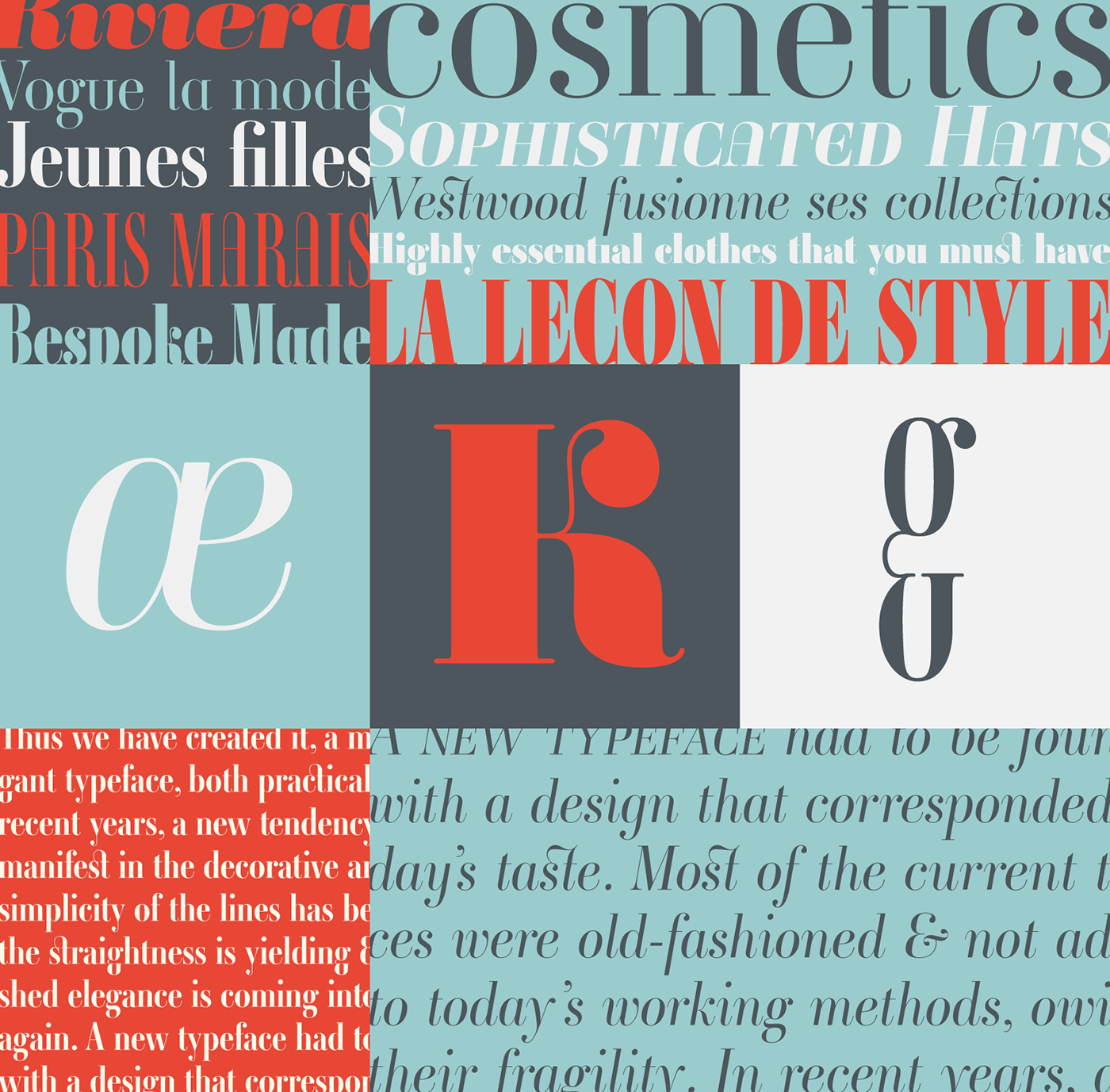
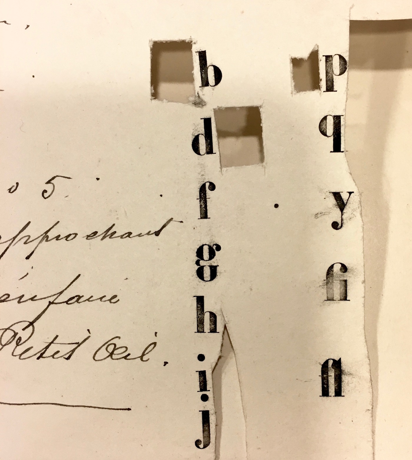
Ambroise attempts to reproduce more of what we see printed on paper in the 19th century; a more accurate representation of Didot punches. So, the unbracketed serifs are not truly square straight-line forms but use tiny transitional curves instead. The result on the page appears softer and less straight, particularly in larger sizes.
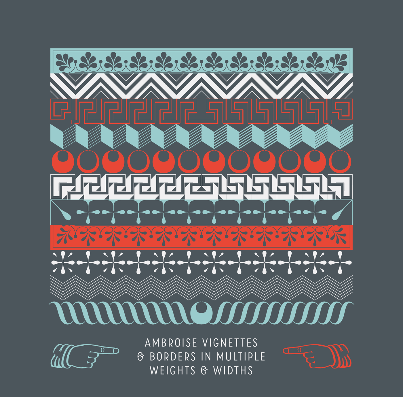
Every variation of the typeface carries a name in homage to a member of the illustrious Didot family of type founders and printers. The condensed variant is called Ambroise Firmin. The extra-condensed is called Ambroise François. Generally, only one set of ornaments are designed for a type family. Each series features the same set of elements, and none of them are similar, they always follow the weight and width of the typeface reference. That way, the Ambroise vignettes and borders are capable of multiple variations. The result is a wonderful tool for the user, as the variations help to create different rhythms and colours to the layout.


We hope you will make good use of this new version of Ambroise Pro featuring fully new italics, new weights and many other new glyphs! We look forward to seeing the first projects with this Didot!
Ambroise: Availability of typeface family
The Ambroise fonts are available in our PRO (exclusive), STD, Epub versions. Download the Ambroise specimen in pdf format for full details of these Advanced typography functions.
→ From € 45 to € 55 for any Ambroise styles
→ From € 119 to € 146 for the Ambroise Family of 4 fonts
→ From € 712 to € 872 for the Ambroise Full Family of 28 fonts
→ From € 119 to € 146 for the Ambroise Family of 4 fonts
→ From € 712 to € 872 for the Ambroise Full Family of 28 fonts
Ambroise in use
As a tradition, at Typofonderie, we test a typeface family on various applications, using existing designs. It’s the final part of any project and its great fun for us. See our Fonts in use section for more.