Initial Design Comp A
Description: This iconic logo represents the front face of the structure and is leaned forward to connote forward movement and athleticism. The logo is intended to unite the structure of the Mayborn Campus Center with the personnel and activities that are held within. The main type face is collegiate and connotative of sporting activities.
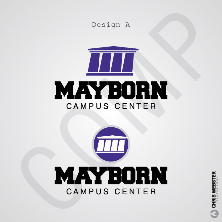
Subtext Treatments

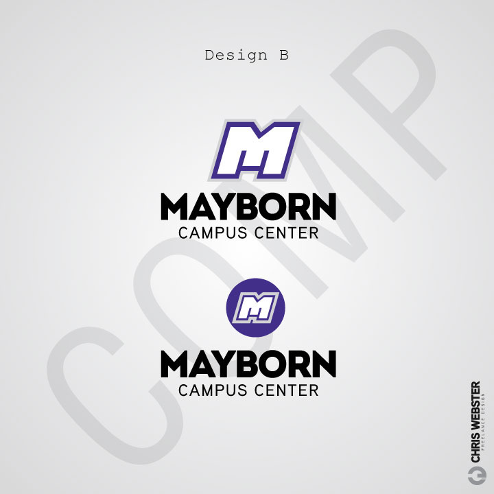
Initial Design Comp B
Description: The stylized “M” of this logo is also leaned forward to imply movement and energy. The icon is designed in the vein of modern athletic teams to strengthen instinctive ties to an active lifestyle. The typeface of this option is bold to imply strength, solidity, and confidence.
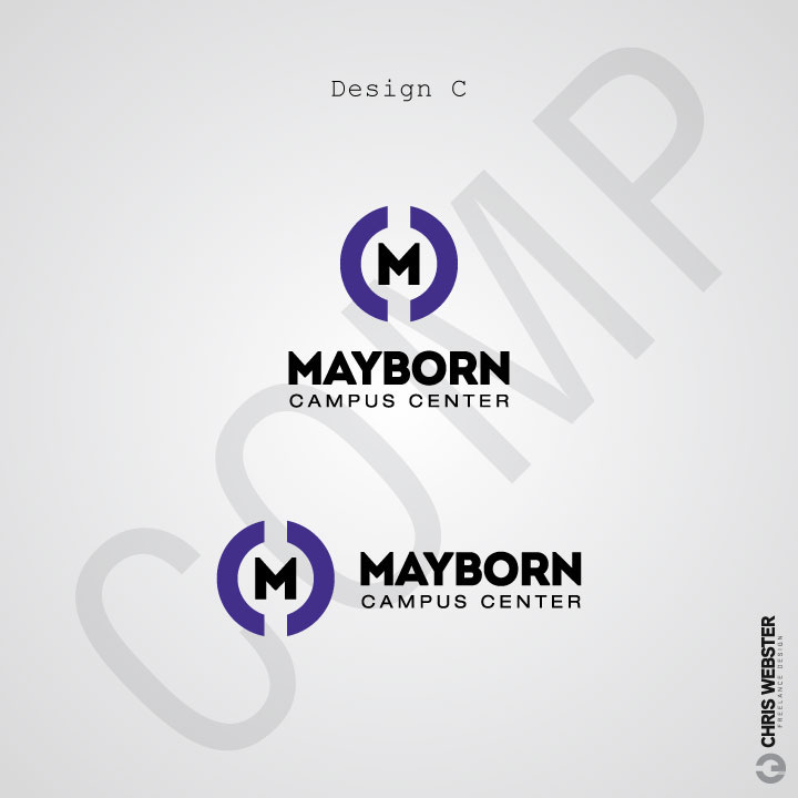
Initial Design Comp C
Description: This logo option is a clean, minimalist construction centered around the “M” of Mayborn. The semi-circle shapes on either side of the “M” represent stylized “C”s for Campus Center. The semicircles and the “M” are positioned to represent and emphasize the centrality concept of Mayborn Campus Center. The roundness of the logo is also intended to connote a complete, holistically active lifestyle, as well as a tie to ball-centered sports.
Final Design