
N E W S P A P E R E D I T O R I A L L A Y O U T
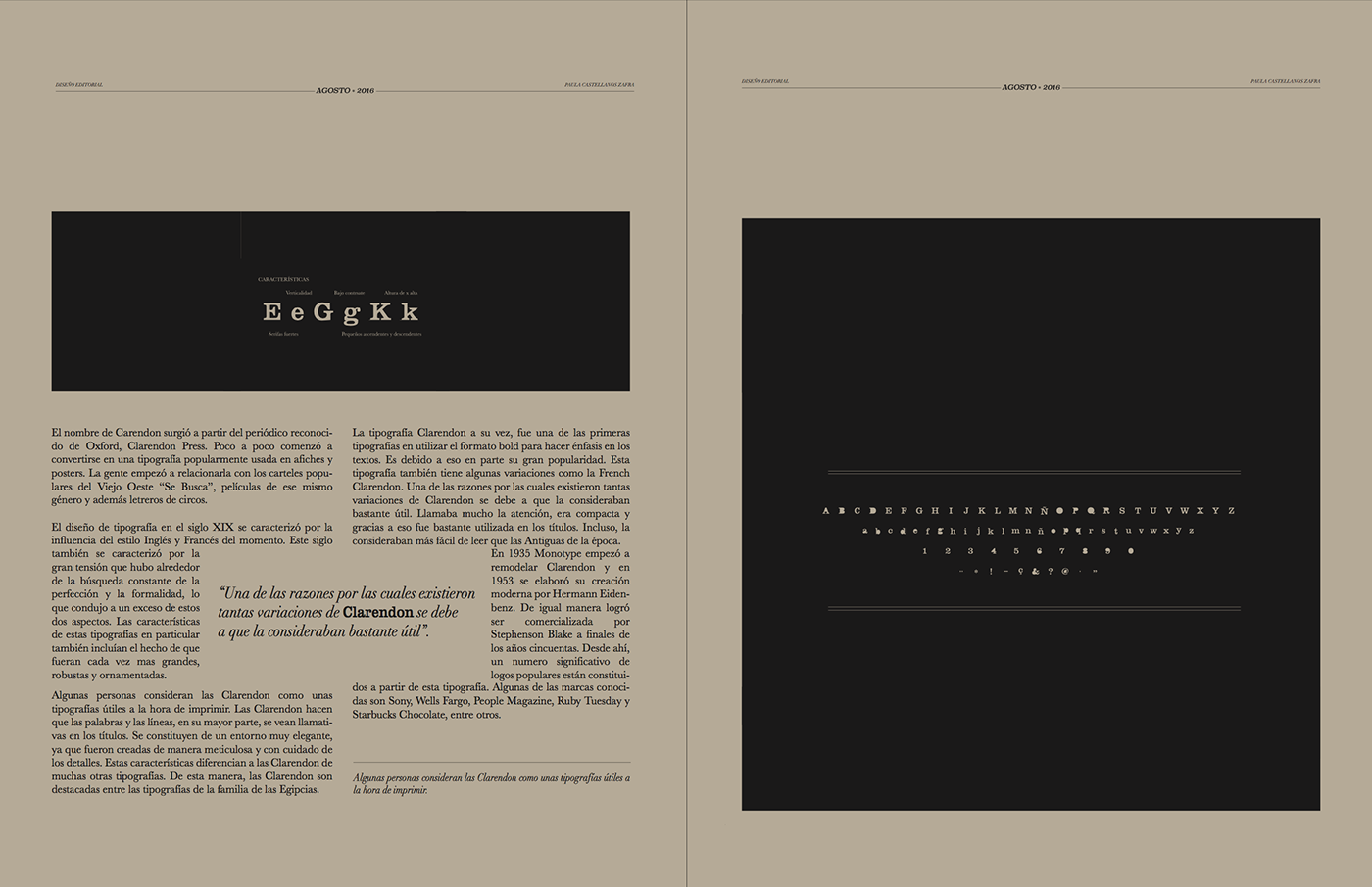
The idea of this project was to investigate a typography and design an editorial layout in order to reflect it's principal aspects. For my typography, Clarendon, i decided to use a layout that resembled a newspaper, and also little details that emphasize the principal values of this typography, such as big headlines.
Clarendon was made specially to highlight words, titles, wanted signs and circus signs. That said, i only used Clarendon in the main titles and highlighted items. For the body text i decided to use a more legible typography, Baskerville.
I printed the layout in thin earthpack paper and finally folded to make it look like a real newspaper.


Proyecto por: Paula Castellanos Zafra
All rights reserved
2016 Ⓡ


