Ninis Fábrica Dulcera.
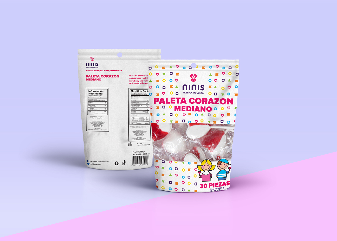
Ninis Fábrica Dulcera is a Mexican candy manufacturer and distributor who started making heart-shaped lollipops as their only product more than two decades ago. Given the exponential growth they have experienced in the last years, and the expansion of their product line into a wider variety of products, they thought it was the right time to step up their game and revamp their image.
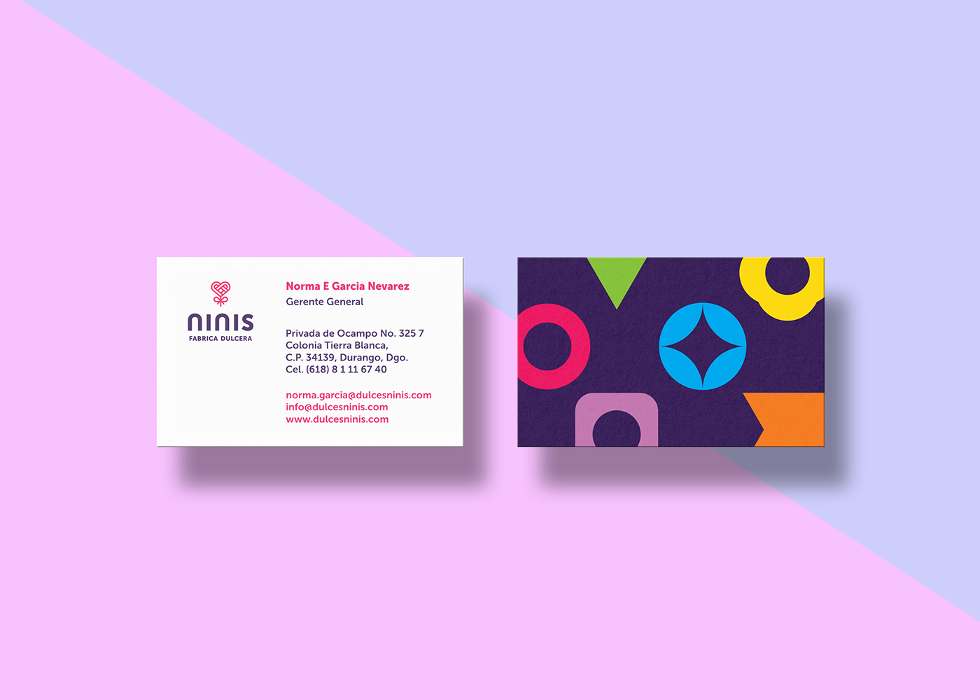
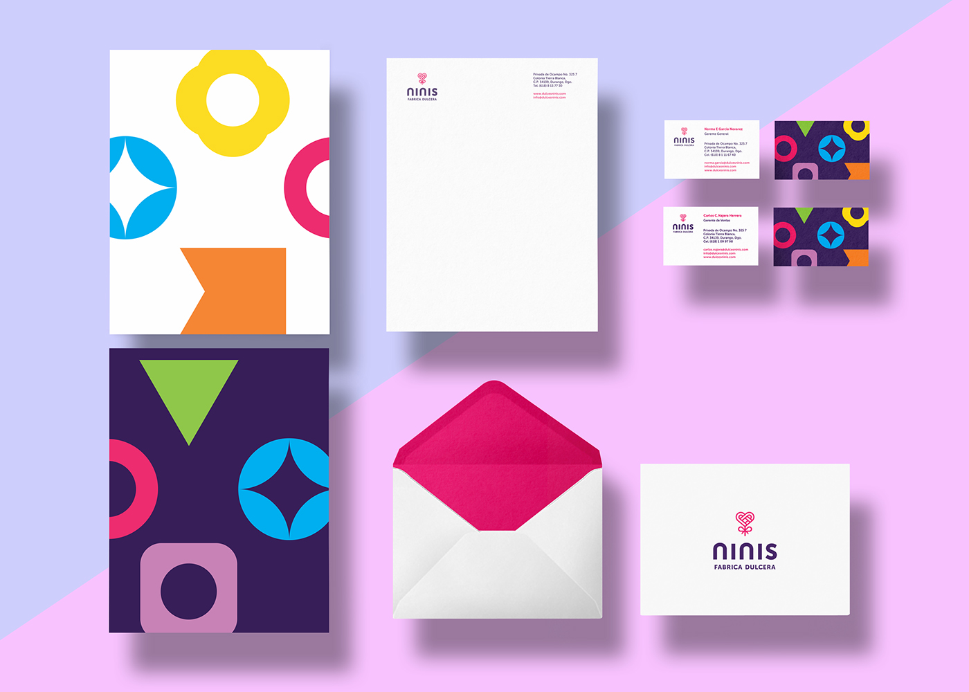
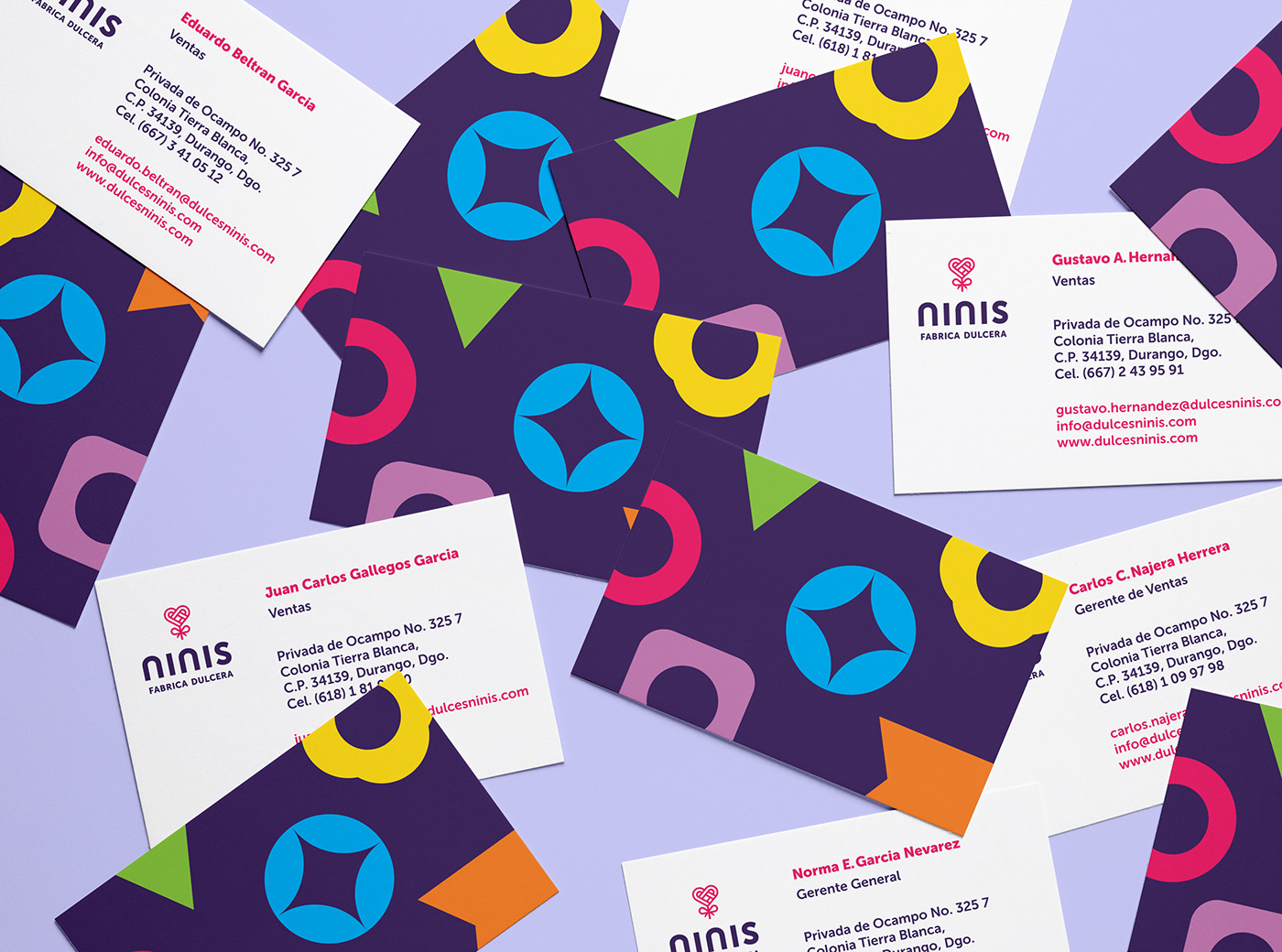
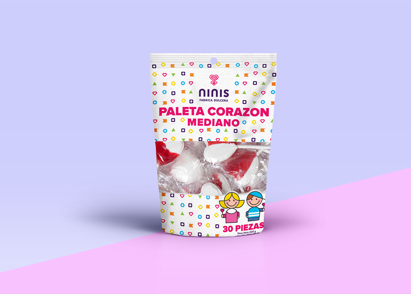
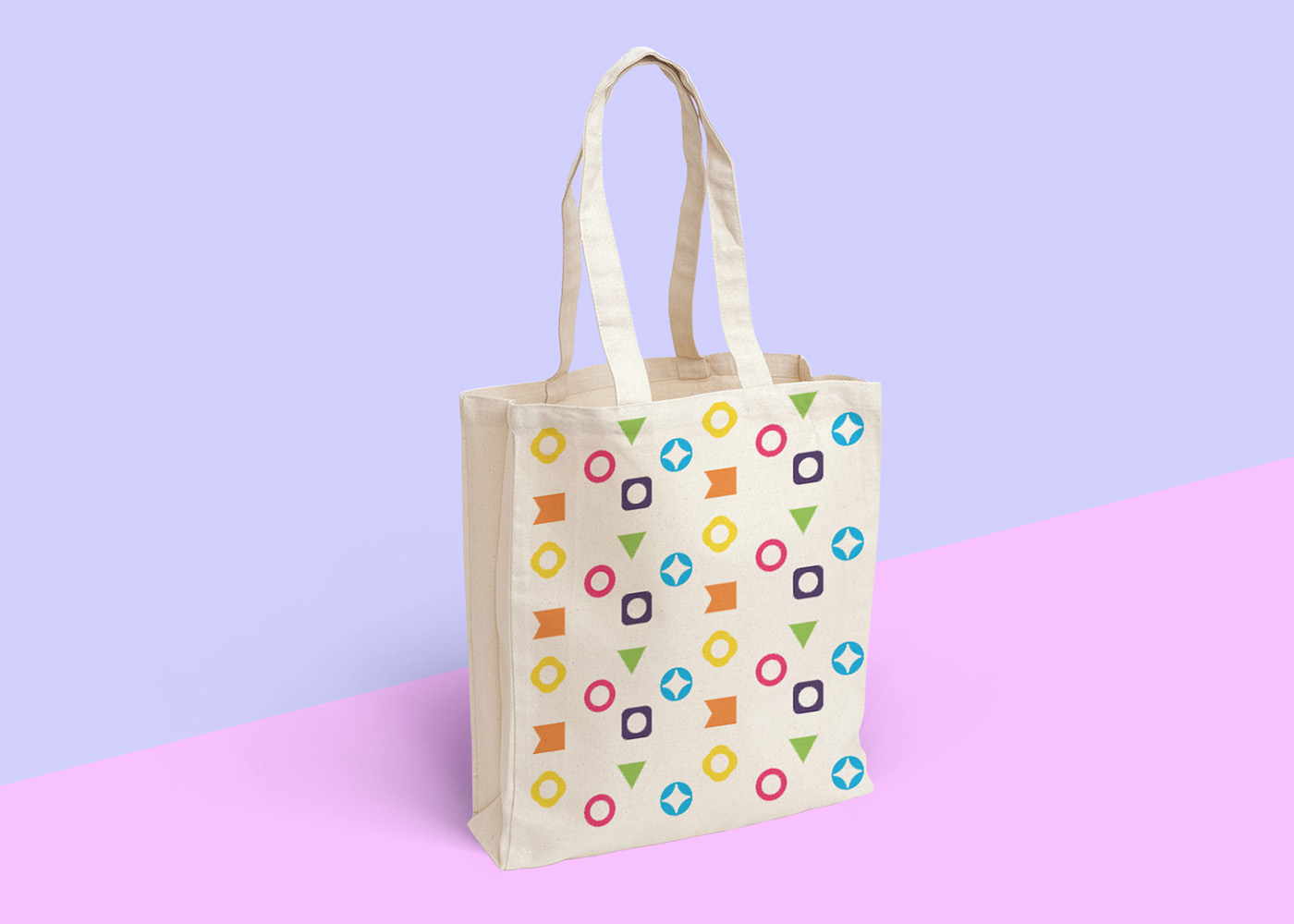
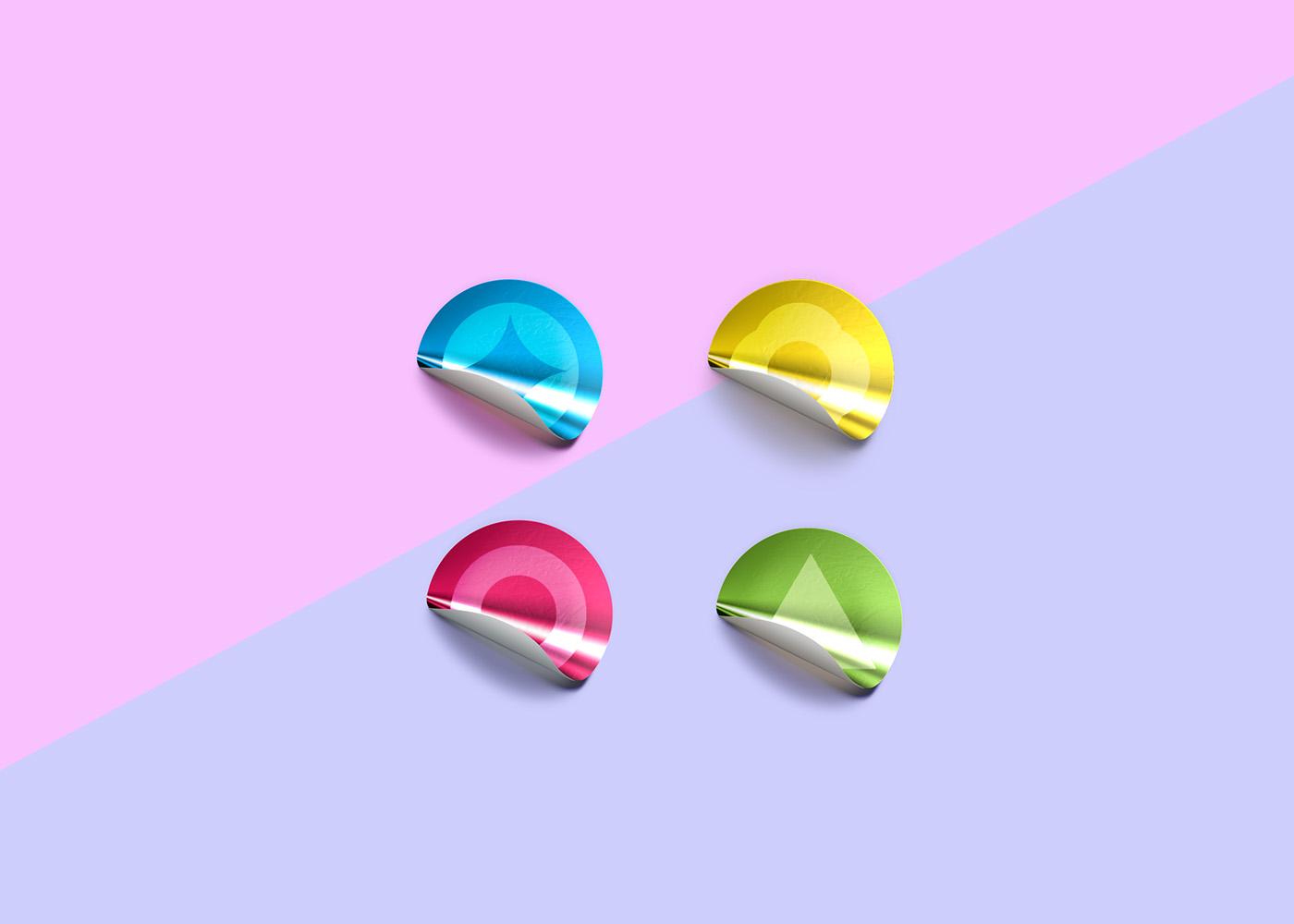
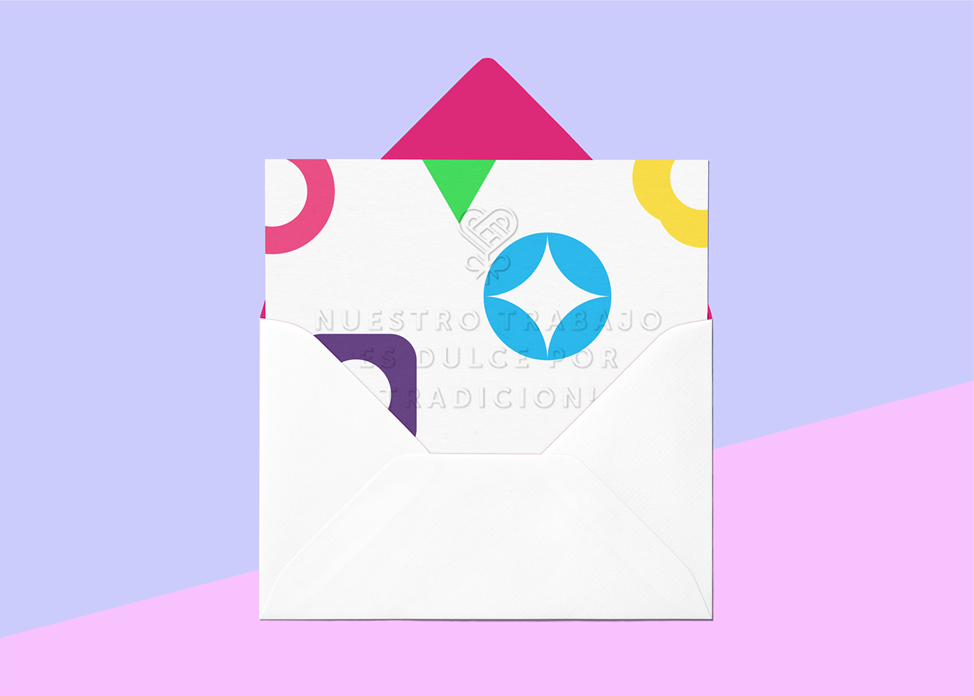
We were asked to redesign their visual identity and product packaging. We came up with a clean, modern and contemporary image, in which we played with a vivid and beautiful color palette, and different geometric figures used as multicolored patterns, these graphic support elements were created with a heavy nod to didactic toys.
We also created a couple brand characters, that will serve as reference to the brand, and which will be used across their different platforms and applications.
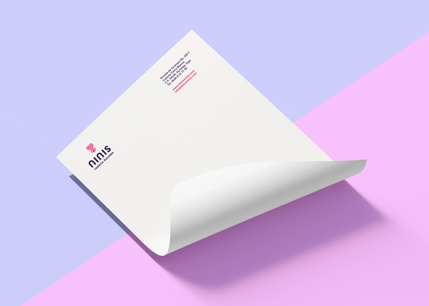
The logo is inspired by their heart-shaped lollipops, it was created interlocking two letters N, the ribbon found in it is intended to convey premium quality as an homage to their first ever created product, which makes the symbol the strongest element of their new visual identity.
Our main objective was to create a strong solution, and to adapt Ninis to the present market by taking a fun and refreshing approach to their identity with a premium yet playful visual language that is appealing not only to kids, but to adults too.
