This is they Style Guide for the fictional coffee company Launchpad. This style guide is also represented in a way to reflect the colors and style of the brand but identify the needs for a business to continue on with the brand identity.
Launchpad Final Style Guide
The above is the finalized style guide to display the aspect of the brand that the designer could pass along to help identify the brand and how to display aspects of the brand when coming up with new ideas of the brand. Aspects of the brand that identify with the brand itself is the curved lines around the title of work as "Launchpad Style Guide" and the Title page with the numbered page.

Clean Style Guide Page with logo
Starting with a clean and clear page to reflect the brand colors and the aspect of the classical nature of the brand was a feature of this style guide. Being able to ease into this with neutrals while making the logo the focal point for recognition training. This was decided based on the brand being a very classy theme and not to crowd ideas into the company at the very beginning of the art being presented. This was to make the viewer more curious with the well developed logo.

Color palette displayed with texture and shape.
The style guide displayed the color palette while also adding the textures and shapes in a sleek way to reflect the brand. Then being able to explain why these colors, shapes, and textures work to reflect the narrative. This page was developed to help relay how these aspects will work together to represent the brand while identifying these aspects.

Typography for the Launchpad Brand displayed.
For such a high end brand it was important to display elegant font. Although some elegant fonts can be very hard to read. So, I moved forward with a subheading and body copy font that could still reflect a classical flow but be appealing for the purpose of reading.
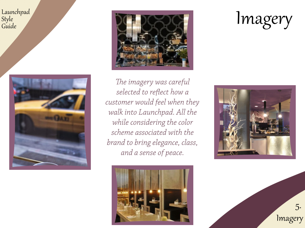
Imagery that guides the brand.
The imagery was key to brining the idea of the brand together. Imagery was placed in the style guide strategically to identify the importance of how the imagery will play a big part as identifying the brand along with the semi-curved lines. The best way to display this was along with the shapes set for previously to start bringing the brand together.
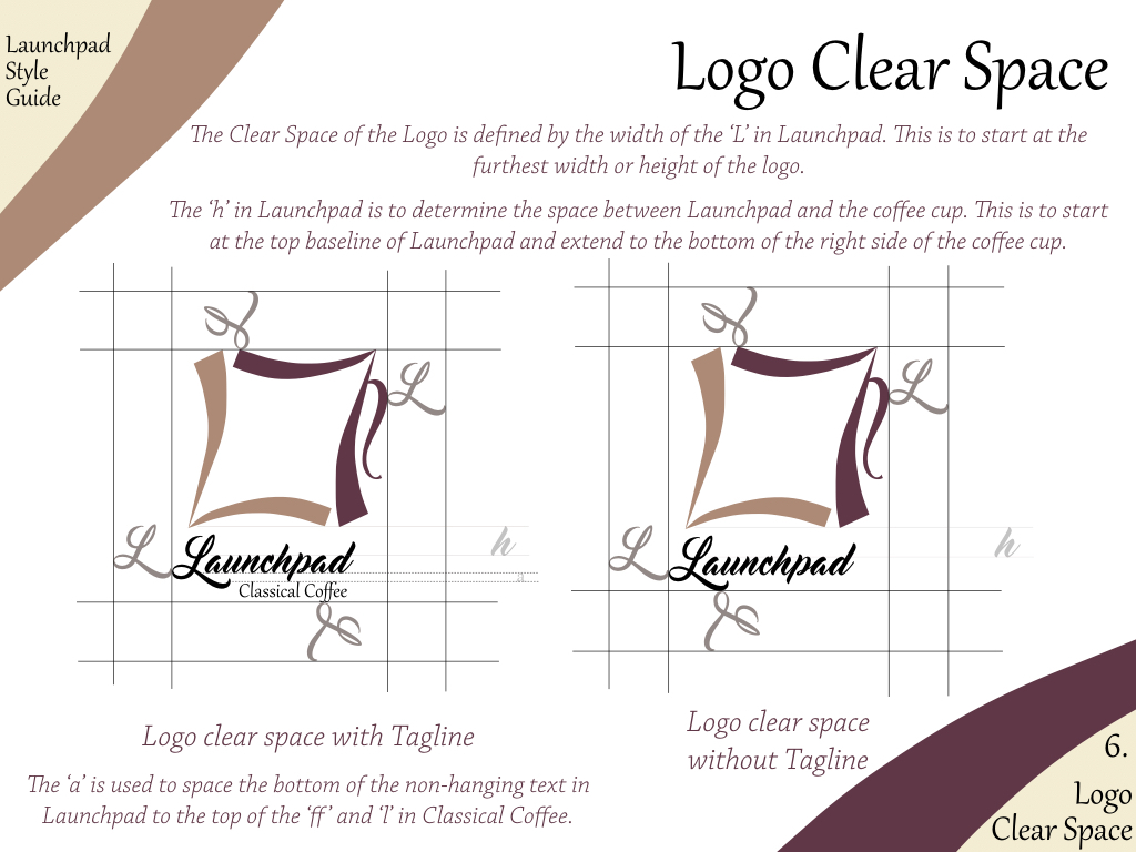
Reflection of the Logo Clear Space.
It is important for a brand to be able to show the technical aspects of the design that the company will need to move forward.Therefore it was important to establish the clear space with the logo in the style guide. I wanted to include the clear space for both the Tagline and without the Tagline. I decided to place these on the same page so that it was easy to understand the relation between the two.

Uses of the Logo to help the brand understand how this is displayed.
Finally, with everything it will need to be relayed as to how to display the logo properly. This is key to address some issues that the brand would potential use to identify how this can effect the look of the brand compared to what the customer has just seen that works well. Knowing the clear space is important but if the application of the logo is incorrectly applied it can just as much affect the brand so it was important to give the viewer visuals of this.
