
Final version of the Family Day 2016 Logo
Here is how the logo for the Family Day 2016—a great conference for the German start-up scene—evolved.
This is the record of the 2016 version of the Family Day. If you are interested in learning how the logos for the prior year's events look like, head over to the Behance Post „History of a Logo“.
This is the record of the 2016 version of the Family Day. If you are interested in learning how the logos for the prior year's events look like, head over to the Behance Post „History of a Logo“.
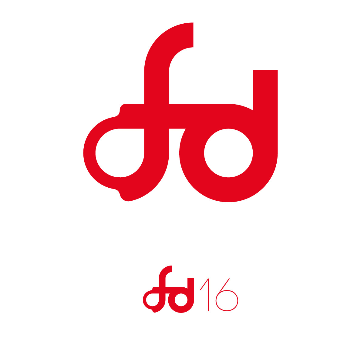
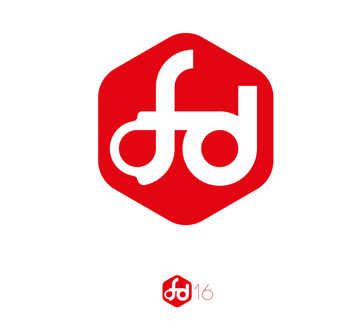
Single color version
Pre-Versions
The images above show the final version of the logo. But getting there wasn't that straight.
I started with three designs. Two of them didn't make it, for obvious reasons.
I started with three designs. Two of them didn't make it, for obvious reasons.
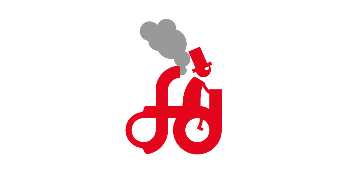
#1
Me: „A ligature of f and d. Possibly being drawn in a single line.“
Client: „Looks like a bicycle.“
Grr … once you see it like this, you can't see it any other way. Or maybe like a steamroller. But not like an event logo, definitely.
#2
Me: „An abstract signet for F and D. Recognisable, flat with an interesting tension of negative space.“

Client: „Reminds me of a bird.“
Okay, I'd rather see Liam Gallagher. But of course #2 is out.
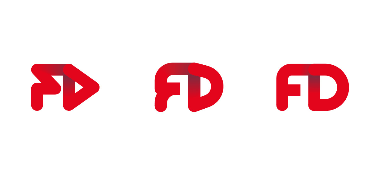
#3
Leaving number three as the only survivor. This draft already shows the main features of the final design: A single line and an implied third dimension by overlapping layers and a gradient indicating a drop shadow.

But it still was to angular and spikey. So I made it more readable even though it isn't a single line anymore.
I tried some variations for the shadow but kept to the first idea of a simple gradient.

In the end the final design was all rounded.

Needless to say that the client's input was enormously valuable. The team over there always had a perfect sense for a good or a bad idea.

