What i did mostly did was change the opacity, but i also the colours slightly. The shapes i chose were square because Squares just look more nice. I chose the colours orange and yellow because they look cool and they feel warm.

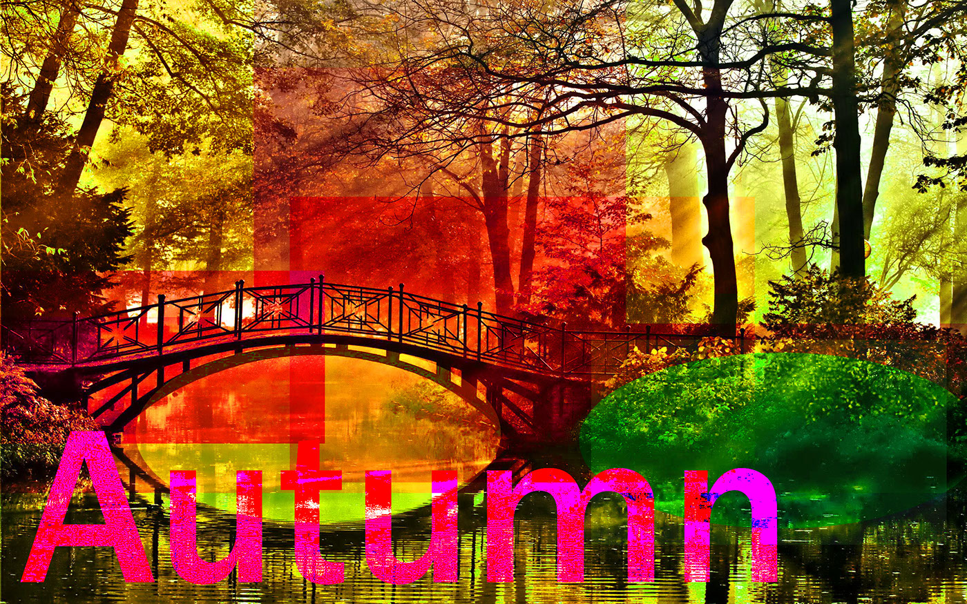
To get this effect on this photo i mostly messed around with the saturation. the shapes i used were squares with different levels of saturation, and hue. The image was a high quality image i found on google images
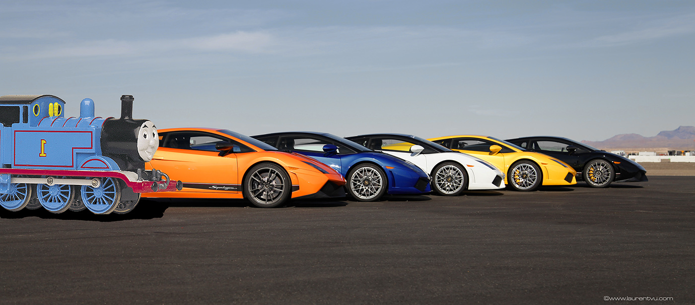
To get this image got a train image from the internet. Then i cut the image and put it in a different image which is the background. i adjusted the saturation and HUE to make the image look more natural. I also made a shadow under the train took look more natural.
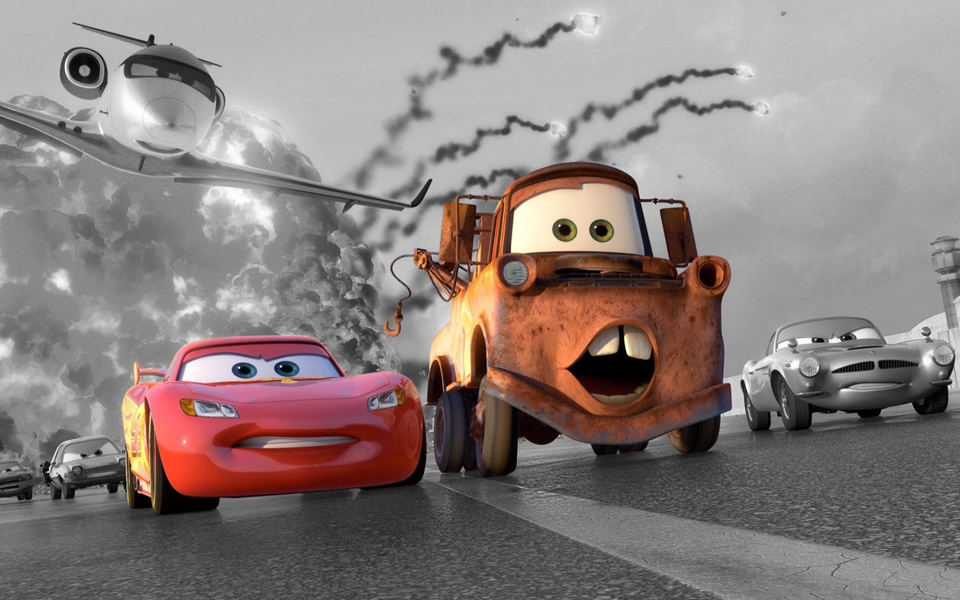
All i did was select the car and the tow truck, then inverted the image, then i changed the background to black and white.
clone stamp easy AFTER. it was really easy all i did was use the clone stamp with about 15% hardness.

clone stamp easy BEORE
clone stamp BEFORE

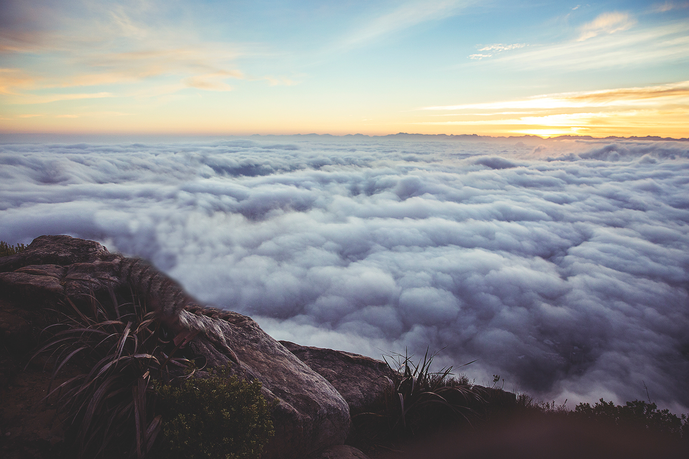
clone stamp after. I used the clone stamp with soft hardness for the clouds and hardness when i was doing the edges.
Magazine cover clone stamp BEFORE
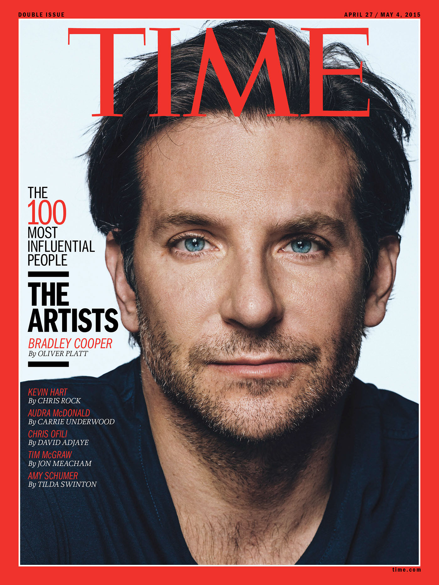
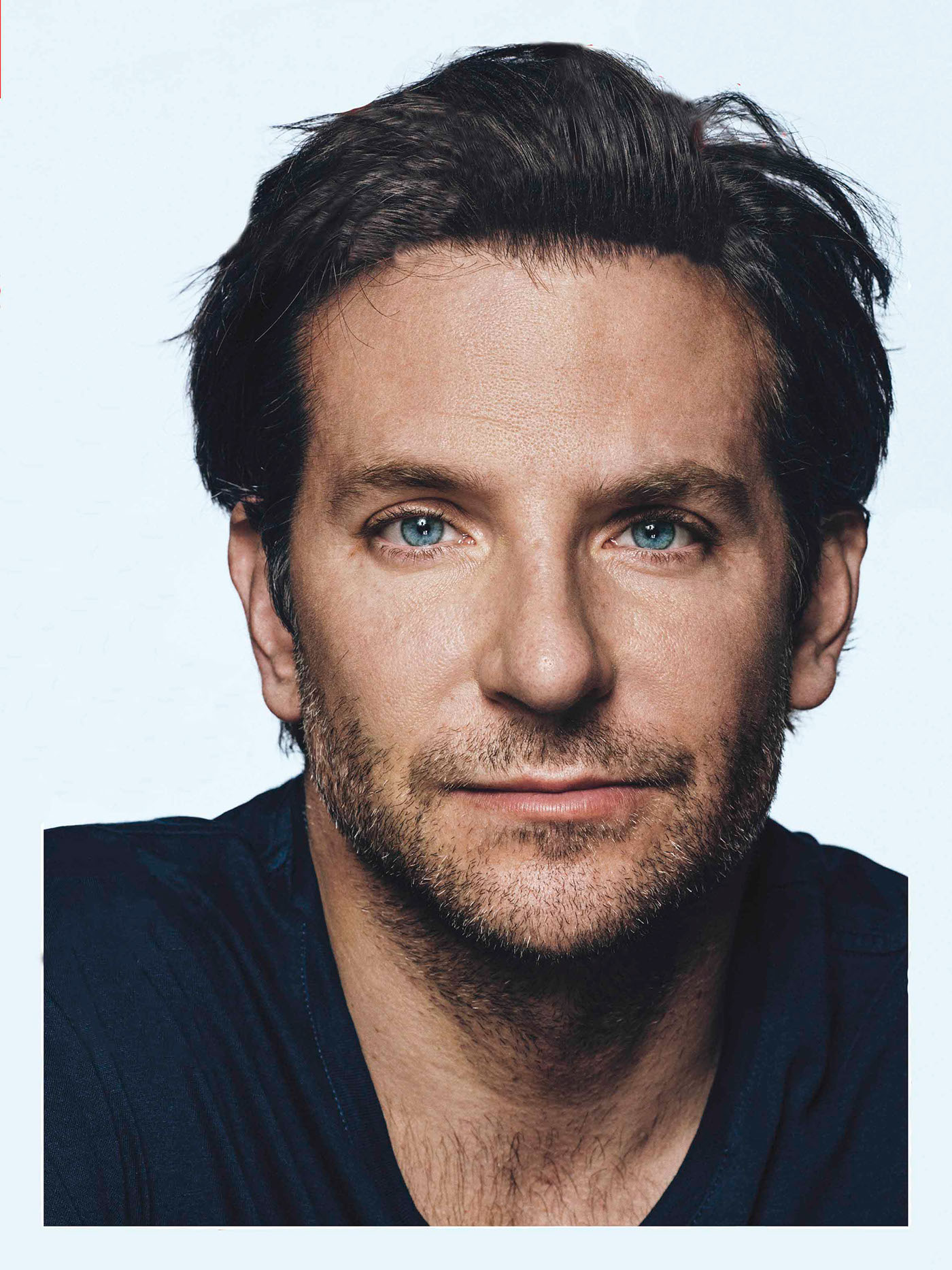
Clone Stamp Magazine cover. I used the clone stamp mostly to take the letters away. the hair was tricky but the other small letter were not to difficult.

The tool i used was the clone stamp to repair this image. that was preety much it and used different hardness.

to get this effect i used the burn tool to make the part around my eyes darker. I got an image of a skull and kept the teeth to make it look like my skin is ripped off and i got a messy texture from google and that how i got the mess on my right side.

First i traced the image and then started using diffrent colours to make a look a little real. the Tools I used was paint brush and pencil tool. There a diffrent mixtures of colours to make the details. The hair was tricky but it worked out okay.

I used adobe InDesign to make this recipe. I used these colours because they matched the chicken. The Font was helvetica for everything except for the title.

For this movie poster i got the image from google images and thought it would be good for a scary movie. I downloaded some fonts from online for the title and the movie poster credits. Took make it look like a movie poster i look at some on the internet to get some ideas.

