

LANDSTREFF FREDRIKSTEN
ONCE IN A LIFETIME
Landstreff Fredriksten is an annual music event for Norwegian «russ», high school graduates, on the historical grounds of Fredriksten
Fortress in Halden. The place where battling soldiers were responsible for the action 200 years ago, is now replaced by partyloving students dressed in red and blue, live acts and DJs.
Landstreff Fredrikstens logo and identity reflects the history of the Fortress combined with the new. As the location will stay the same, Landstreff Fredriksten will each year have a new, unique crowd of people attending and they will dance to new music.
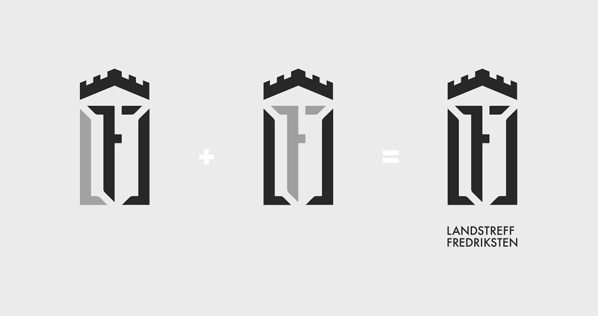
The symbol is also a monogram consisting of an L and an F and some optical illusions.
Design: Page Black / Client: LTF as / Hoodie photo: © Kine Jensen / Film & photos: © Landstreff Fredriksten


www.landstreff-fredriksten.no | facebook.com/landstreff.fredriksten
Thanks for watching.
Please press the nice thumb below.
Thanks for watching.
Please press the nice thumb below.


