Omega Consultancy
Corporate Identity
OVERVIEW
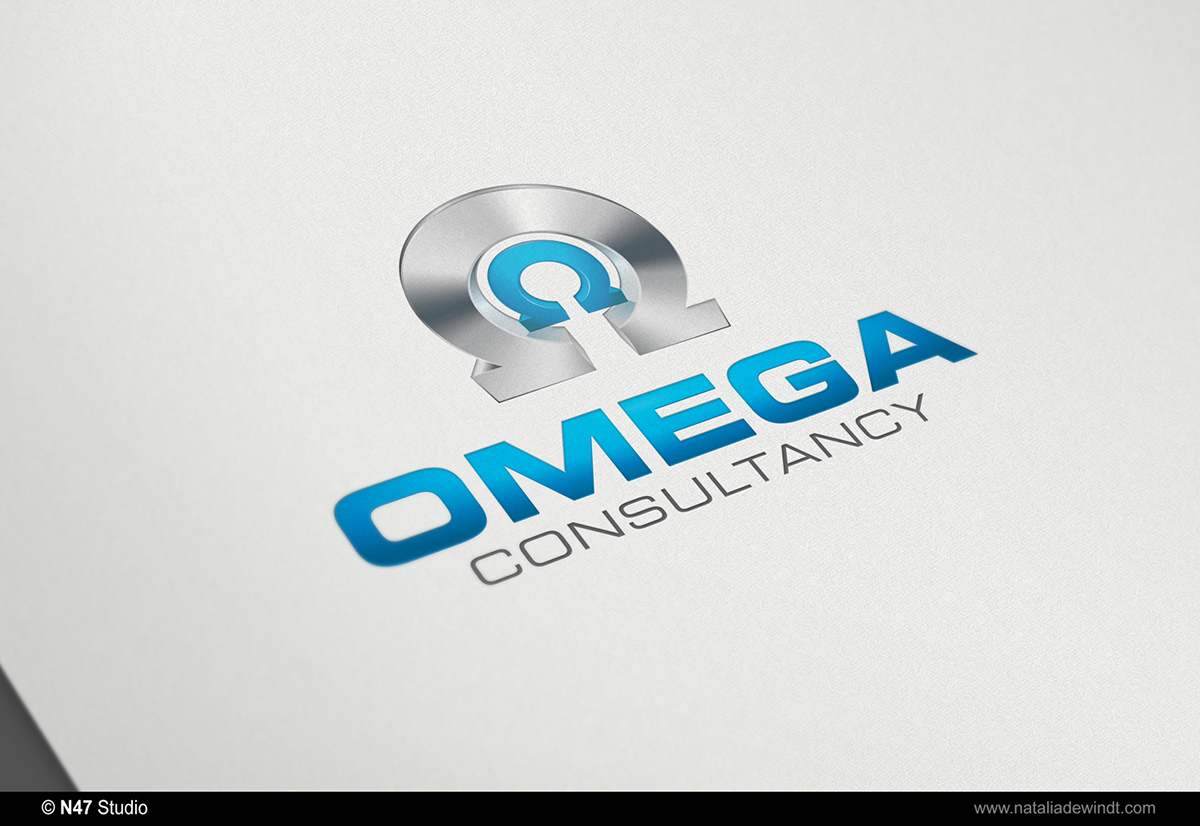
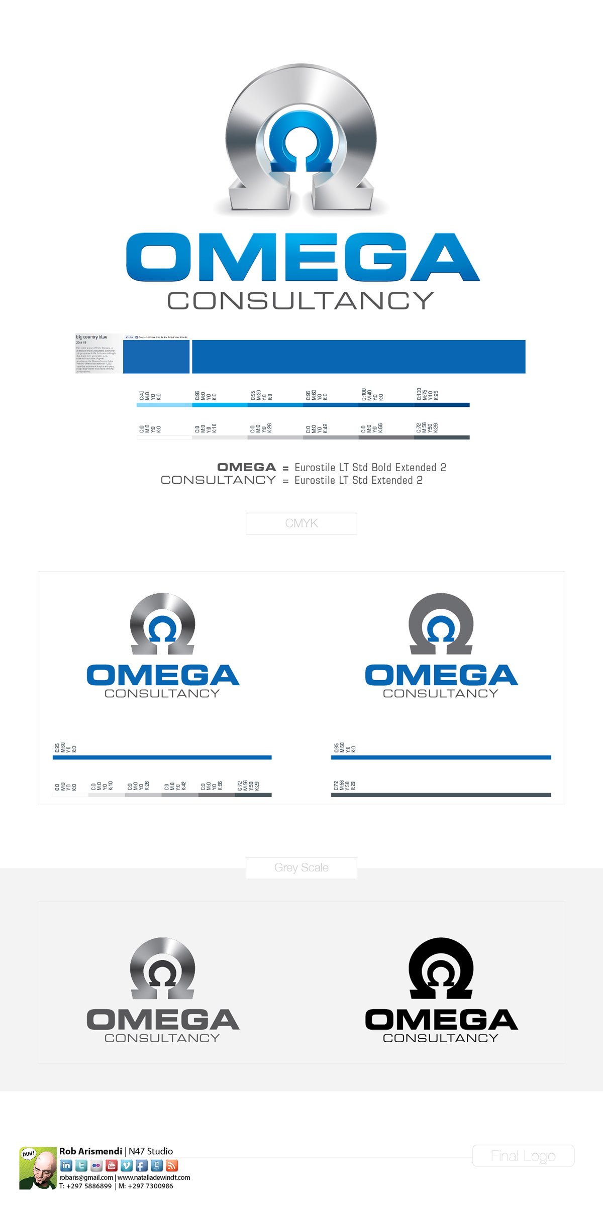
We created an elegant, eye-catching, memorable identity that is quite distinctive from any in the competition. The logo is composition of geometric shapes; symmetry and form are best reflection of client business profile.
To depart from the three-dimensional form that illustrates the multidimensional nature, modernity and quality of services, relates directly to the company’s name, we enriched it with a inner symbol drawing attention to the ‘distinguishing core” of each department.
In other words, the big Omega symbol is the company itself and the inner symbol represents the specific department which is the most important feature that we wanted to highlight in this project.
WHAT I HAVE USED
Illustrator & Photoshop


Omega Consultancy
Mock-ups
Mock-ups