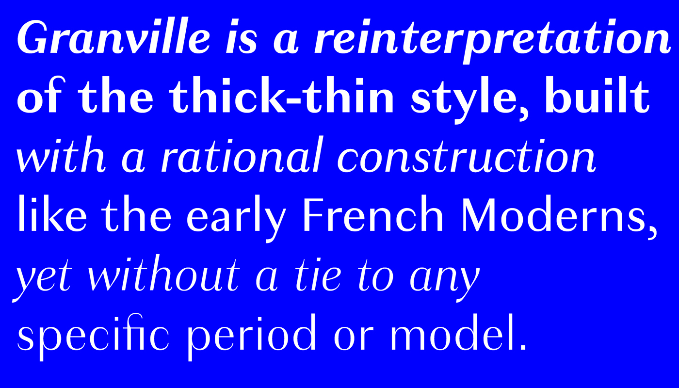
The modulated sans serif — that is, a sans with visible contrast between thick and thin strokes — was once a mainstay of signs and posters, as well as advertising text during the mid 20th century. These faces lost their appeal with the rise of Modernism and were rarely seen over the last 40 years, but Jean‑Baptiste Levée rediscovered their charisma for his latest release. Granville is a reinterpretation of the thick-thin style, built with a rational construction like the early French Moderns, yet without a tie to any specific period or model.
Design: Jean-Baptiste Levée. Team: Mathieu Réguer.