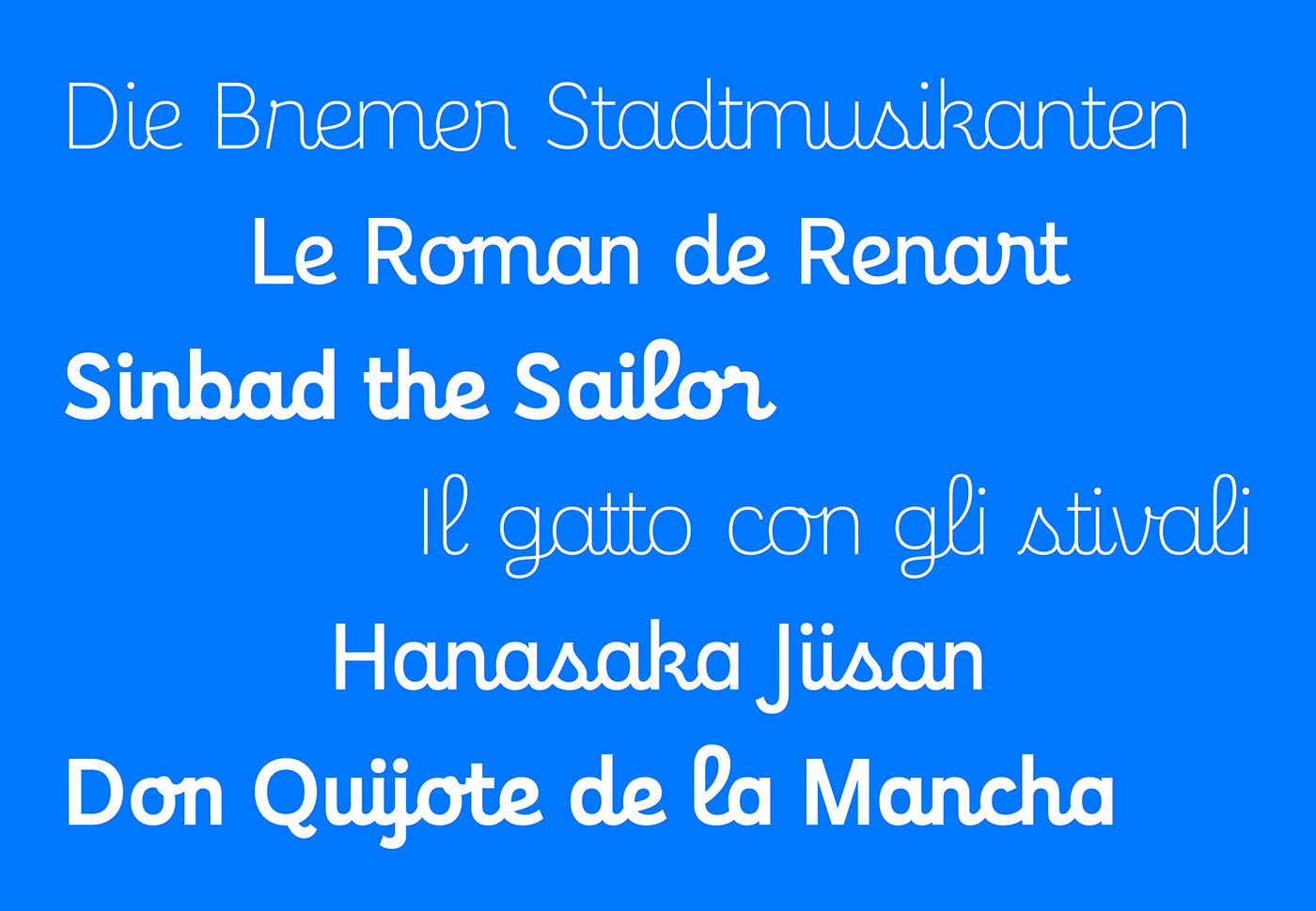
Normally, due to their handwritten origins, script typefaces are sloped. This makes an upright script something of an oddity. Yet there is something about Enfantine that makes it welcoming and familiar rather than off-putting and strange. Perhaps it’s the memory of learning how to write; some of Jean-Baptiste Levée’s references were cursive educational models from Holland and France. Or maybe it’s the relationship to youthful brands; like the Nathan imprint’s books for children for which Enfantine was originally designed; or Catimini, a classic kids’ clothing label and Albert Boton’s Pam-Pam typeface that inspired its logo.
With its plain lines, unassuming disposition, and clean, roman sans serif uppercase, Enfantine is charmed by the past, but doesn’t live in it. The family has three weights, plus Baby, a bold style with soft ends.
Design: Jean-Baptiste Levée. Team: Yohanna My Nguyen, Loïc Sander, Yoann Minet, Ben Kiel.