This project was developed to Typography unit at the University, with the goal of creating a visual alphabet.
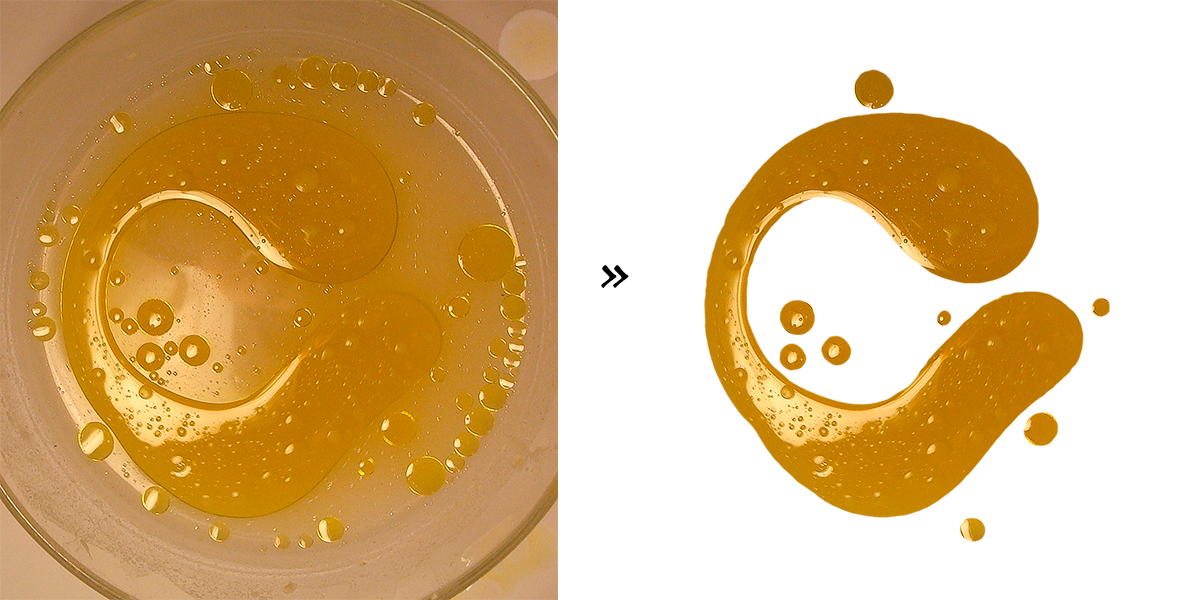
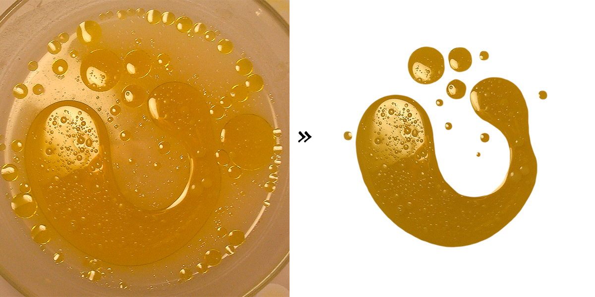
My choice focused on the promotion of olive oil as well as essential and national product, conveying its richness and purity. For this purpose I used a container with oil, water and flour in order to obtain the shapes, desired texture and consistency.
My choice focused on the promotion of olive oil as well as essential and national product, conveying its richness and purity. For this purpose I used a container with oil, water and flour in order to obtain the shapes, desired texture and consistency.
Este projeto foi desenvolvido para a disciplina de Tipografia I para a universidade, com o objectivo de criar um alfabeto visual.
A minha escolha centrou-se na promoção do azeite como bem essencial e produto nacional, transmitindo a sua riqueza e pureza. Para este efeito utilizei um recipiente com azeite, água e farinha com a finalidade de obter as formas, textura e a consistência pretendida.
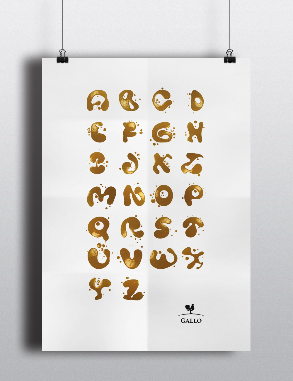
The process
O processo