With such a modern and disruptive proposal, we needed to create a brand that translated all these concepts in an equally and direct way.
In this scenario comes the NuBank.
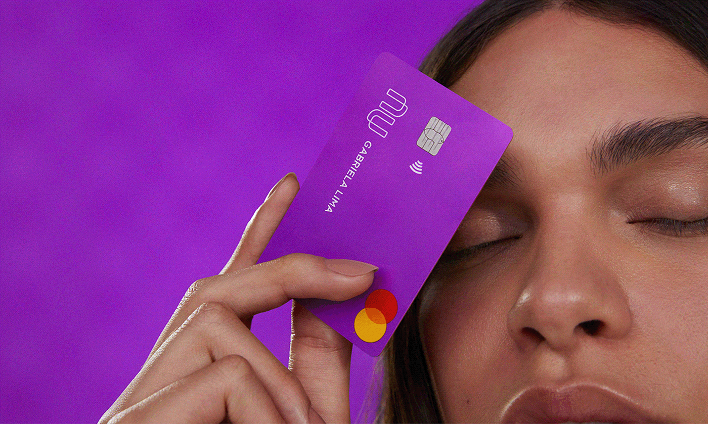
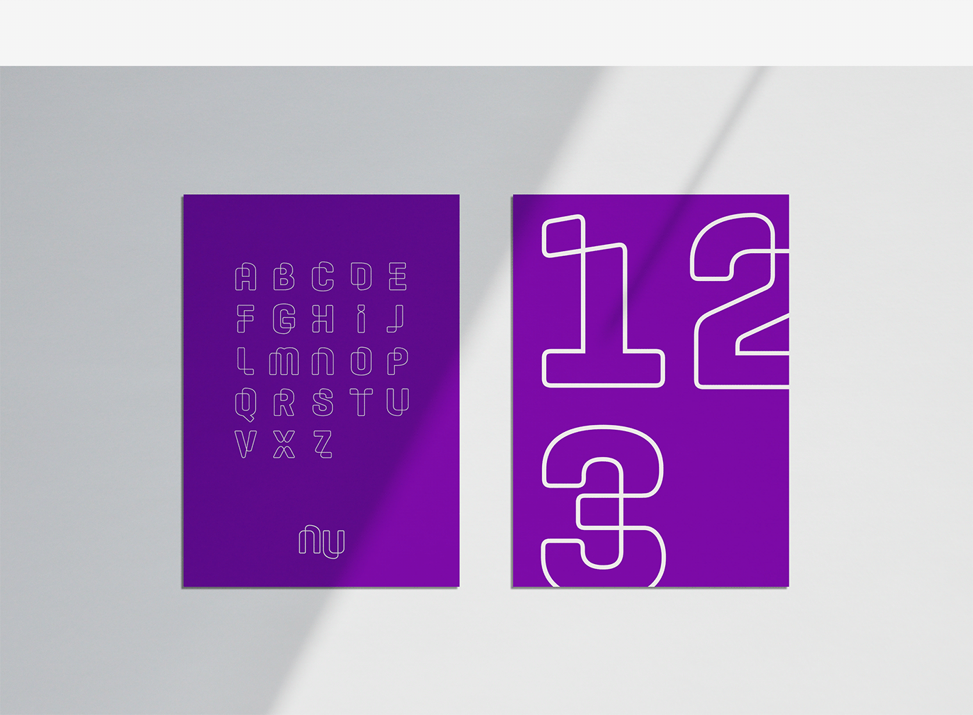
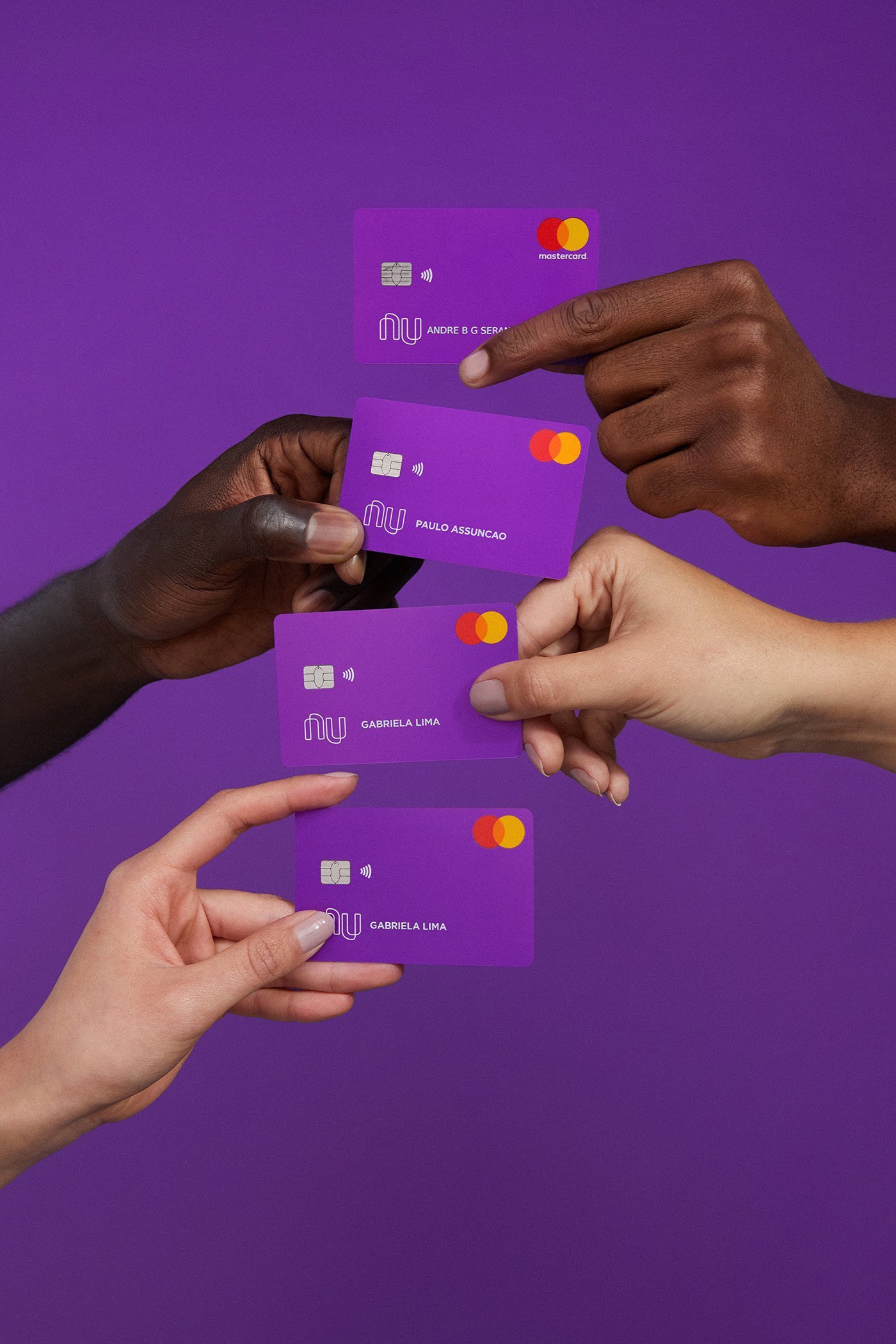
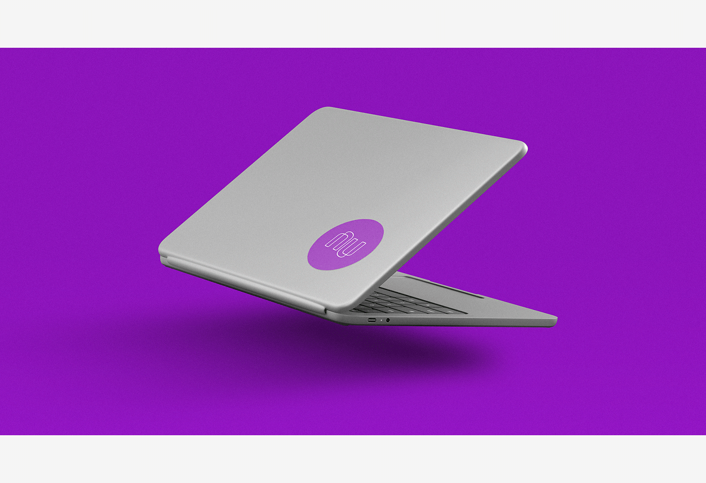
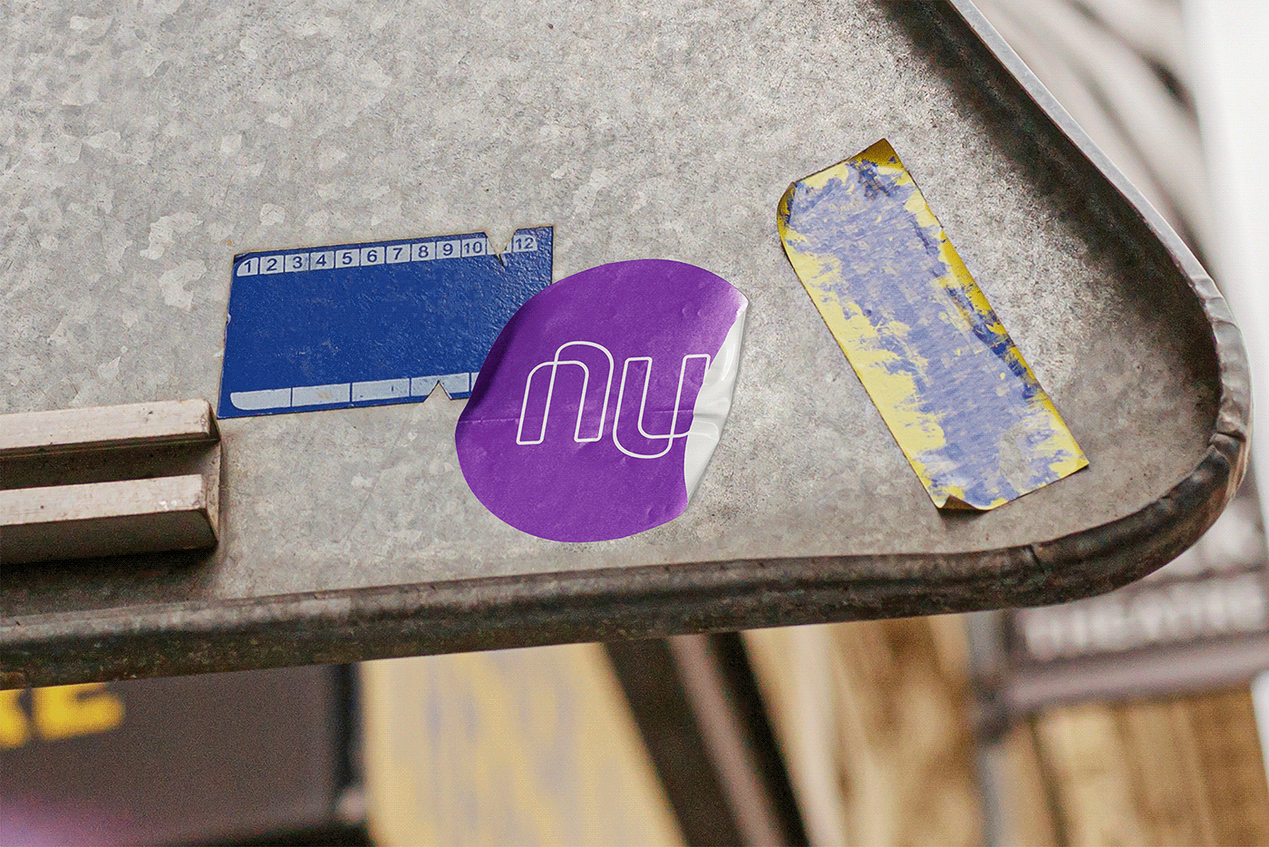
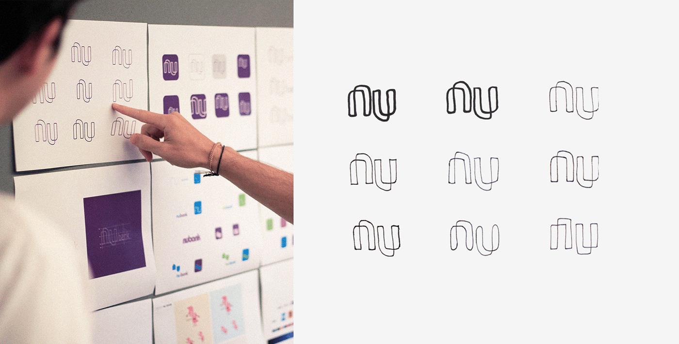
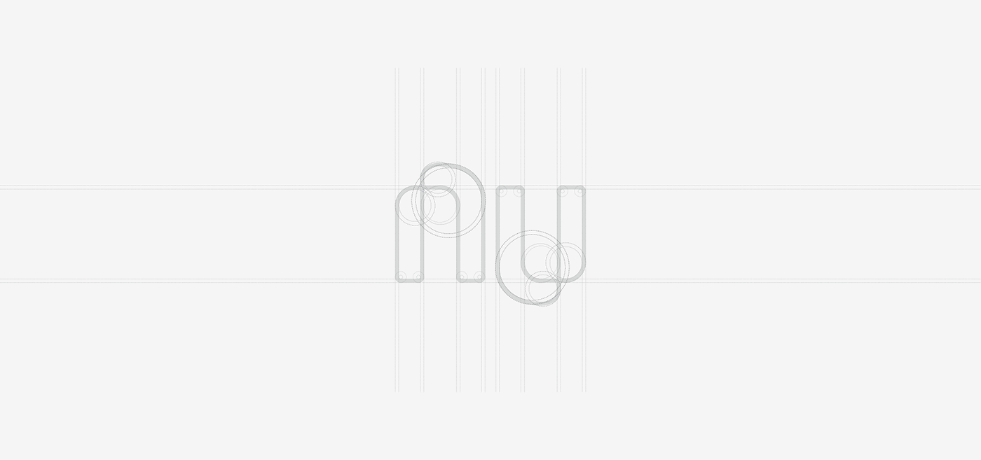
As its name suggests (nu means “naked” in Portuguese), transparency was the north in the creation of the project. While the geometric lines bring the solidity of the financial segment, the fluidity and the use of a leaked graphic system show us the modernity and transparency of the brand.
With as ambigram logo, which can be read upside down, and hitherto little-used color system in the segment, NuBank, now also known as “roxinho” ("purply”), has quickly stood out in the marketplace as a modern, widely recognized and desired brand.