

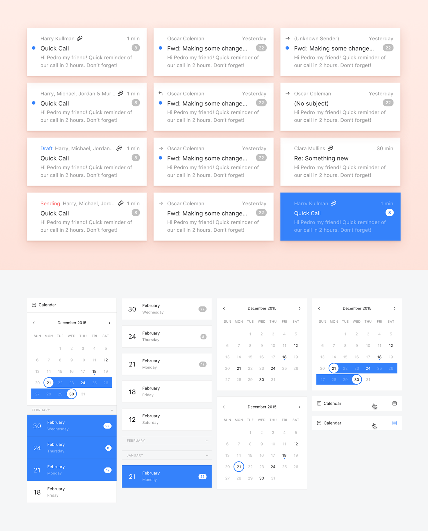
Faces
With Mailcube you can browse your inbox using faces. Each face filters the next. You can add and reorder them to better suit your needs. This is one of the core elements that makes Mailcube unique and an excellent tool to organize your emails.


There are 5 types of faces: messages, contacts, attachements, calendar and tags. These can all be rearranged to filter the next face. For example, if you have contacts on your left and select one them, all of the faces on the right will only display content relative to that contact.


In every email client there are numerous permutations of the same information. Take email for example: it can be unread, read, have an attachment, have a subject, been forwarded, etc. All of these possible combinations had to be designed for in order to keep the user accurately in sync with his email workflow.
Cubes & Contexts
Notifications will only appear if the message fits inside the context.This way you can easily separate your work life from your personal, allowing you to increase your productivity at work or dedicate time to your family without having work to interfere. Drag messages to a cube to organize your mail. If the user adds a person or a tag, all their messages will fit inside that cube.
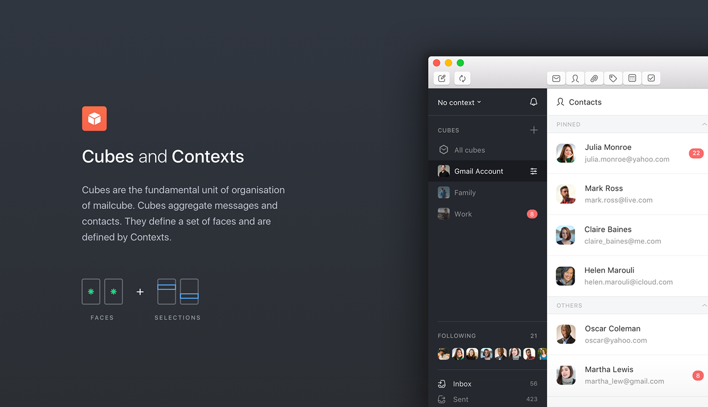
If you are inside your Home Context, you can have various cubes such as bills, vacations, purchases and within each of these cubes you will have a set of contacts and messages that are specific to that cube.

Design on a grid
When you create such a complex platform it is essential to stick to an incremental grid. In this case we used multiples of 8 pixel structure ensuring that any element we created would work alongside the others.

Typography
Mailcube is being developed for MacOS and it’s main purpose is not only to organize information but to display it, so it was essential for the text to have unmatched legibility, clarity, and consistency. To achieve that we used Apple’s system font, San Francisco UI Text.

Color Palette
To focus the user’s attention on the contents of each new email, it was essential to use neutral tones of black white and grey, using only red for notifications and blue for selected elements.

Iconography
To focus the user’s attention on the contents of each new email, it was essential to use neutral tones of black white and grey, using only red for notifications and blue for selected elements.

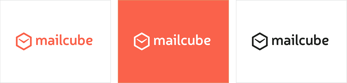
The Mailcube Brand
The Mailcube brand was created with junction of three elements. First the cube which is the foundation of the brand itself, then a clock that represents email time saving, plus the envelope that represents the product itself, email.

Using an altered version of the Neris font, the mailcube lettering lives harmoniously with the glyph, creating a very balanced logotype that works very well in both digital and graphic platforms.
Landing Page
The Landing Page was the last piece of the puzzle, as it was created as an online brochure of Mailcube’s core features, capturing the user’s attention and allowing them to download the app.
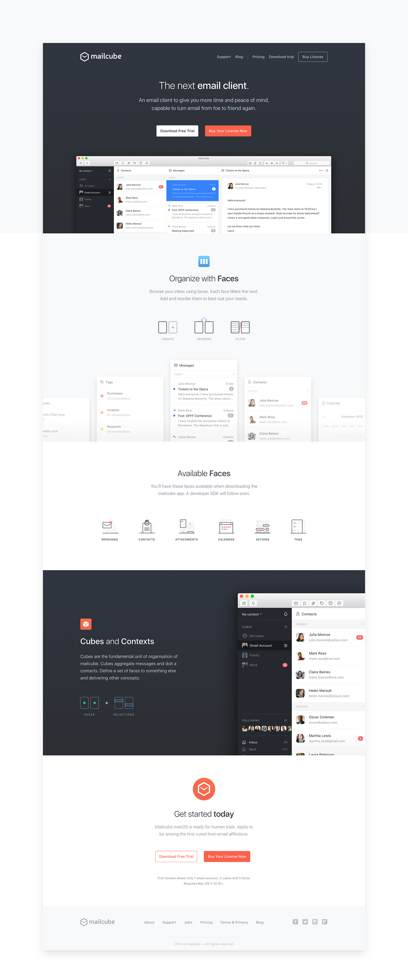
For the Contact section of the website we found a creative way to display the form. We created a dynamic and interactive contact form in an email composer format of the app.


Thank you for watching!
Visit us on significa.pt or send us an enquiry at hello@significa.pt
Designed by Significa in the heart of Porto.


