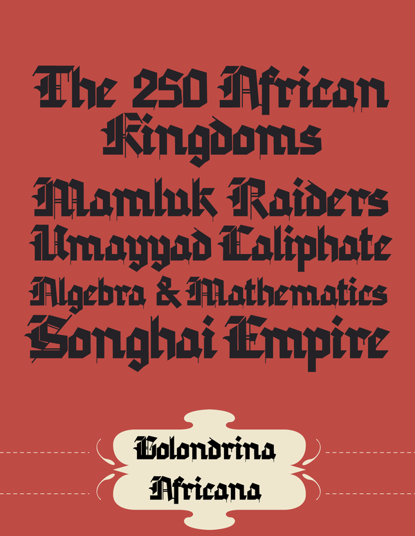
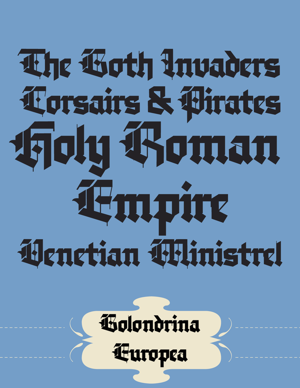
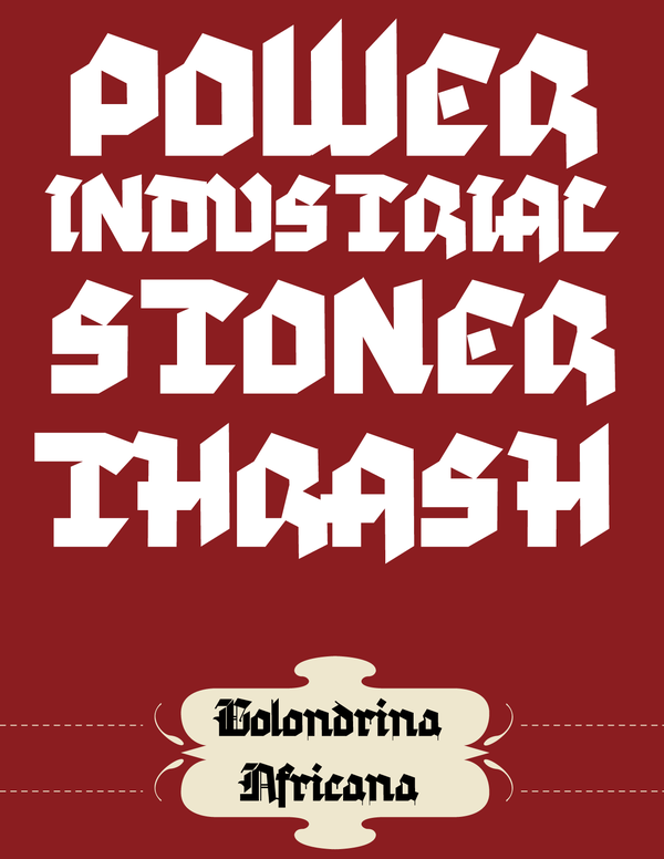
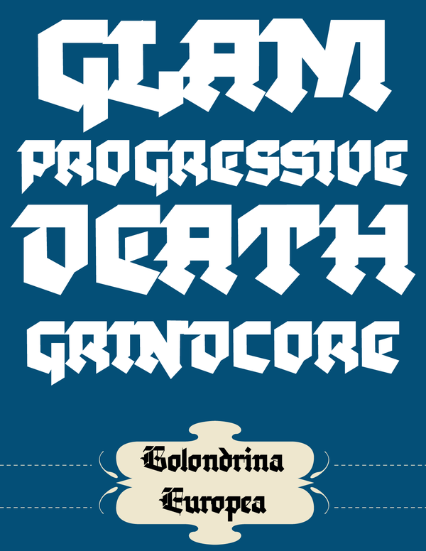
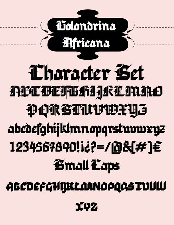
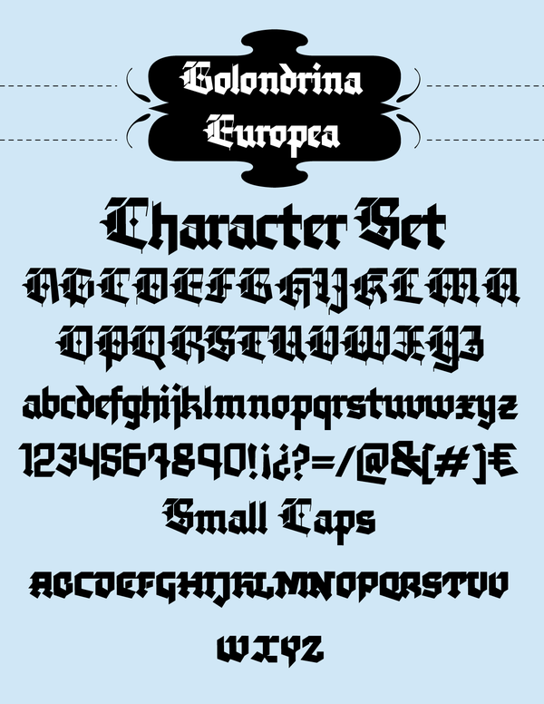
Golondrina was born from the need of a more clean and geometrical Blackletter, and also from a quest to create more powerful looking lowercase characters. The result is a sharp, fresh, loud and assertive medieval looking typeface.
Dołącz do Behance
Załóż konto, lub Zaloguj się,aby wyświetlić spersonalizowane rekomendacje, obserwować autorów i nie tylko.
lub
Dołącz do Behance
Załóż konto, lub Zaloguj się,aby wyświetlić spersonalizowane rekomendacje, obserwować autorów i nie tylko.