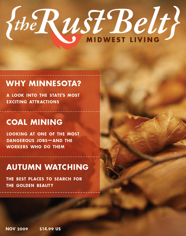
This was a student project magazine that I like to think of as the “Discovery Channel” version of Midwest Living. The target audience was active, working adults in their 30’s–40’s. The design was to make the magazine strike a balance between modern and blue collar. The use of Futura Bold comes from my fascination with Aaron Draplin and the way that he can somehow make this “futuristic” font look everyman-Joe. The full logo on the front cover can be replaced with the leaf, or “{RB}” throughout the magazine as branding variations in tight spots.