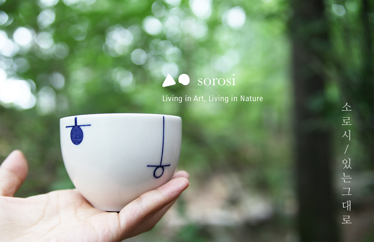
sorosi
소로시
Art Direction / Product Design : KIM SUNYOUNG

BRAND IDENTITY

‘sorosi’ means ‘remained intact’
Focusing on the beautiful forms of everyone’s lives and inheriting the heritage through the reinterpretation of Korean traditional art and culture from a modern viewpoint. It starts with Sansuhwa(Korean landscape paintings in the 17th Century Chosun Dynasty) series
소로시는 ‘건드리지 아니하여 조금도 축이 나거나 변하지 아니하고 그대로 온전한 상태로’ 라는 뜻을 가진 순우리말입니다. 소로시는 자연스럽고 아름다운 삶의 방식을 만들어갑니다. 조선시대 산수화를 현대적으로 재해석한 [산수화 시리즈]를 시작으로 우리의 아름다운 전통공예와 미술을 현대적으로 재해석한 디자인 제품들을 만들어갑니다.
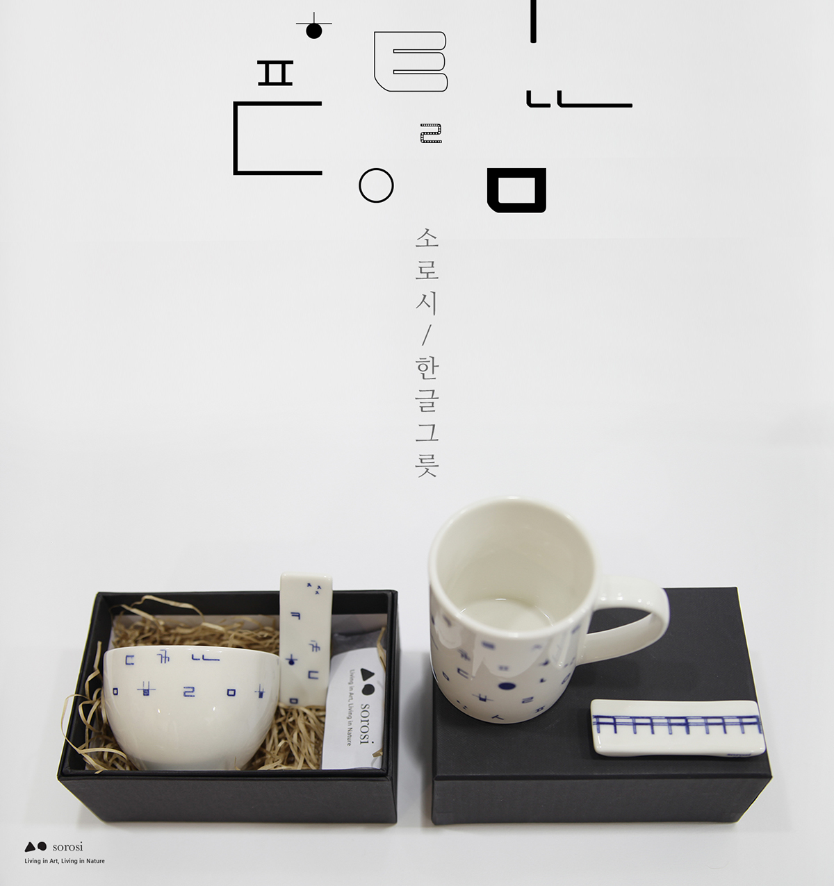
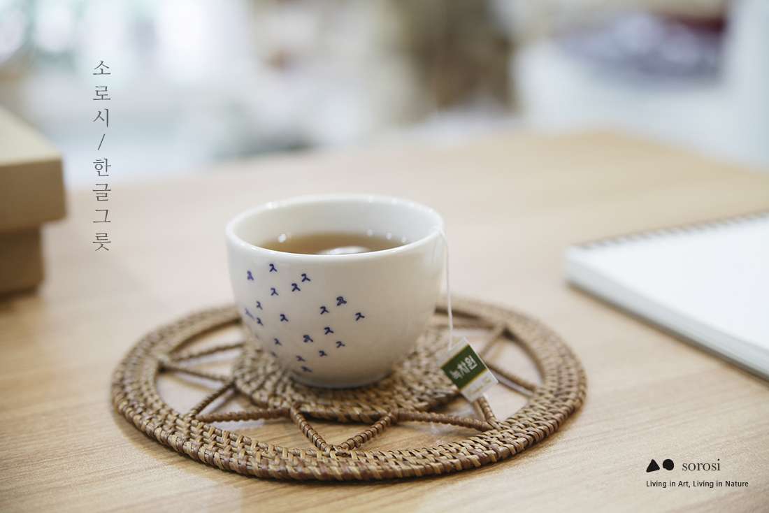
HANGEUL PATTERN SERIES
PLATES / CUPS / ECOBAGS
한글 패턴 시리즈
14 consonants & 14 patterns
each designed with different design elements


The reinterpretation of Hangeul
The Korean script has sometimes been called the most scientific writing system in the world.
It’s also great with its esthetic shape.


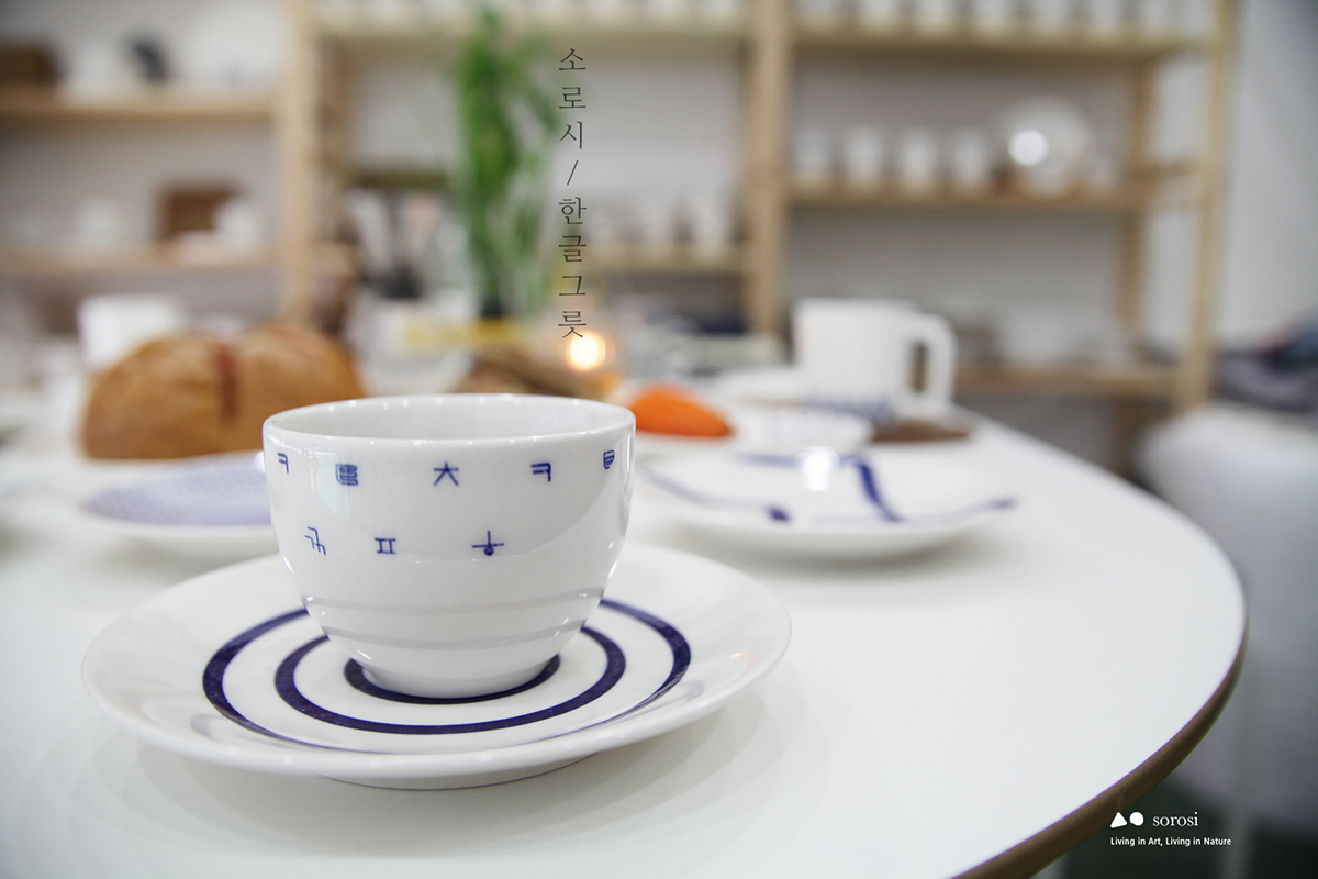

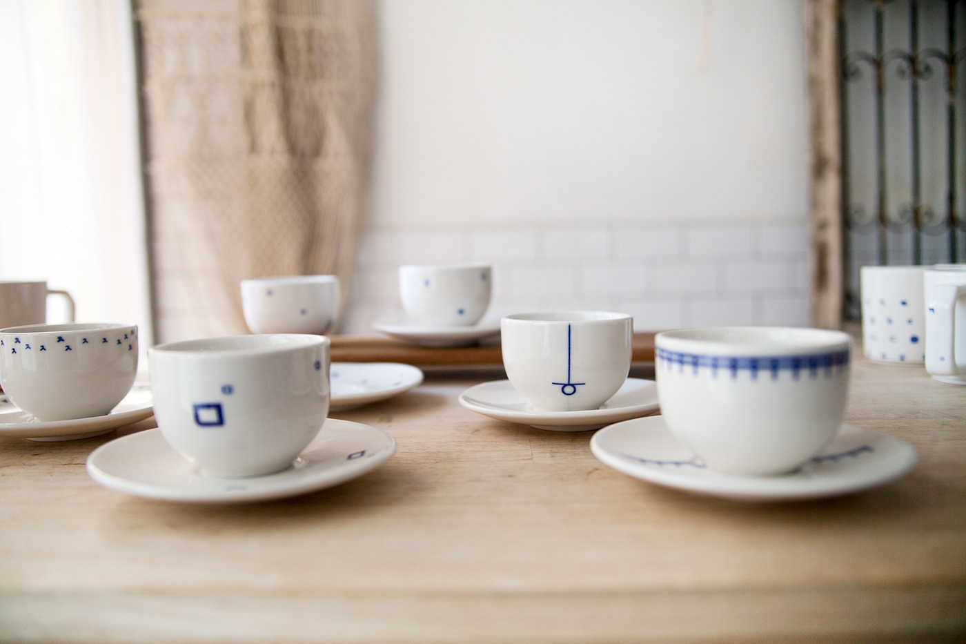


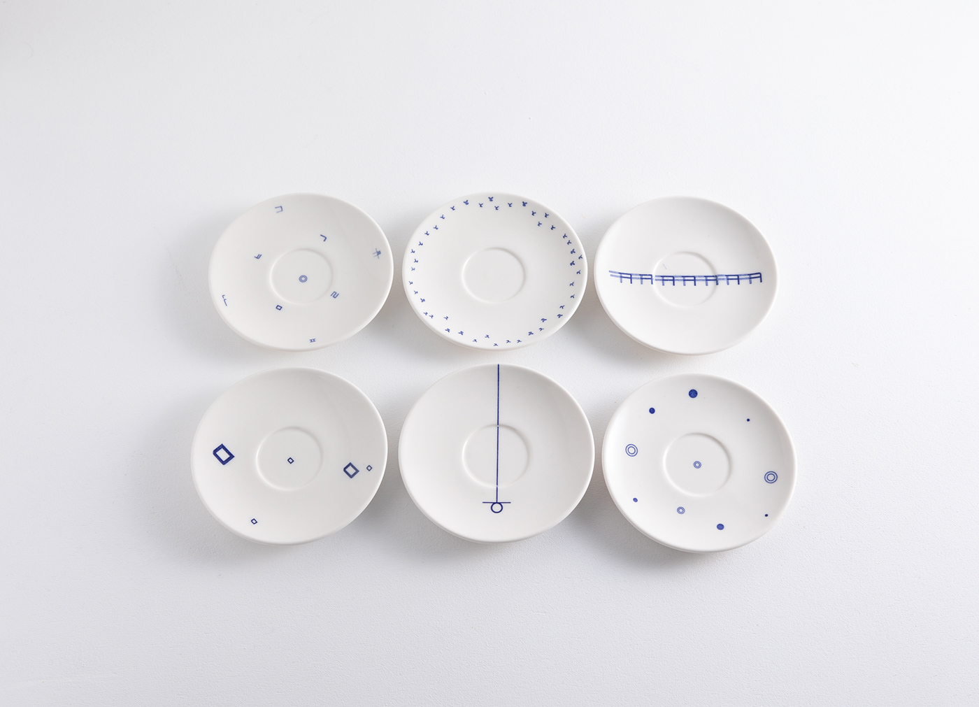


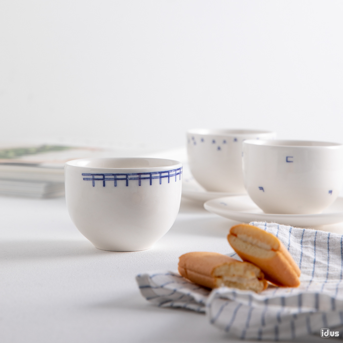
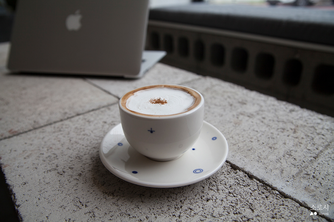

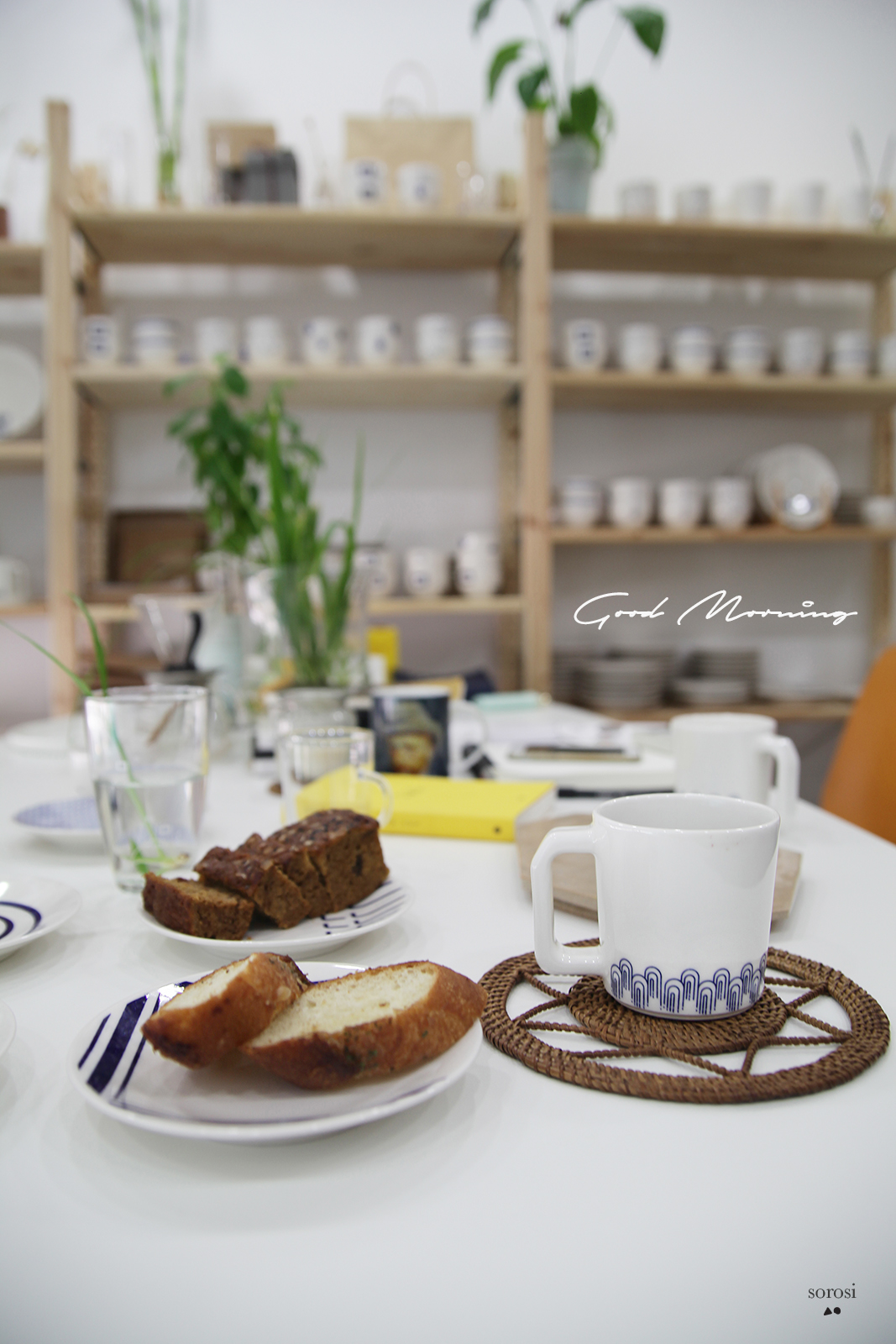
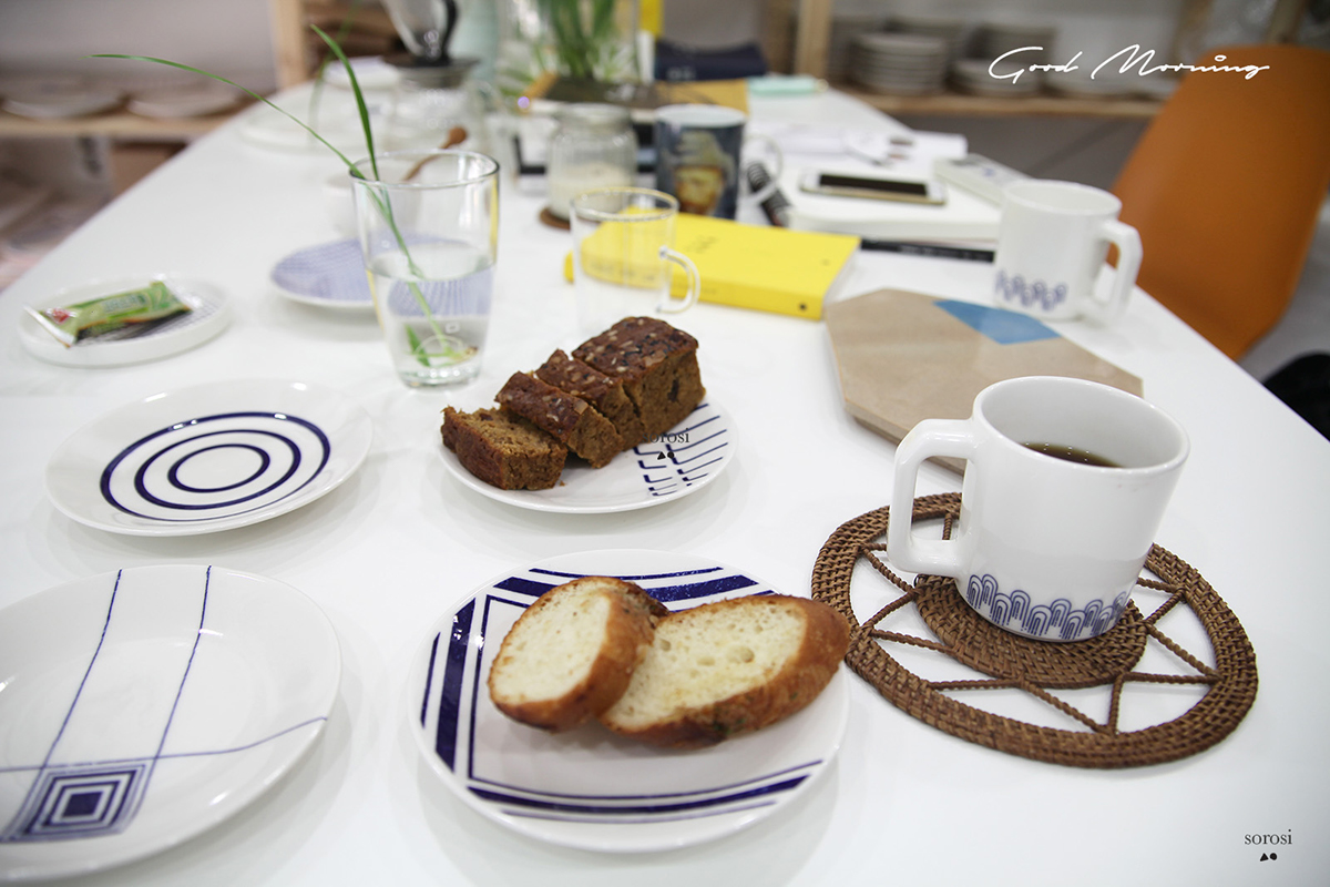
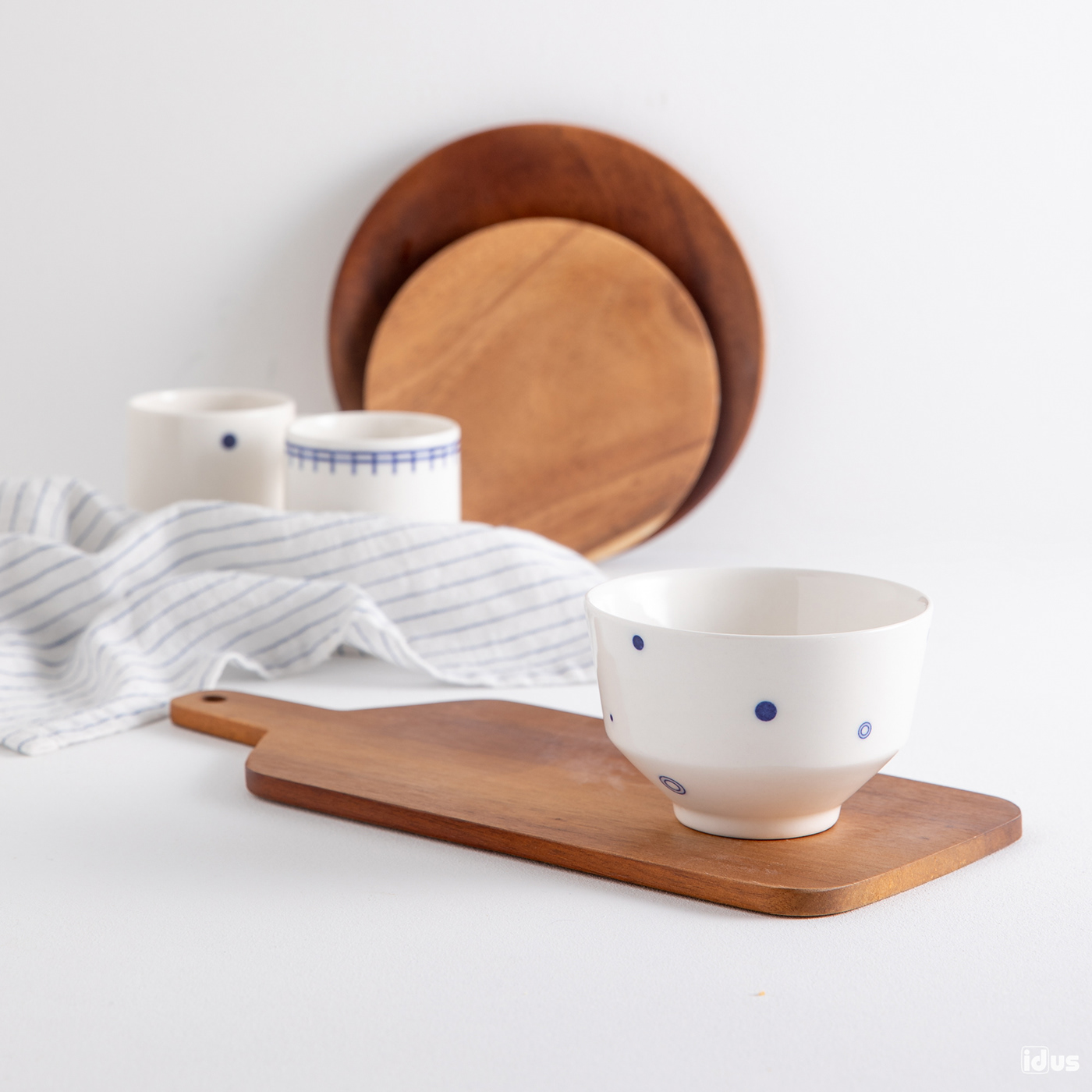


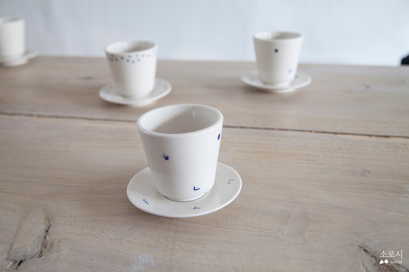


We hope to make valuable products which have beautiful appearances
representing the past and the present of Korean traditional arts and crafts.
studiosorosi@gmail.com
facebook.com/sorosiliving
Instagram: #sorosi_living


