E-shop.gr is a web-based e-commerce platform that sells mostly electronic goods to customers around Greece. They have both a website and an application. The overall app uses greek language so i ll do my best to translate it.
What i wish i knew before i step into the redesign process:
+ The analytics data for the existing application
+ What path generates the company the most revenue
+ Design choices of the existing product
+ Advertising deals with external companies
A Small First Look At Some Problems :

.
Phase #1: User Testing & Strategy
I conducted user testing with 5 users. All of them had bought from E-shop before. Since it was my first real time interviewing and using user/task scenarios mistakes were made, not only at the interview phase but on the technical part too (the 5th user interview was lost trying to upload the video to the cloud ...corrupted file...)
The users were asked to complete a set of task through User Scenarios.
Some examples:
1) "You love photography, a good photo inspires you do to great things, with that in mind you decide that you want to buy a black digital camera from e-shop app. But because your budget is tight this month you want the camera to be no more that 70 euros. How do you achieve this?
User Tasks: Browse, search and buy products (new,used, special offers) / Filtering.
2) "What would you buy from an online E-commerce shop?" <user input>
"Great! Lets say you want to purchase <...> next week. How would you save the product for a future purchase?"
User Tasks: Add an item to your Wishlist.
3) "Remember that digital camera we purchased? Lets get shipping estimates/pricing shall we?"
User Tasks: Follow order details > "When" - "Where" - "How much does it cost again?"
User problems found, from serious to minor ones:
"Stock House" (cheap reused products that can be resold at lower price) was hard to found or, most of the times, not found at all. Users had trouble understanding what it meant.
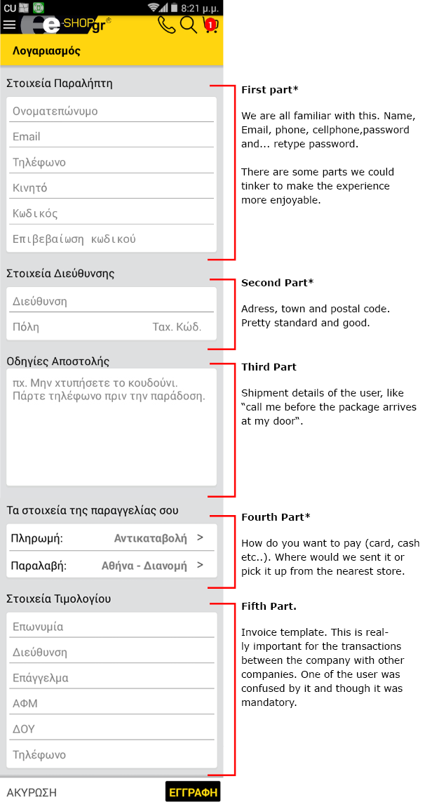
"Sign Up" form is a "headache", though the company is giving the choice of "quick ordering" which is great and really functional.
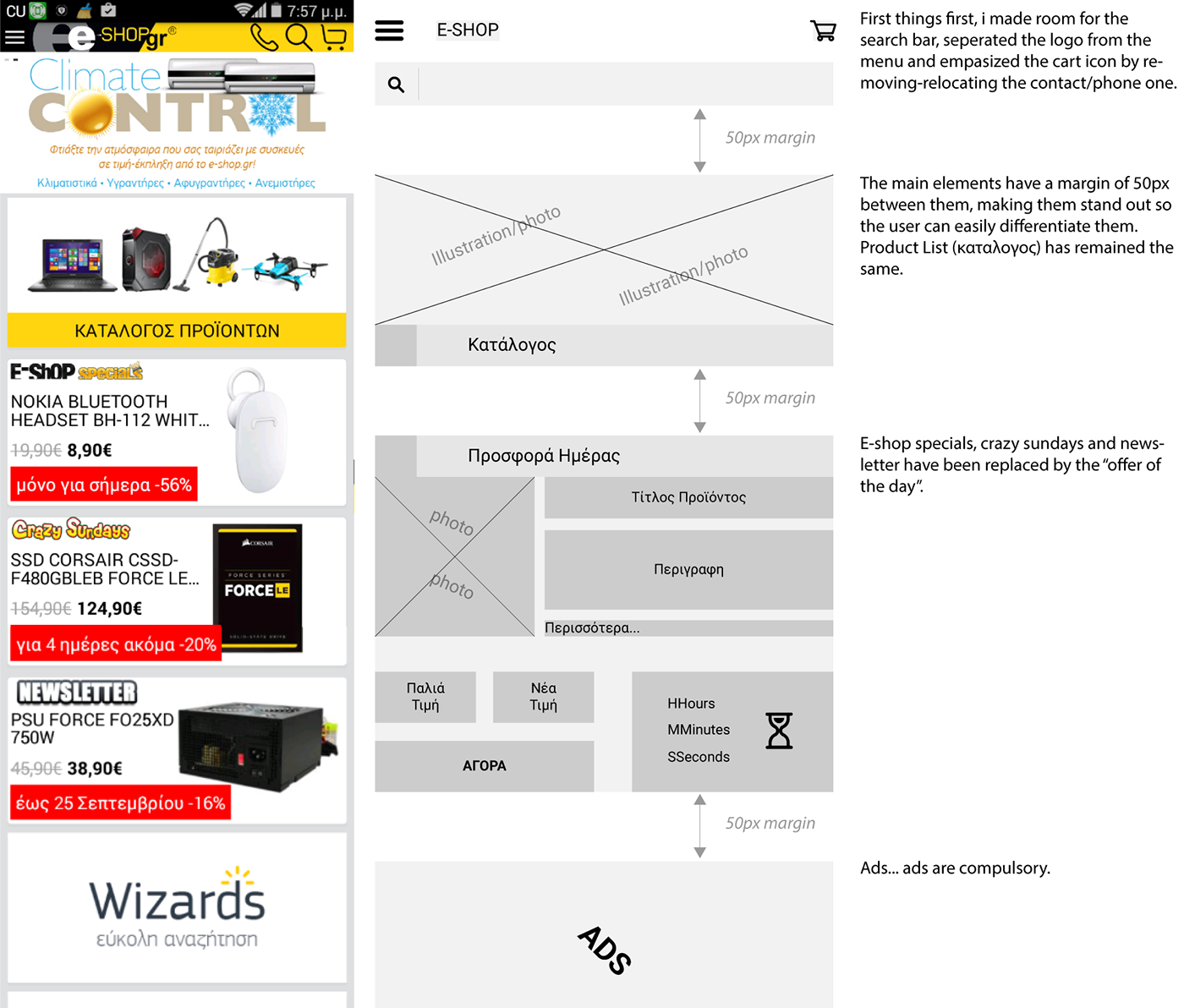
"Products List" and the search bar needs to stand out more, most of non - search dominant users missed it.
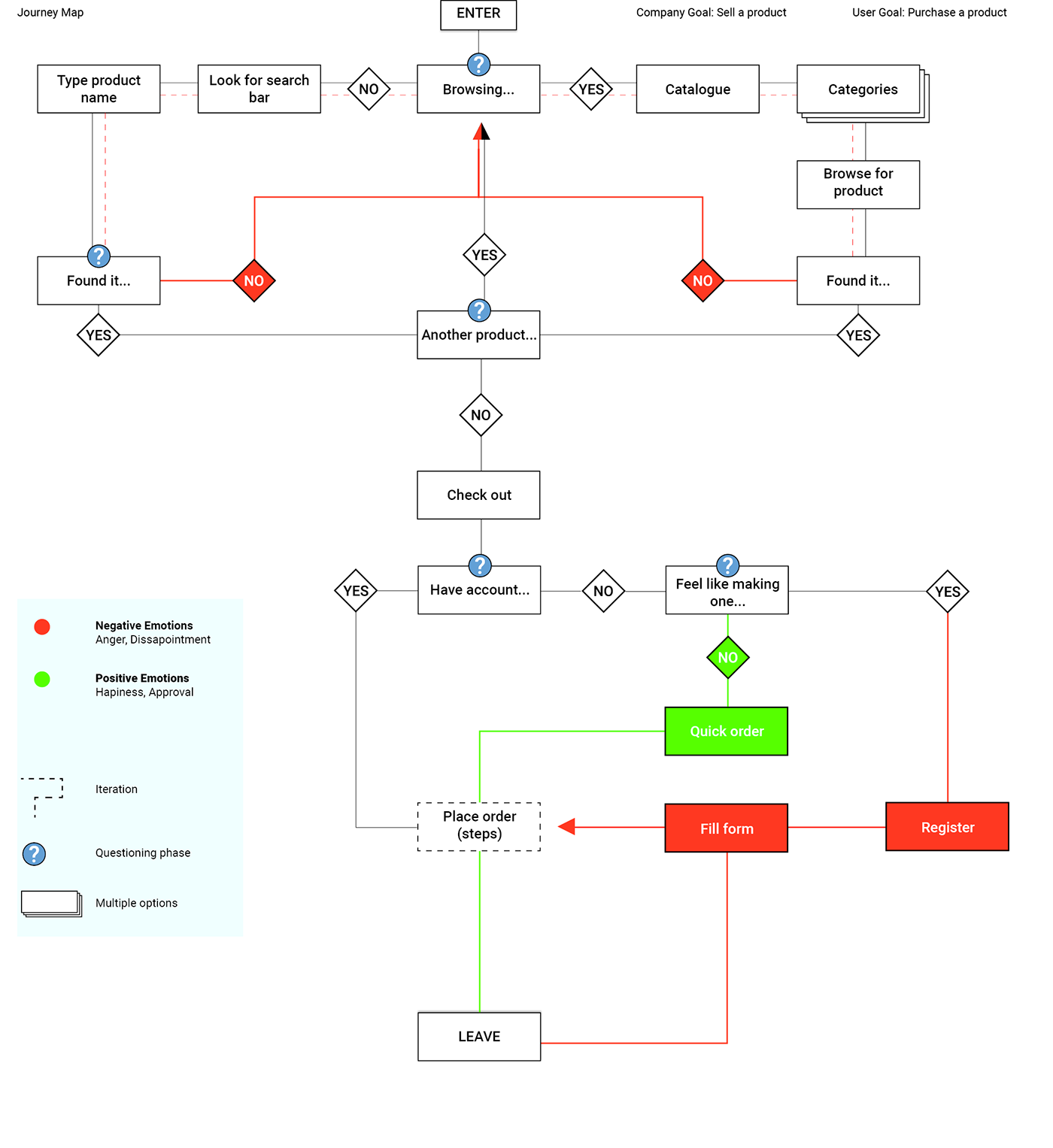
Understanding users better with a journey map:
Phase #2: Wireframing & ideation

So the 'Stock House' has has been replaced and has it's own special place at the main menu.This way users can quickly access cheap, reused
products if they choose to.
Moreover, even when they browse regular products, 'Stock' ones
could make an appearance.
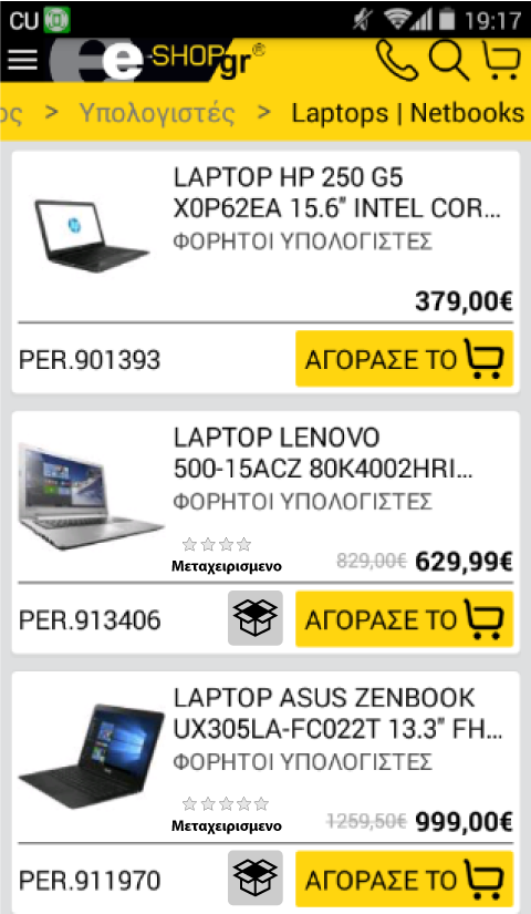
An icon accompanied by text (μεταχειρισμενο) informs that the product is resold. Users could also have the option to turn it off from filters sub-menu.
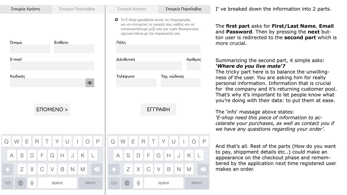
Breaking down the Sign - Up Form.