I was asked to make this years visuals for the "Nordic Creative Talent Award 2016" hosted by Adobe. I will go through the process on this in detail, as the final result drifted quite far from the original idea, and I often find that the process is the most interesting part of a project.
BRIEF
- Create a poster for this years Nordic Creative Talent Award, using your own visual style and taste.
- The poster should – in some way – visualize the NCTA prize ”The Brick”.
- All copy will be written by Abby Priest (NCTA logo, description, dates etc.).
- The poster should include design elements that can be used in other channels.
TARGET AUDIENCE
Graphic designers, art directors, illustrators, photographers, motion graphics – all under the age of 28.
Both professionals and students.
PURPOSE
To get as many creatives as possible to apply for NCTA 2016.
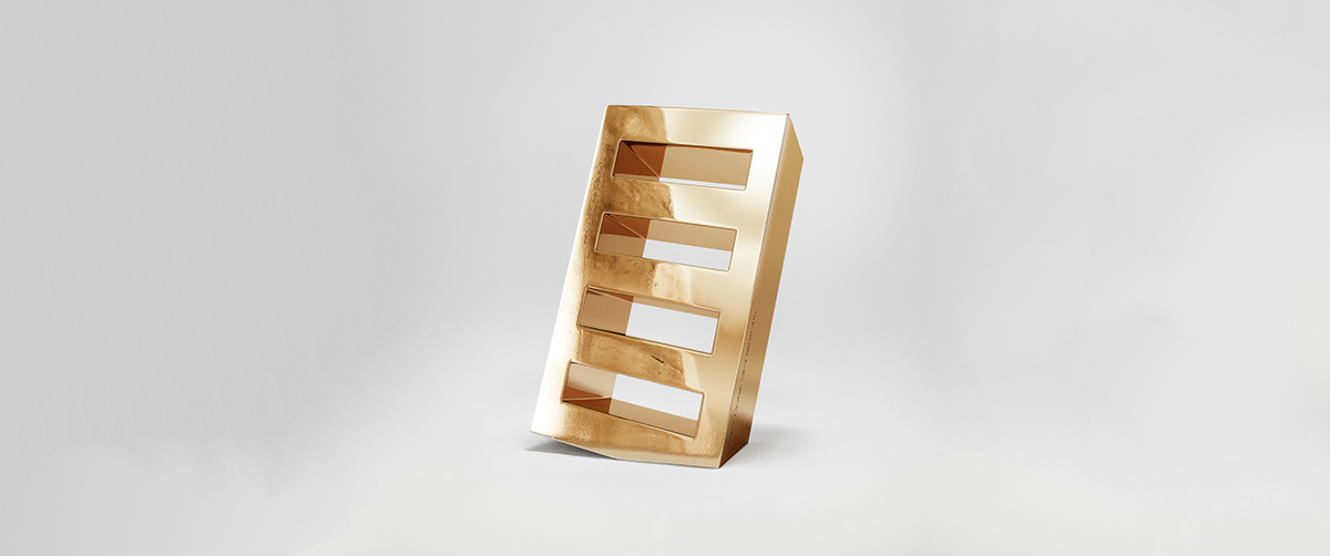
The prize called "The Brick"
IDEA
After receiving the brief I started sketching out some ideas, just simple thumbnail sketches with pen and paper.
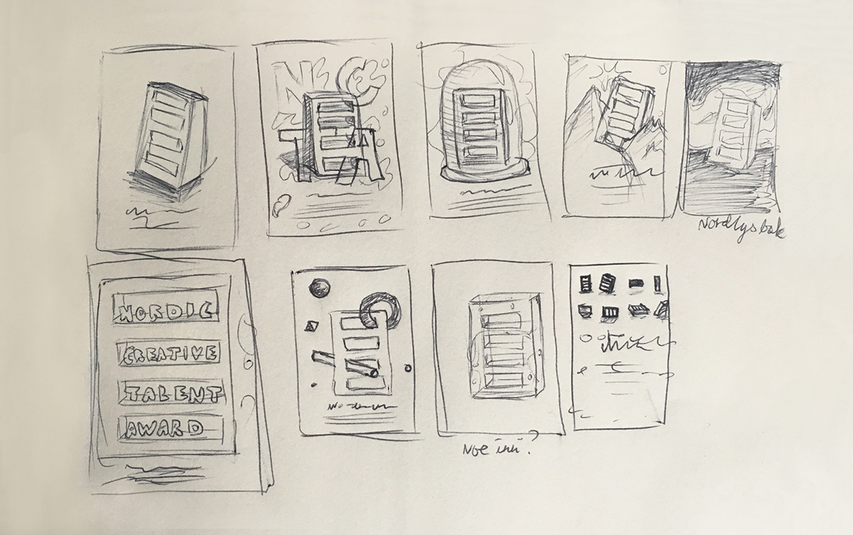
I picked out two of the ideas I believed in, and worked out a simple debrief to explain them for Abbey Priest (Adobe Nordics ad agency), whom I worked closely with throughout the process. This is the idea they chose:
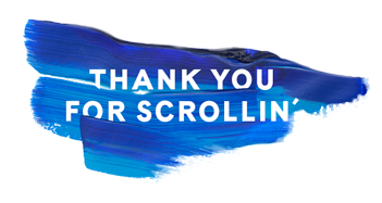
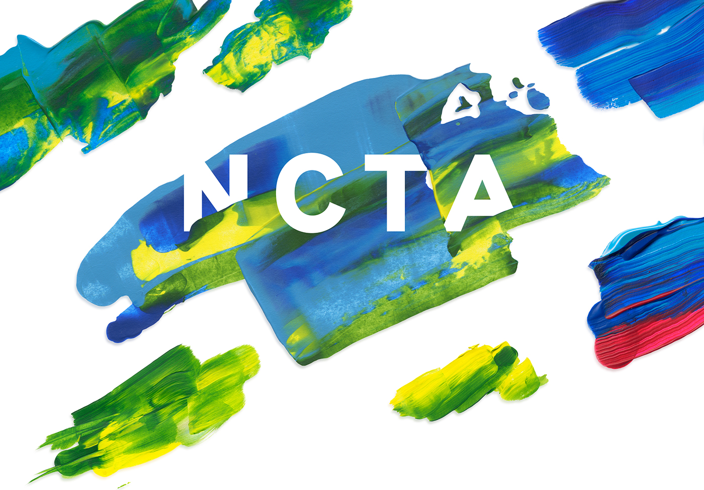
NORDIC CREATIVE TALENT AWARD
The nordic countries are known for their beautiful northern lights.
Can I visualize the northern lights in a new, more abstract way? For example with paint-strokes? This might draw associations to both northern countries, and art and creativity.

Moodboard
This idea can easily be adapted to several formats and channels. The poster and visuals should be inspiring and attention-grabbing. The Brick itself looks nice, and should be the main focus of the poster.
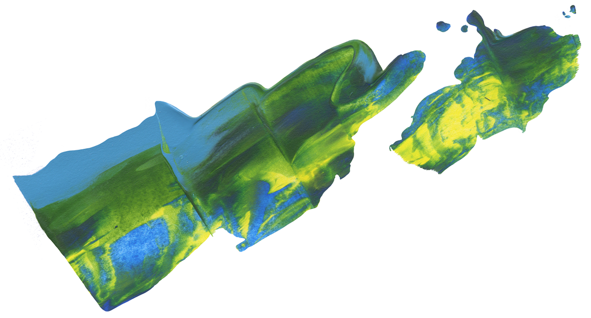
They Liked the Idea, and it was time to get started. I played around with paint, colors and several different ways of making brush strokes (spatulas, brushes, folding etc.)
My whole kitchen and livingroom was covered in paper sheets like these:
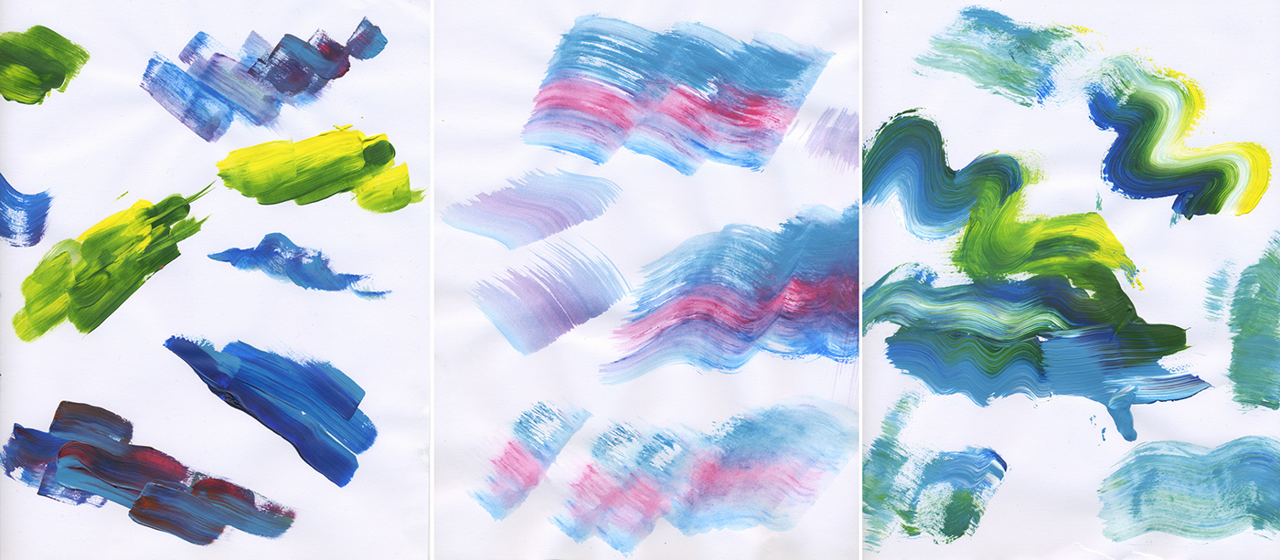
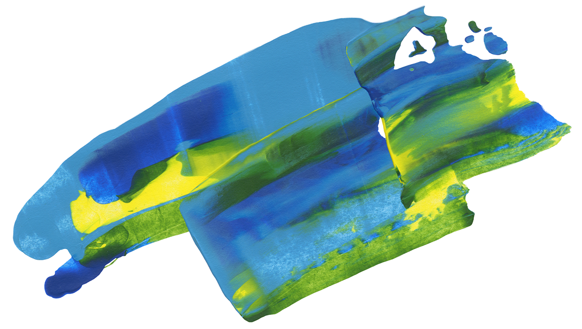
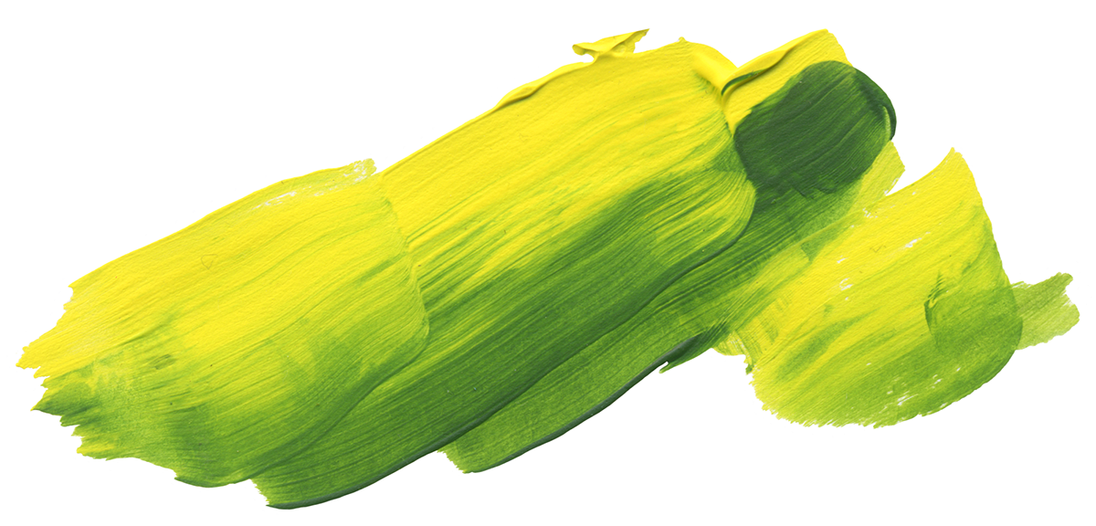
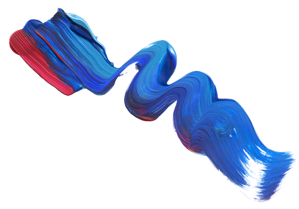
I then scanned in all the sheets, and masked out all the paint strokes I liked best in photoshop.
Finally I had enough material to start working on the actual poster. The first early sketches I sent for feedback looked like this:
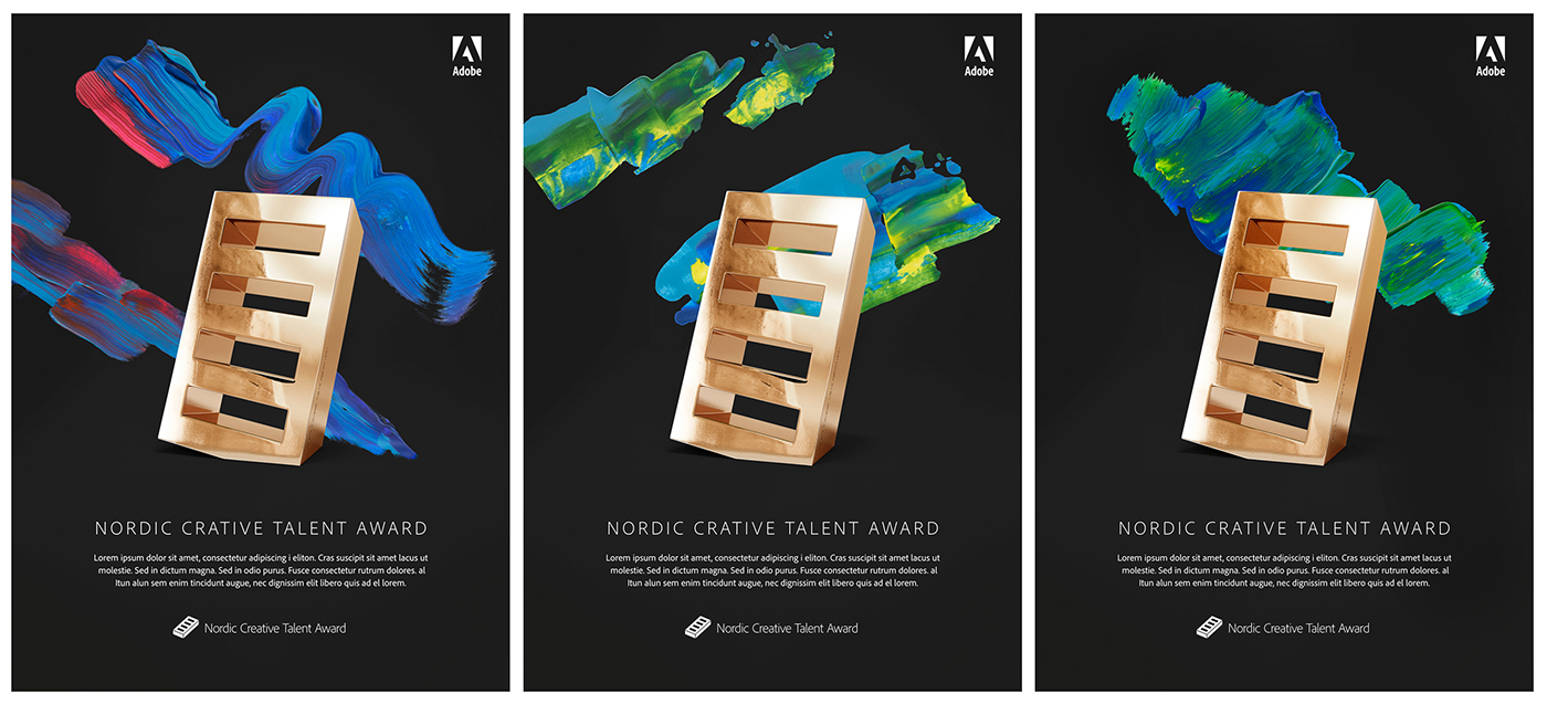
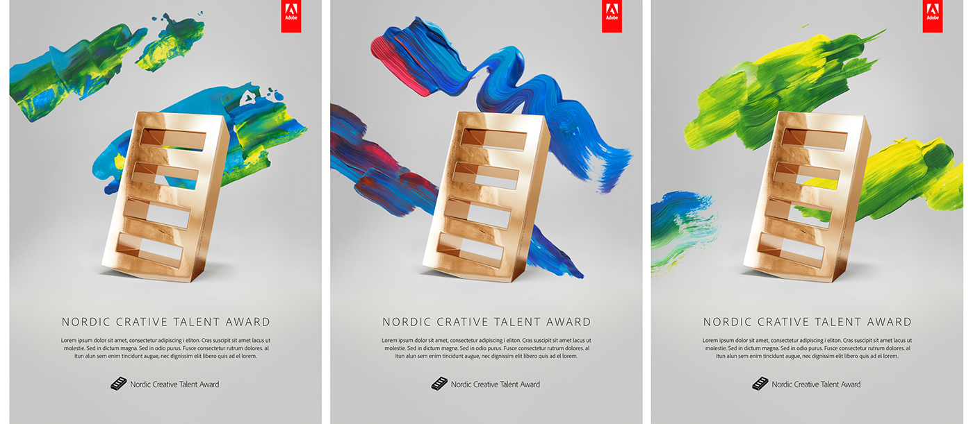
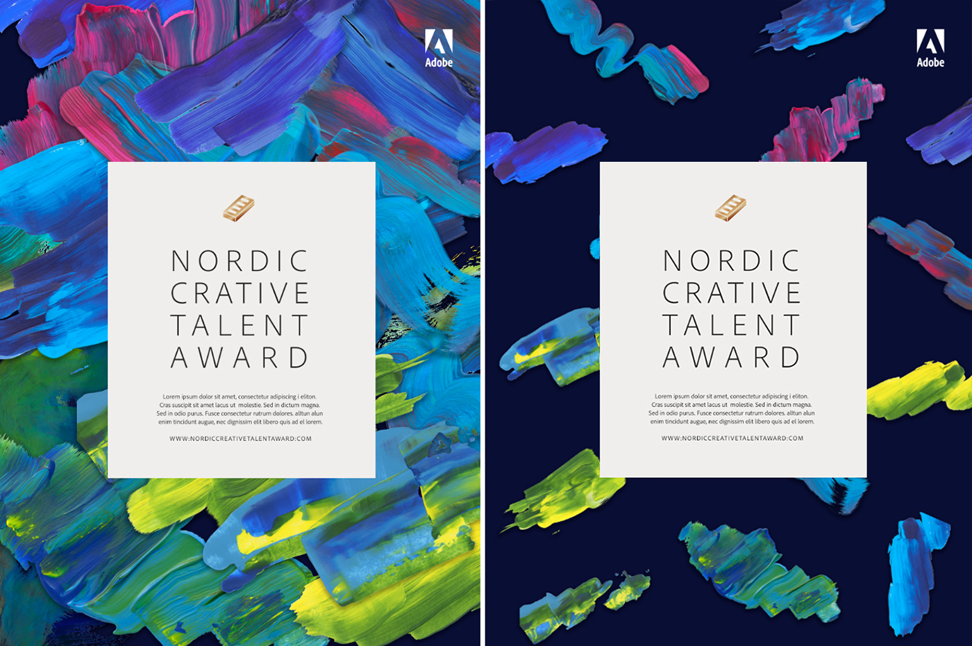
The darker versions makes it easier to get the concept of paint strokes as northern lights, but I like the look of the ones with a brighter background as well.
Summary of feedback from the client:
- We like the idea of a gradient background, but needs less "corporate" colors.
- Try to make the brick less centerd. Maybe let it fall a bit out of the frame/format.
- Maybe add a more vintage feel/texture to it?
- You don't have to use the actual image of the prize/The Brick, feel free to play with it a little more, interpret it as you like.
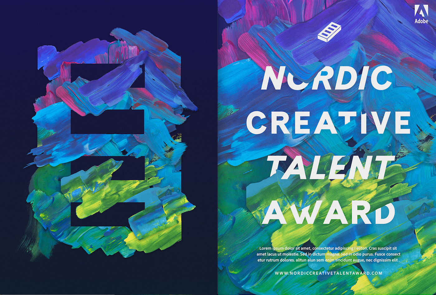
At first I experimented with abstracting the brick and testing colors. I then made an "impossible object" of the prize, changed the perspective, and added some depth to the background.
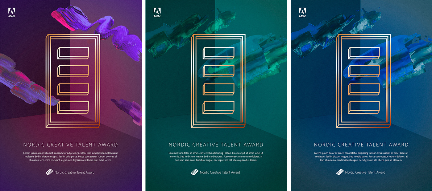
I suggested to print it in gold foil, and that the paint strokes and background colours could vary, to make a poster series.
I was very happy with the result at this point, and considered it as almost done. I did a few more versions where the brick was off centre, to see if it would look moe interesting.
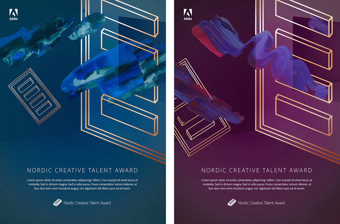
Abbey Priest liked these too, and sent the sketches over to Adobe.
Their feedback in short:
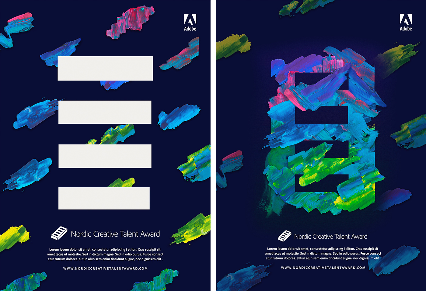
1. Can you make the brick more part of the artwork, rather than lying on top of it?
Reference: the "Adobe Remix" project.
2. We like the "room" in the background, but it might be difficult to adapt to other platforms/formats. Can you make a pattern of your brush strokes and use as a background in stead? It would be easier for us to use. Reference: The Way out West festival.
I really liked the previous drafts, and this feedback made me feel like i had to start all over again from scratch. I guess the look on the previous sketches was too ”serious” for the target group, rather that young and fresh. Well, in the end, the client knows best what they want and whom they wish to reach.
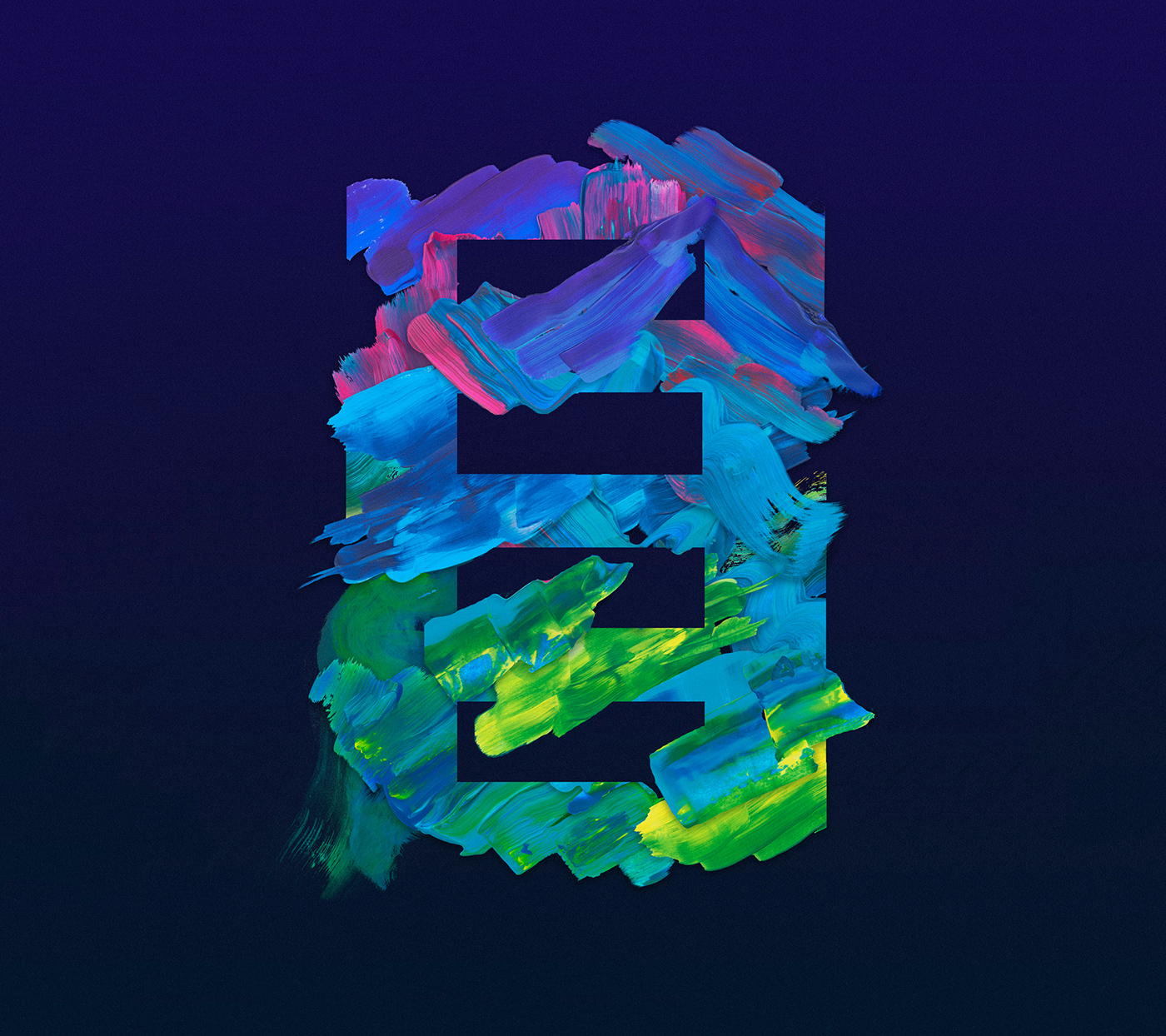
At first I tried to reconstruct the brick with paint strokes. At this point the visuals strayed pretty far away from the original ”Northern lights” idea, but the paint strokes are still the main focus.
My brain was a creative mess at this point. Stuck.
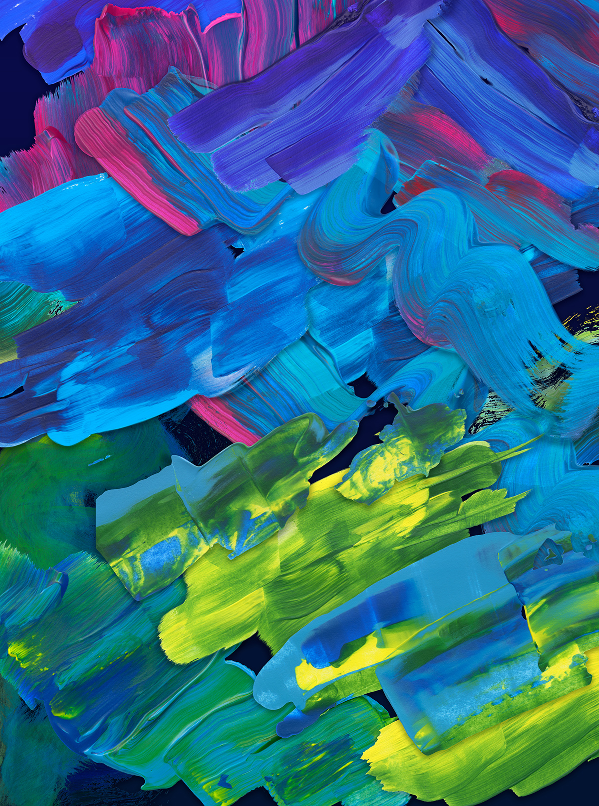
I then focused on the second part of their feedback; creating a pattern of brush strokes.
This first one I named Order, and the other is Chaos.


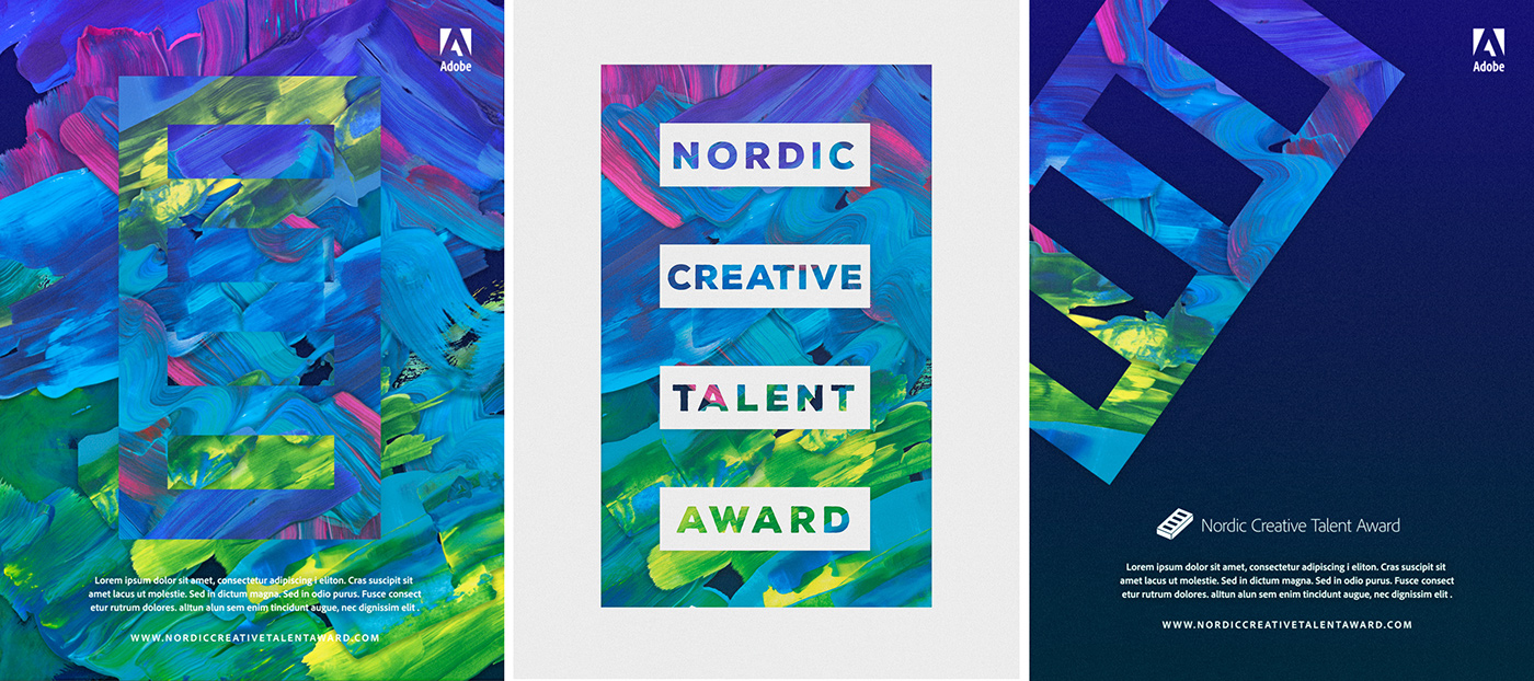
The next step was to try to make them work as posters and market material.
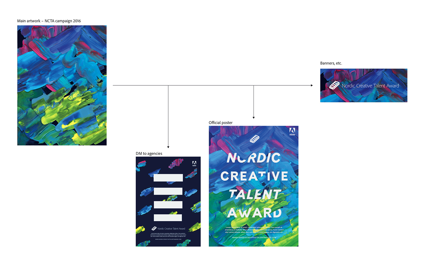
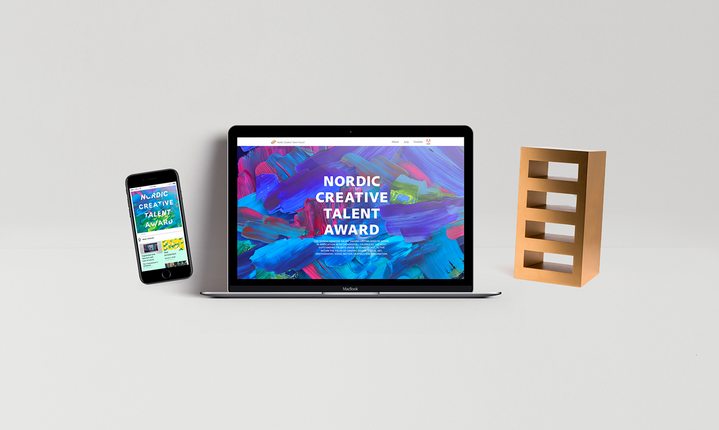
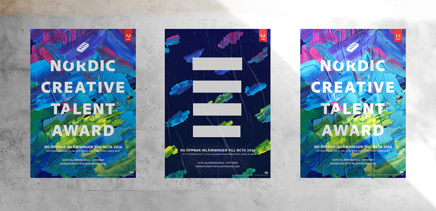
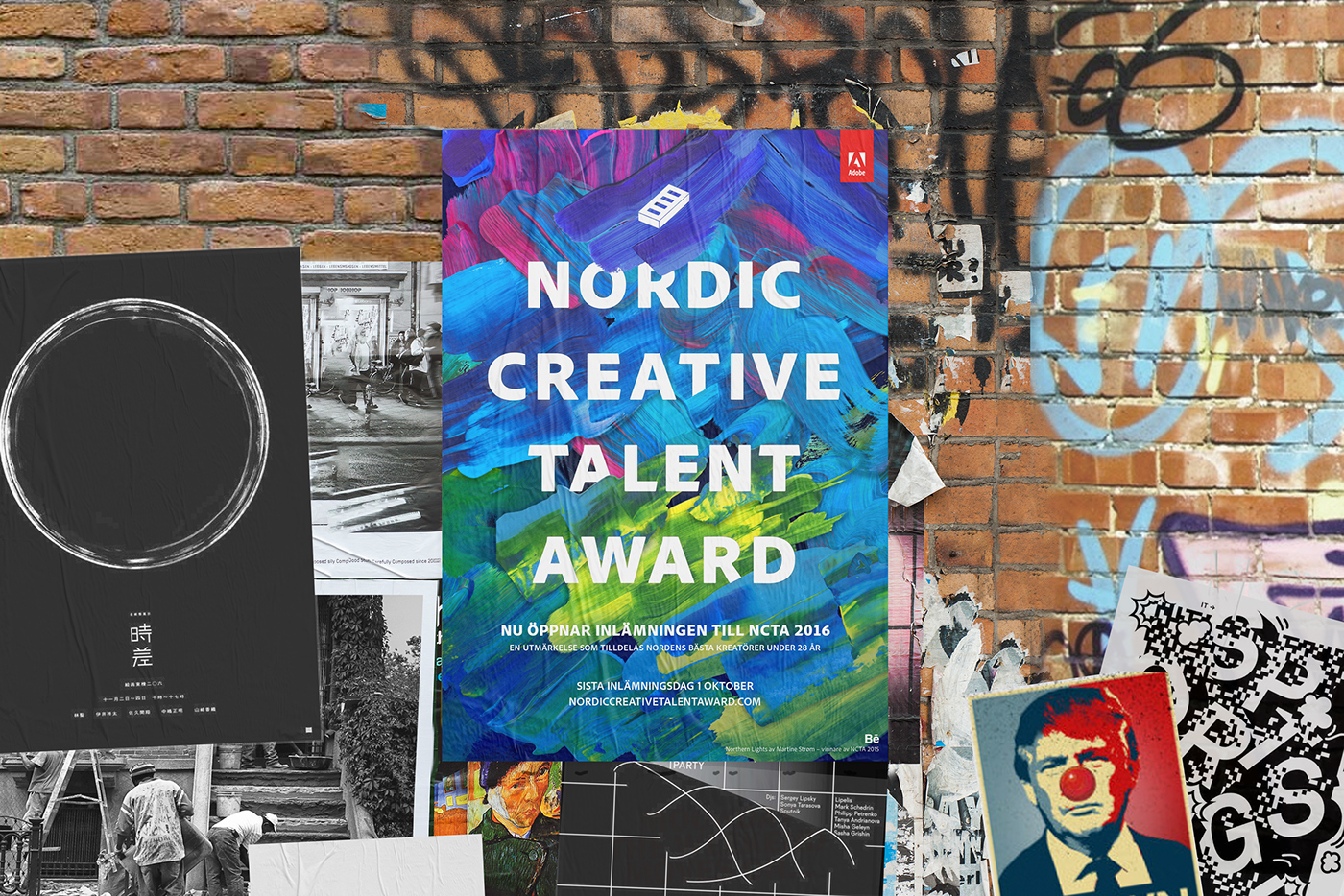
FINAL WORK
Finally we landed a look including a poster, a DM and the two patterns.
This is the system for the use of te elements:
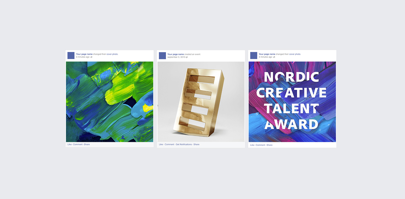
Posts in Social Media
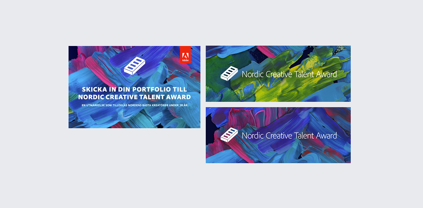
Mobile and web ads
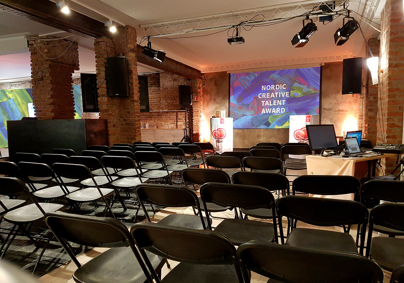
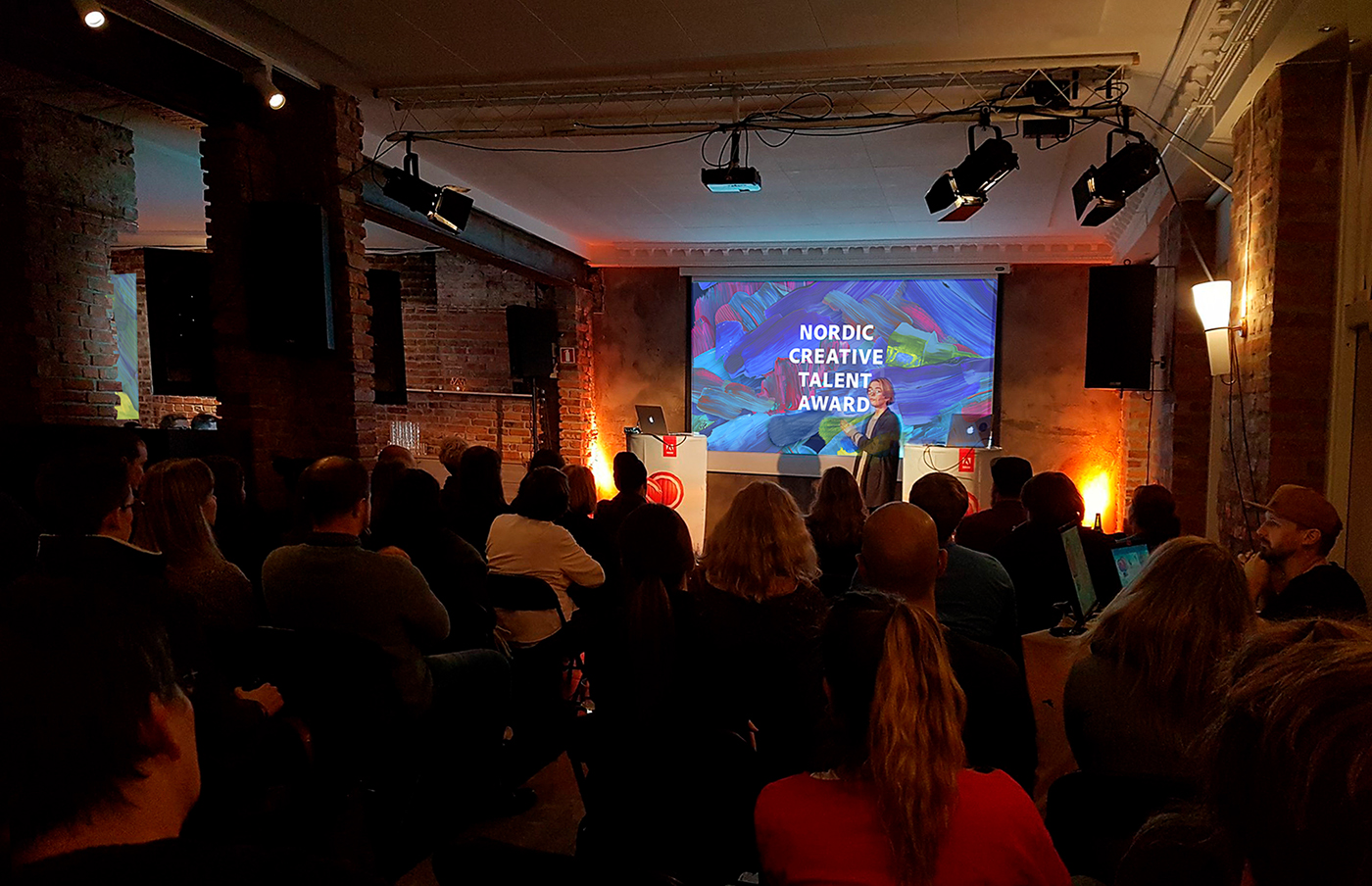
The Adobe Creative Meetup, Oslo

The Adobe Event in Stockholm

The Norwegian winners of 2016.