


Logo designed by third party agency.
Gloss bar is a beauty services company that offer many kinds of manicure and pedicure services.
Images come from Google Search.
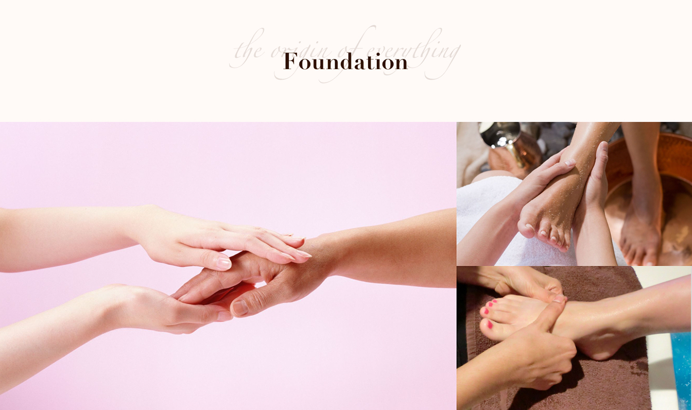
We create a mood board by searching manicure images to establish a right feel. After a discussion with our client, we lock down these three images that best represent a design that fits our client's need.
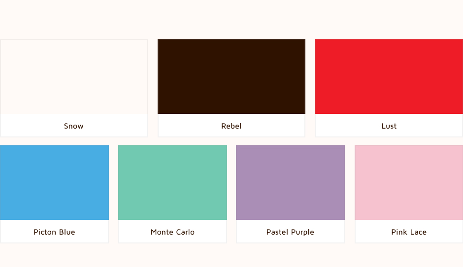
We set a color called snow as superior tone and background color for most general use. And the color rebel is used widely in most texts. It gives app and website a stable and trustable feeling. On top of these, the color lust becomes the accent color for UI details. Another four accent colors were picked from the client preferred nail polish product colors.

The Zapfino font is the best choice for the services catalog photos. The greatly rounded bowls in Maven Pro font really fit the overall feeling of Gloss Bar.
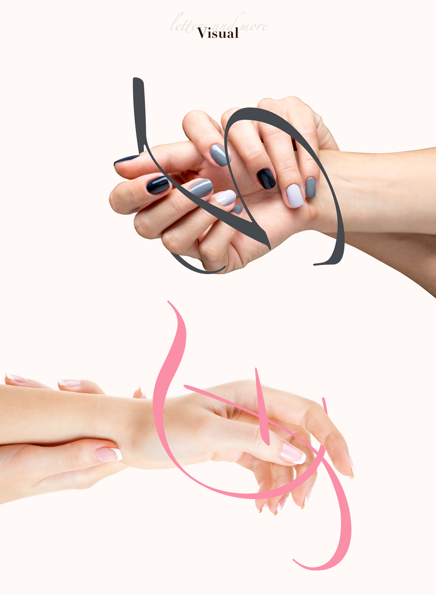
Once combine the curlicue shape with the photo, the general catalog photos looks much more vivid.
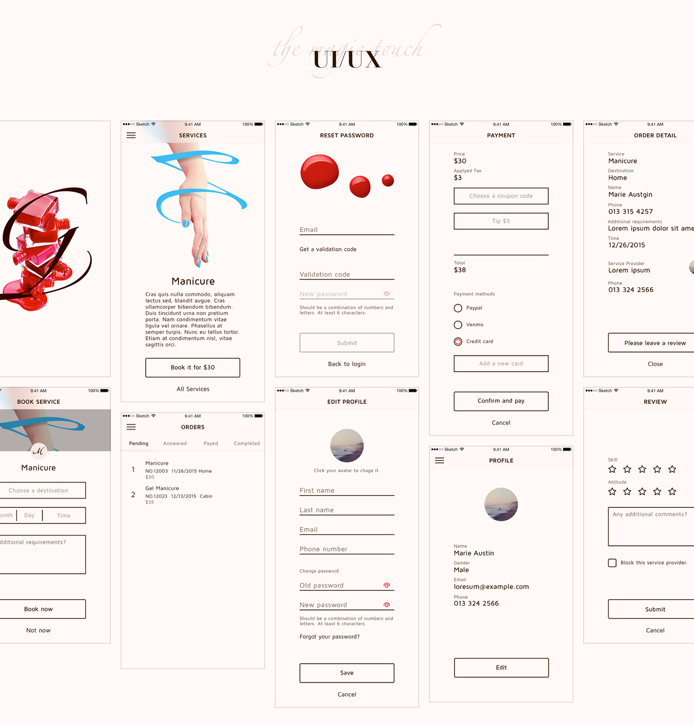
We removed all unnecessary elements and styles to put the right elements under the spotlight, which results in a balanced UI design and intuitive UX.

By following overall design guideline, we developed a set of basic UI components. It could be use across mobile and desktop devices. And could be adjusted base on the target OS and device.
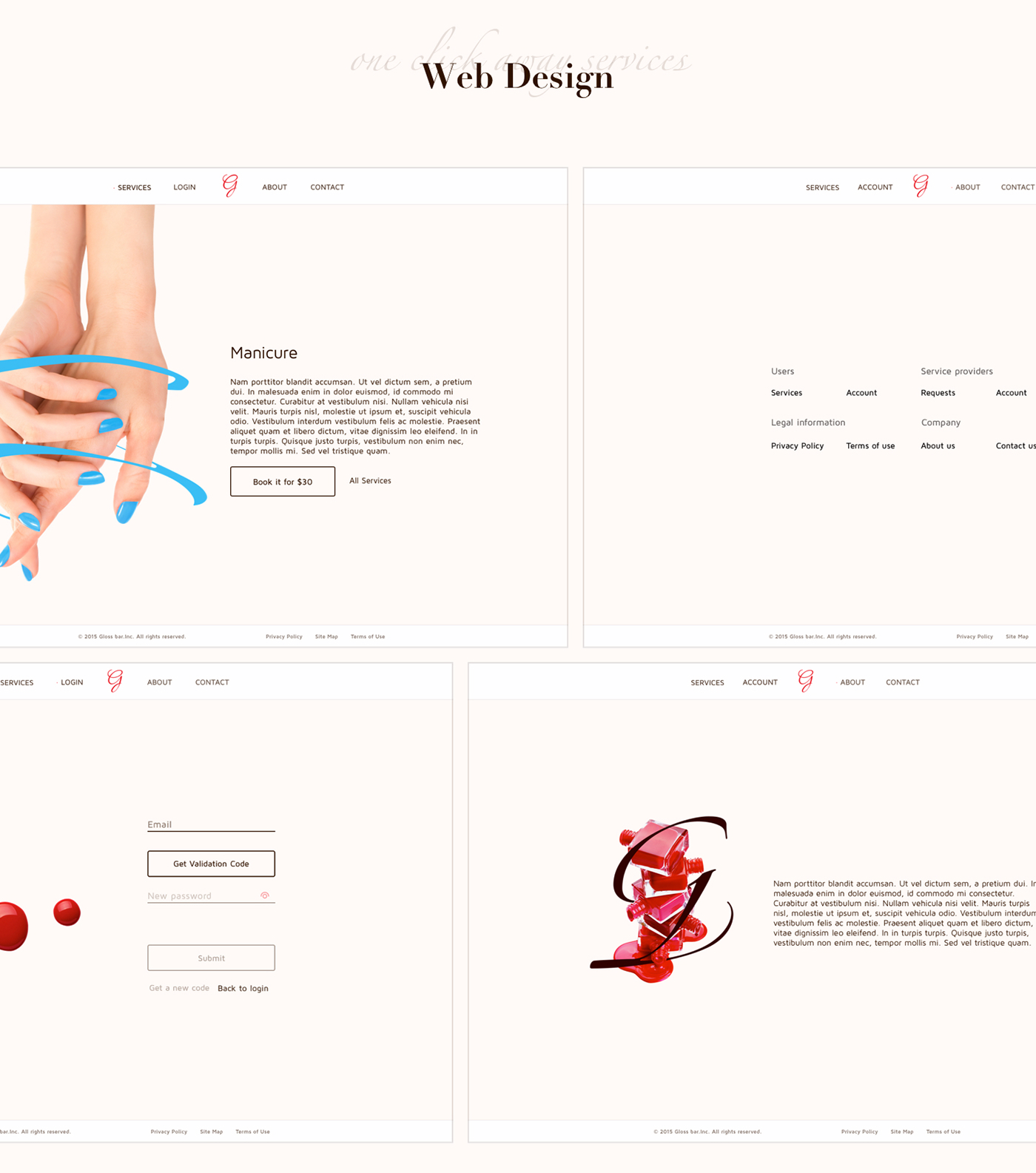
We created a web design pattern which could minimize the cost of learning. A user could easily book services and manage profile in both the mobile app and desktop website.


