

For MitchelChannal, I have to do all the branding and the design language myself. Let me show you some logo's.

This was an early version of the new '16 logo. As you can see, the text is slightly tilted and the M and L letters are sharp. This design did not come trough.

This version of the logo is a lot more streamlined then the previous. The "Bitenut" logo is as big as the text, giving it a nice straight feel. The Roboto font was used for the text.

I made a software development variant of the logo as well. I don't know when we will use it though. It was more of a test to see how the byline could be changed properly.
I use a different logo for the YouTube channels. These logo's were early prototypes of what I thought would be cool. But these were all scraped because the top one was to big and hard to put in a profile picture. The bottom one looked to professional and boring and since we're a comedy channel, this didn't work out.

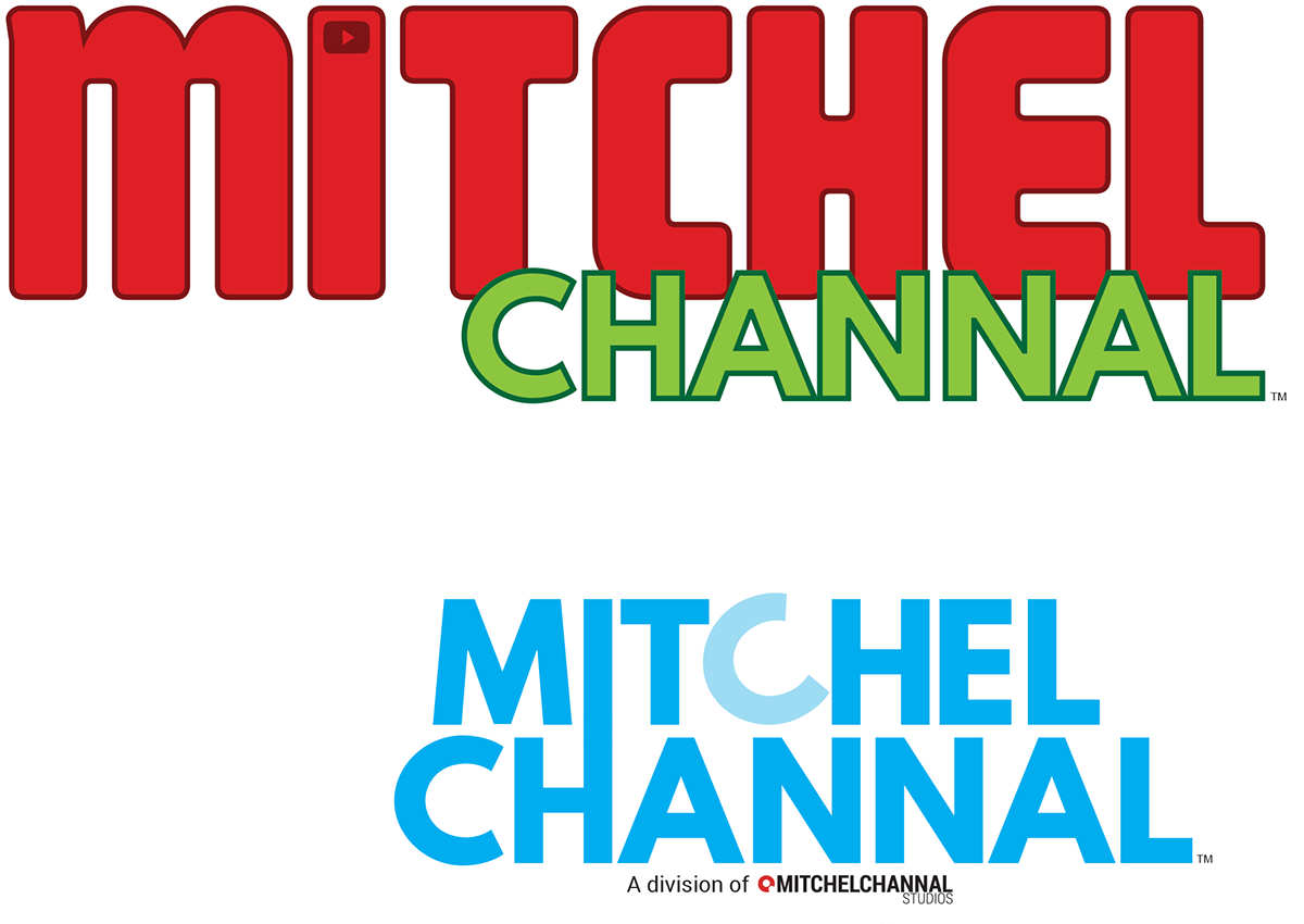
This logo ended up to be the final one. It looks a bit like the old version but the play button is now inside of the "I".


