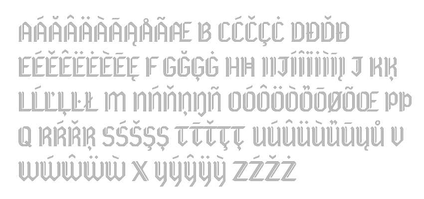
A modern blackletter optimized for use at small sizes.
Cathedral Gothic Text is a blackletter-inspired typeface re-imagined for modern use. It has been carefully constructed to marry the rich strength and individuality of medieval blackletter with the simple rationality of roman form for the purpose of increased legibility at small sizes. By no means is Cathedral Gothic Text the first attempt at “romanizing” blackletter, but it does stand apart from others in its purpose, execution, and suitability for today’s audiences.
One contemporary obstacle in the creation of blackletter typefaces, fraktur in particular, is its unfortunate association with the Nazi regime. To avoid this, particular care was taken to reference blackletter specimen without historic ties to that era, and every attempt was made to humanize the typeface through variance in angles and slightly rounded corners rather than strict adherence to sharp and severe forms. The resulting typeface is a friendly, gentle, and reliable blackletter whose darkness balances — rather than overpowers — the whiteness of the page.
The typeface is at its best at 10 point, where the thin vertical line is not muddied. At smaller sizes, Stylistic Set 1, where the line has been removed, should be used.

Default Set

Stylistic Set 1


Symbols & Figures

Language Support: Default Set

Language Support: Stylistic Set 1

Language Support: Small Caps

Language Support: Lowercase


