


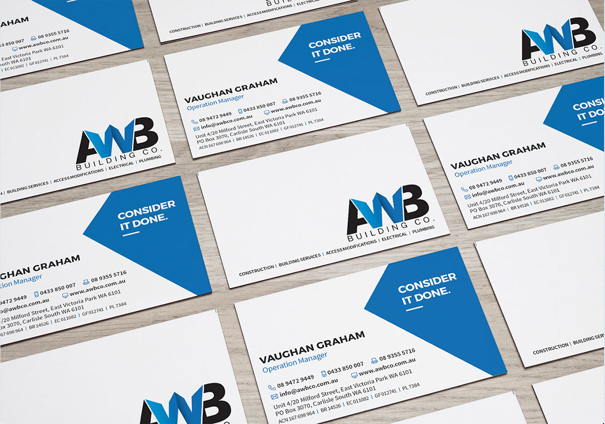
My client, AWB Building CO, needed all their internal & external marketing tools redesigned without changing their logo. I started by the business card and letterhead new design, and developed that blue triangle brand element that I will then re-use on every new designs.

All the designs I created needed to be editable by the client in Word. I kept all design simple and clean of gradients and other design style that would have been heavy and ugly to transfer in Word. Facing the challenge to redesign everything in Word, I stick to ONE RULE: KISS.

From left to right: After Hour Workflow Process, Team Profile, Project Profile. My Client applies to numerous Tenders and always need to change their documents for every new Tender Application. All of these design are Templates editable in Word.
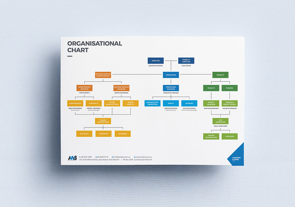
Organisational Chart
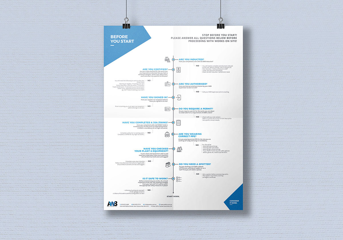
Take 5 Checklist Flowchart - Before You Start Poster Design


HTML email signature and website redesign

Brochure Design (Give Away Marketing Tool)


To help my Client furthermore, I had designed a Font Usage Style Guide for them to use when they start their own Word document from scratch but still need to keep the brand identity consistent. Follow the link below to see the Font Usage Guidelines designed previously.


