Identity and Uniform Design for NHL Team the Minnesota Wild
Client: SME Branding / NHL
Services Performed: Logo Design, Illustration, Uniform Design, Production
Software: Illustrator
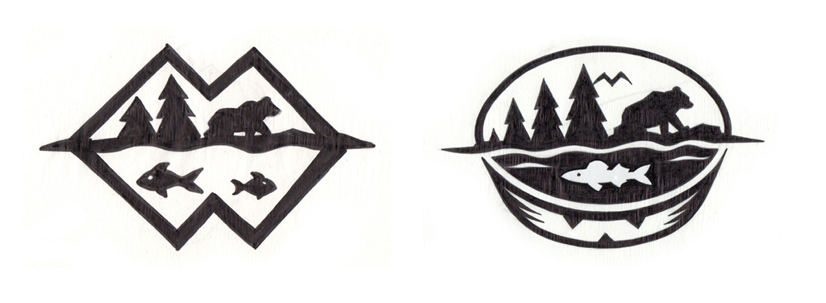
I'm always striving to include only relevant elements and combining when possible. On the left, the M, for Minnesota doubles as the mountains and the W, for Wild becomes the reflection and both serve as the retaining shape. The concept on the right uses a puck as the retainer, the bird is the M and the W is the thickness of the puck. Not exactly in your face but discoveries.


Yeah, that's Wite-Out®!
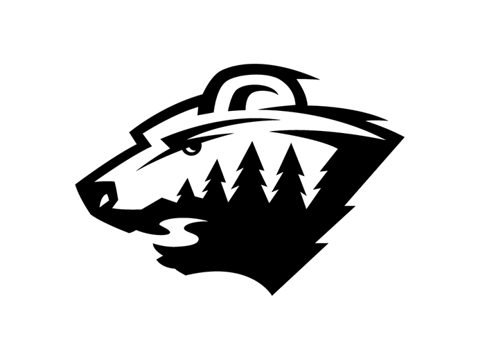
Animation depicting just some of the iterations ranging from more animal to more wilderness.
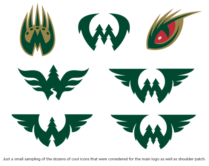
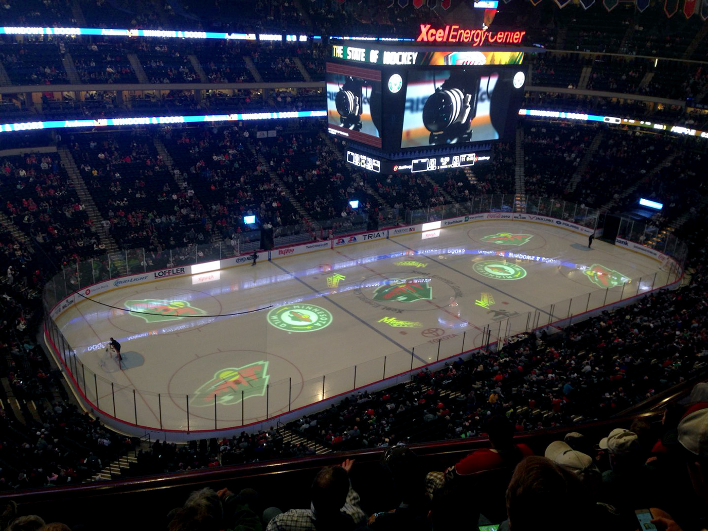
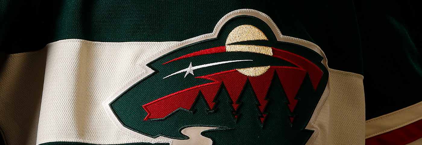
Photo: junkieflix