

Applied Typography: Personal Branding


This Project was personally one of my favorite projects I've completed thus far at Seattle Pacific University. The first half of the quarter was about recreating works that had already been done. We used different Swiss graphic art and re-purposed it into a business card/letterhead/envelope. We took those elements of those designs that we liked and continued to push our designs further. This is where the creativity took flight. We had 2 more variations of the design to get a feel for what we wanted to turn the original piece into. In that hands on process, we learned what it takes to create a well formatted envelope, etc.
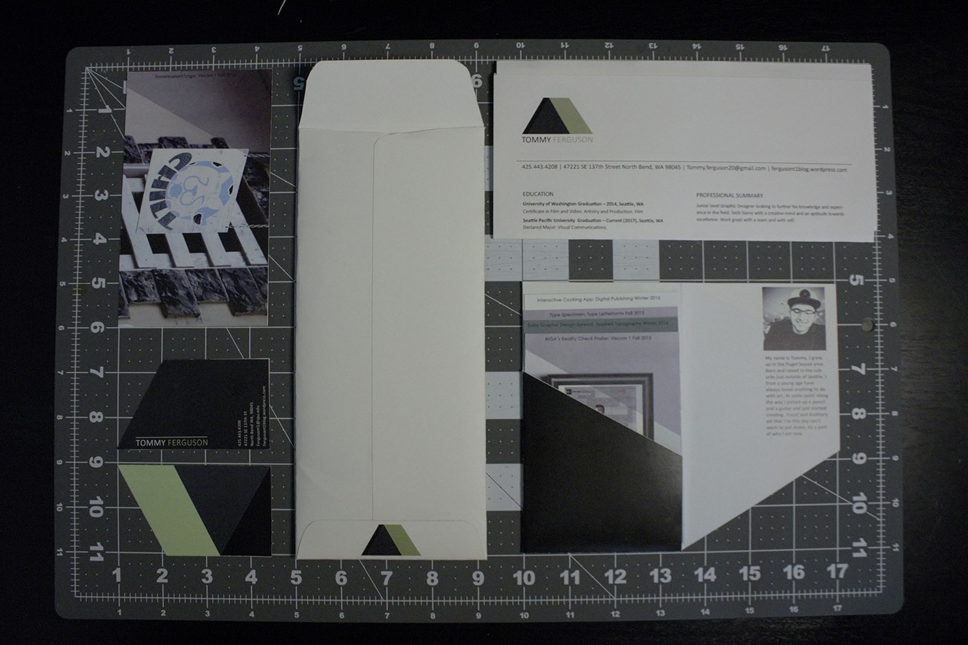
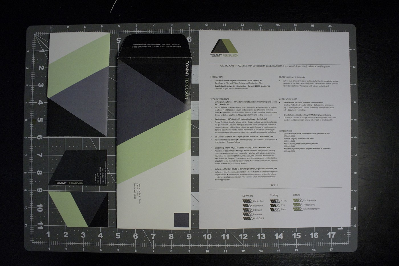
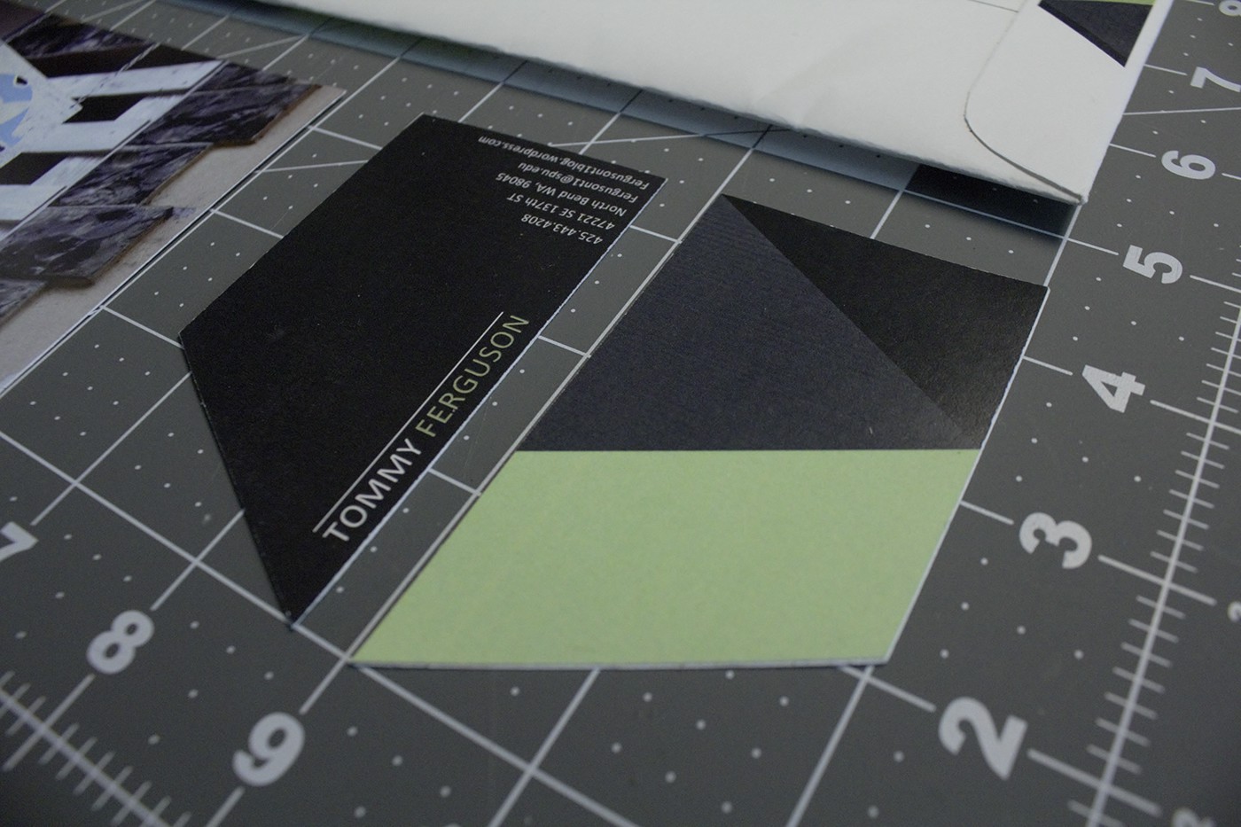
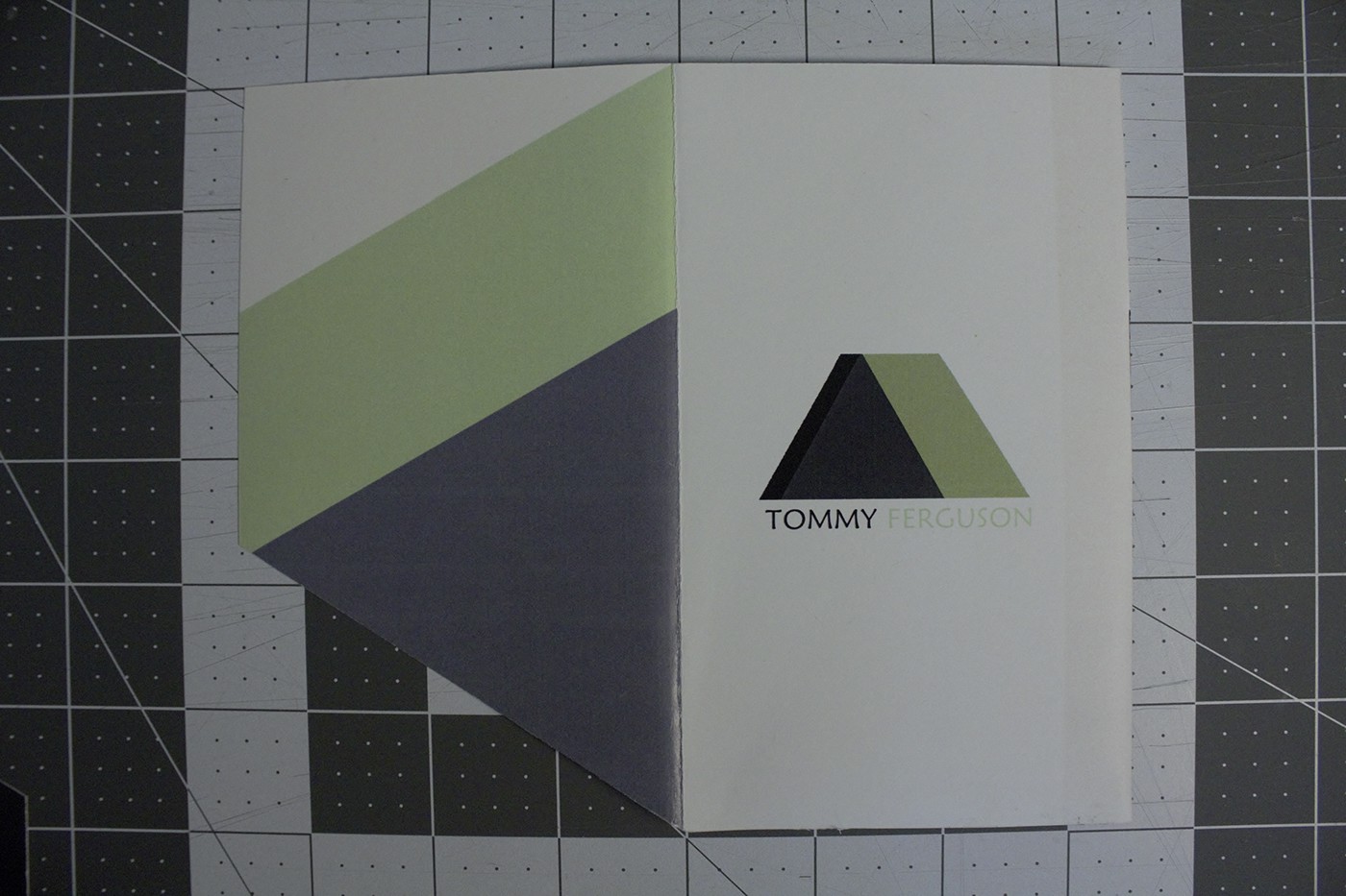
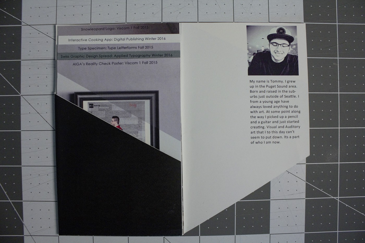
Once we understood what it takes to create elements within a branding project, we created our own. I wanted to create something distinguishable as well as design something that represents me as an artist. I spent long hours on the concept in which I wanted my brand to move towards.
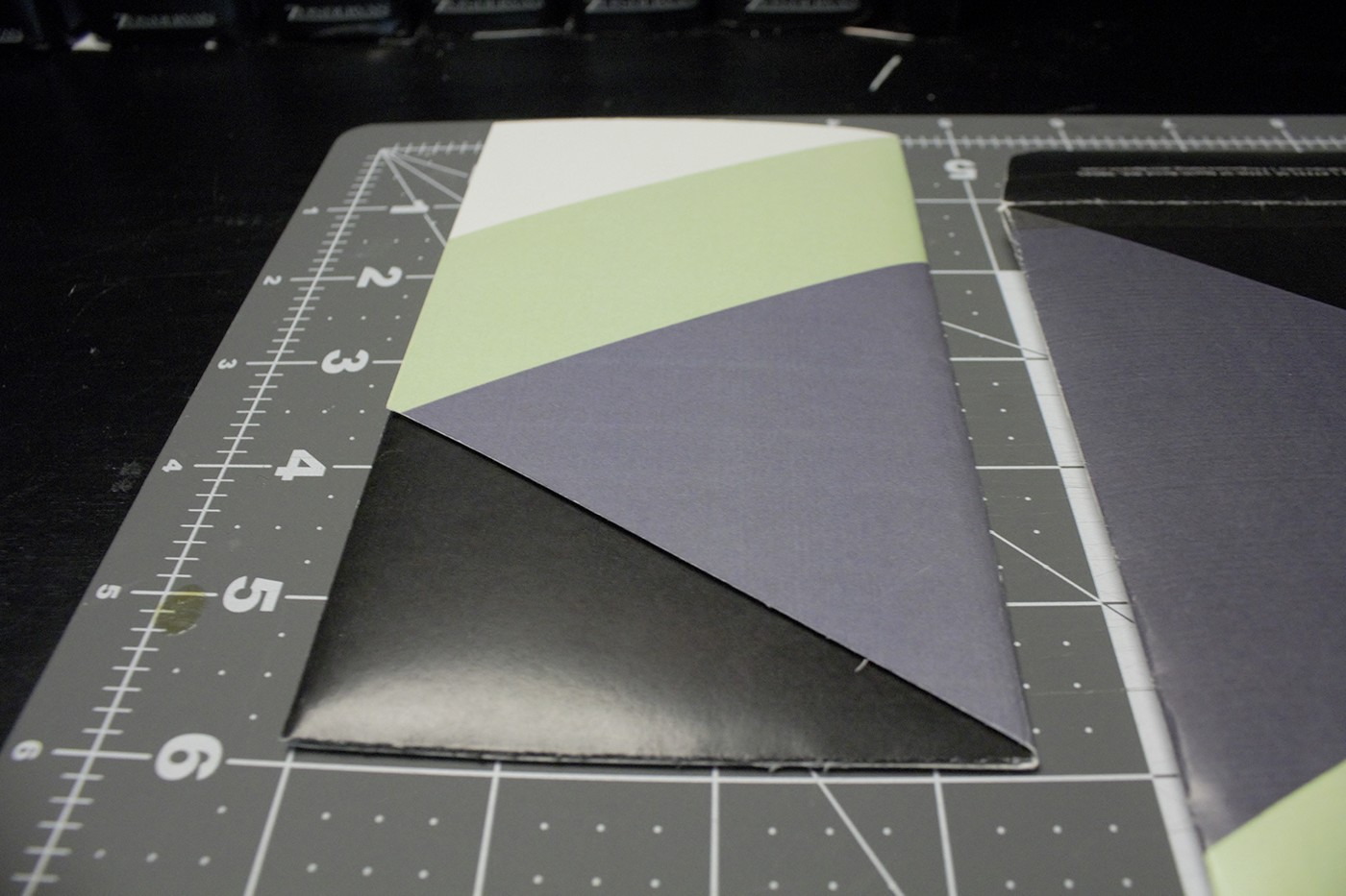
I started with the logo. The color palette I chose was the original way in which I found the inspiration for the logo graphic. I'm a big fan of angles and cuts but I wanted to keep it simple. I designed the shape of the logo to have a resemblance to a mountain but still remain ambiguous.
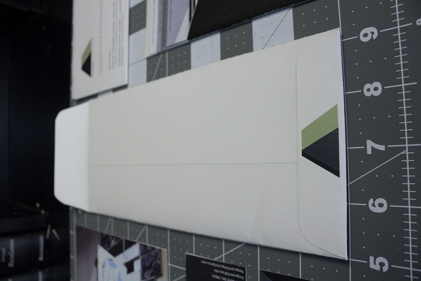
From there I began to create and refine up to the point where I felt like each element has its own personality but they come together to fit like a glove. The most rewarding part was seeing every element fit into the envelope for the first time; all neatly packaged away exactly where its supposed to go.


